Park / Nowton Thrill Park
-
 28-June 15
- Views 7,237
- Downloads 1,013
- Fans 1
- Comments 23
-
 70.63%(required: 70%)
 Gold
Gold

csw 80% tyandor 80% Kumba 75% MCI 75% 5dave 70% Faas 70% Xeccah 70% RCT2day 65% FredD 60% inthemanual 60% 70.63% -
 Description
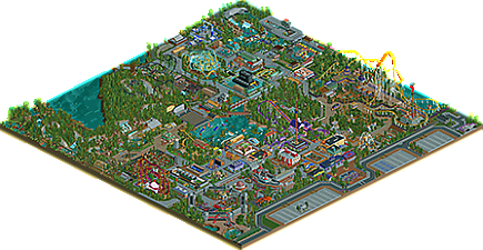
Ok, so here it finally is. My first upload to this awesome website: Nowton Thrill Park.
What started off as a motocross and 4x4 adventure park for stag do's in the suffolk countryside, has blown into the country's biggest thrill park. Including Europe's highest and fastest coasters.
The park is divided into 5 main area's, plus a stage and an entrance plaza. To the left is the fairground which grew from a few ride's purchase to amuse the kids while the adults rode their bikes.
The next area is C.E.R.N. where riders take the place of atoms! the area feature's the speed of 'Particle Accelerator' and the Mind Boggling 'Dimension Warp'
The third area is 'The Caves' which burrows through the caves of Nowton peak. Main features include the creaky 'Boulder dash' and the hair raising 'Abyss'
The fourth area is 'Battleship row', where peeps struggle to survive in the fog of war. It features the very wet 'Thunder Rapids River Rescue' and the blast of 'Torpedo Run'
The final area is 'The New World' where peeps follow in the footsteps of the pioneers and the challenges they faced. The area features the colossal 'Conquistador' and the 4D 'Quetzalcoatl'.
So enjoy, I'll probably do a stand alone ride next, as I can put much more detail into the project. I'll check out the H2H's too. Had a lot of comments about my originality but the awesome designs on this website definatley influenced me.
Cheers
more to come -
1 fan
 Fans of this park
-
 Full-Size Map
-
 Download Park
1,013
-
 Objects
590
-
 Tags
Tags

![park_2095 [NEDC] Archimedes - #1/9 (Winner)](https://www.nedesigns.com/uploads/parks/2095/aerialt1885.png)

![park_3211 [MM2014 R3] Heart of Darkness](https://www.nedesigns.com/uploads/parks/3211/aerialt2825.png)


![park_3806 [NEDC4 2/15] - Interstellar](https://www.nedesigns.com/uploads/parks/3806/aerialt3455.png)
So much good stuff here, a great mix of new objects and old style of building. I hope that I can give a full review sometime in the future as this park definitely deserves some praise.
It's finally here! Can't wait to see this in game. I'll edit with my review...
Wow! Spent a lot of time checking this park out and it was really hard for me to judge.
Somehow I can't seem to figure out whether this park is designed by a drooling two year old with some crayons or a creative genius with an art design.
You have a really creative mind that's for sure.
Parts I liked:
+ The entrance area, including the dynamo coaster, which was awesome in its simplicity. Great station and fun colours! Generally great architecture in this entrance area. Simple and efficient.
+ The gardens with the elevated walkway, might steal that idea later, I'm sorry
+ The Abyss roller coaster, especially the parts around the station (cool queue line with those sexy curves).
+ Dimension warp. Cool idea and perfectly executed. I like it when steel roofs make sense.
+ Doodly bug (it's named like that right). Very cute little junior rollercoaster, with an equally cool theme.
+ The custom flat rides. Actually added something to the park and to the peeps' experience. Not just there to show of hacking skills. Good job!
+ The ideas for some of the rides in battle ship row, although I don't think you executed them that well, which brings me to....
....the parts I didn't like:
- Boulder Dash's layout
- Particle Accelerator. Really cool idea, but not executed that well, the whole area was a bit too grey, and the coaster was a tiny bit too crazy.
- Conquistador. Too big to look good in RCT.
All in all a really great park and it's good to have you on this site, since you don't take your work to seriously (I mean this in a positive way). Keep on bringing stuff like this to the table, with maybe some more refinement, but enough crazy stuff to keep it original!
This kind of sums it up perfectly. There are a TON of original ideas (I might even go as far as saying pretty much all of the themes are about as original as you can get after 16 years of the game existing). I guess I'll do a plus/minus list:
+ Original theme ideas
+ Gardens are pretty spot on
+ Architecture is not bad
+ Park layout makes sense
- Layouts have a lot of weird sections. Boulder dash has weird bumps (get some flat track in those if you are going to do them), Abyss has a twist after the half loop/corkscrew plus a dive turn out of a corkscrew (lots of weird lateral Gs especially at that speed), and other rides just generally... have the right idea, but then throw in a curve/element that would probably rip someone's kidney out in real life.
- Too many fences and blocked off sections. It just seems like you say "oh hey here's a plot of land for a ride", fence it in, and generally use that fence line to segregate paths from rides. Let them bleed together more; Dynamo was one of the better ones in this regard. You can generally get away with putting less fencing down.
- Some weird texture issues. I think sometimes you pick too many textures like your entrance to Boulderdash. The walls just don't end up looking coherent or normal because of materials that are placed either where they wouldn't be in real life or just that no one would mix that much.
Definitely an awesome park, I think it deserves at least a bronze and hopefully you can use the critique you get here to help make your future parks a little more organic and realistic.
I'll give a full review later, but I love your park. I know a ton of hours and hard work went into it. Just browsed through it for a few minutes just now. It's fresh, it's exciting, it's unique, it's fun!!! I'd give it a high silver for sure, maybe even a low gold, but my vote doesn't count on the panel.
You, sir, are crazy, in the most positive way. You will hear more in a video review sometime down the line
The screens for this made me so excited! Glad to see you finished it. Gonna check it out soon.
I love when people just basically say "Fuck the NE Style I'm having fun". That's what you did here and I love it (other than the entrance area which was just so, so Thorpe).
I love the awesome creativity, the fun layouts and the fun themes... and Particle Accelerator is my favorite thing ever.
Great job on this.
I absolutely love that Particle Accelerator area. And the Rapids ride as well, really good stuff.
I really loved this park! Some great ideas, solid theming and some of the coolest rides I´ve seen in ages. The big drop through the burning hut on the Inverted coaster, the monstertruck-ride, that crazy Launch coaster next to Particle Accelerator, the boat-stunt-show, this crazy motocross-track... I could go on and on
We spend a good 30min, looking through your park so here is the video of that. Starts at 7:50min.
https://youtu.be/GdM5nj8PJr8?t=7m51s
So many fantastic ideas in this park. The parts that didn't really make sense such as coaster layouts were definitely erased by the pure creativity of everything. I could probably spend hours looking at this one, and I'm sure I will.
If this was released back in the beginnings of RCT2 it would be a spotlight for sure. I still thought about it. But I'll stick with 80% and no. A bit more refinement and you've got a spotlight.
Park of the year for me so far.
holy shit! gold guys! (just!) thanks so much for your comments and ratings. I definately agree with the criticisms and know how to improve. so should be getting better. cheers again
I don't disagree with the rating, but gold seems a little high for me
I liked this park and gave it 1 70%. It's a gold for me, but just barely.
Overall there was a big but interesting contrast between skill in the park. Some areas seemed more thought out and perhaps more interesting, while others seemed more simplistic.
Keep building and keep improving. I feel a bit like a posix, but it's good you got the finishing down. A lot of people go a long time without being able to finish a park of this scale.
tyandor and Kumba right at the top of the voting. I love it.