Park / Portrait of Heaven
-
 10-April 06
- Views 5,364
- Downloads 773
- Fans 0
- Comments 21
-
 65.63%(required: none)
 Silver

5dave 75% Cocoa 75% Liampie 70% alex 65% csw 65% inthemanual 65% MCI 65% nin 60% trav 60% posix 55% 65.63% -
 No fans of this park
-
 Download Park
773
-
 Objects
410
-
 Tags
Tags
Corkscrewed Offline
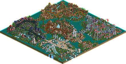
Admittedly, this is not the most jaw dropping or amazing park in the world, but it's still pretty nice. Five pleasant themed areas, five main coasters. I would have liked to see more development, but it was enough to impress Iris.
I think the way for you to improve would be to take more time thinking about what you are building, think about how peeps would view your parks and also to spend more time with your foilage and level out your landscaping a little.
I really hope my reviews helped you CF, good luck for the future!
-X-
Overall, a very good park, and a well-deserved award as well. I actually enjoyed every single area, and the rides within them. This obivously shows that there are plenty more high-quality parks to come from you in the future.
~Jazz~
~Jazz~
Edited by Jazz, 10 April 2006 - 01:13 PM.
just by looking at the screen it looks nothing like it.
congrats, coasterforce.
Corkscrewed Offline
Mostly cuz he tries to sound like he's an authority, when it's blatantly obvious he's not.
I dunno, for some reason, I have this memory of CF saying it was or something. I could just be delirious though.
Just a little something I noticed.
-Ryan
Basically for me this park is about 60% there and 40% not. That is two of the areas I really didn't like.
The first of those two is Aquatics Summit because it simily burns my retas too much for me to enjoy viewing it and in terms of color/texture it seemed pretty confused. I can tell a lot of effort went into it though, I can respect that even if I don't like it.
Circle of Horror lags badly as well. Mainly because the whole area is negitive in terms of spacing. I don't know how it's even possible but NOTHING in the area attracts my eye; which wonders around looking for something to cling to... Strangly I think the coaster there may well be the best of them though. Anagonist is a good old school B&M invert with all small inversions and very punchy pacing. Really there are only two things holding that coaster back: 1) No B&M dips man! 2) The steep drops/inclines in and out of corkscrew/half corkscrew inversions always looks like crap and is exagerated by the inverted track. I know it would've wrecked the pacing however the visual effect would've been better.
Now for the good news. I really liked IOA, Bald Mountain Village and Cliffs of Tomarrow.
I'll start with (imo) the weakest of those, Cliffs of Tomarrow. The architecture here is the most developed in terms of form and composition and in many ways is the best. Unfortunently the mix of the colorful accents on the buildings and the green grass didn't work for me here. Revelation is an excellent coasters though, very solid up until the rambling ending where it couldn't seem to find it's brake run so it just kept wandering under bridges. As a whole I came away feeling like this area tried to mix Fright Nights and Arch Angel and while those are definently the two best rct2 designs of late and possibly ever it didn't mesh.
Island of Adventure and Bald Mountain Village I'm torn between for favoring. Texturally IOA is much stronger but in terms of color Bald Mt. Ville is far better. One has a coaster that looks rather terrible but runs quite well (Bald Mountain Express) and the other has on that looks fantastic but doesn't run nearly as well as it looks. I don't know, but if both of those areas are showing where you're going rather than where you came from I look forward to seeing more in the future, near or distant.
Ride6
as for the bad, the rest was kind of 'meh,' if you know what i mean. the entrance area and the area with the arrow were lacking after looking at those other two areas. the area with the water ride, however, was just ugly. no offense, but it kind of hurt my eyes. and, as ride6 stated again, the area with the invert didn't really have any definitive focal point, so my eyes just kind of wandered, watched the coaster, then went on to the next area.
anyway, as i said before, congrats on getting the runner up, there seems to be a bright future ahead for you.
1. Cliffs of Tomorrow - My favorite mainly due to the great coaster and a few really interesting buildings. ArchAngel clone? maybe, but it didnt bother me too much. The coaster was my favorite though. A smooth, high-speed ride through various elements. My favorite section being the immelman-like inversion down the side of the cliff and then zooming past the waterfalls at top speed. Then the two graceful helicies in the second half. This coaster flowed nicely, had some nifty hacks and incredible stats. Coasters don't get much better imo. Some of the outlying buildings were cool, but the interior seemed kinda bare. Good landscaping to boot. Great concept done with good execution.
2. Circle of Horror - The invert here was really good, despite some "creepy-crawly" inversions. lol
3. Bald Mtn Village - The slow-developing woodie here was decent, but not my favorite coaster in the park. Its max speed was only 42mph. Maybe you intended it to be that slow, but I think more speed somewhere would've been better. The double log flumes were nice, nothing spectacular. Same goes with the buildings, nothing spectacular. Overall a solid mountainous western feel and convincing theme.
4. Land of Adventure - A quite generic area with a only a so-so coaster, imo. The coaster has some painfully slow inversions, and maybe, it was too many inversions that brought it down for me. It also had two lift hills which totally killed the flow. The surrounding were ok, buildings included, but not my favorite area.
5. Aquatic's Summit - My least favorite area, but not color-wise. I liked the color choices here, but the buildings seemed rushed imo. The 88ft splash was cool.
Entrance/Plaza - Slightly boring. I didn't like the pink centerpiece.
Overall, a solid park that I thoroughly enjoyed. It was fun to look at. I do think, however, that you still have room for improvement in your architecture and landscaping. Your naming was iffy too, and no shops had names....
Eitherway, I'll probably move you up a couple slots in the non-parkmakers thread because of this park. Congrats CF!
Corkscrewed Offline
I know. I have a wide screen on my computer and when I format them, I'm haphazard. Too lazy. Oh well.
decent park with great touches, really enjoyed the look
The park originally was meant to be just five coasters in their own environments. It was a unique concept that no one had ever done before to my knowledge, a park in which the only cores are five coasters. Back then I didn't know I would have any shot at a runner up so I wanted to build it as a transition-type park, but as my style changed I couldn't really go back on what I started to begin with. So I ended up modifying some of the coaster layouts and making the necessary space for rides. this does explain the very small passageways separating each area, which definitely did not give each area its own isolated feel like I originally wanted. I did add little details that I didn't originally plan for though, most notably all the main rides (coasters, submarine ride, log flume) have fast pass distribution, fastpass entry, and stand-by lines/buildings. (Look at the burnt down one for the flume...
the first area built was Land of Adventure. The corkscrew coaster there kind of represented my old style, with a really n00bish layout (esp. the underground turn before the corkscrews) but still a few highlights, like the first dive loop. This ride was very much inspired by "Macaw" in Turtle's BM, which has been the park that opened my eyes to beauty in RCT. Obviously Turtle has gone above and beyond since, but at the release of that park I saw that beauty, and I tried to have some of that in Exodus, especially in the waterfall by the ride's first drop. The land block use there is a mess though, and that's mainly due to poor planning with the waterfalls in the back. The whole area missed the immersion aspect that I originally intended, but like others have mentioned, that's probaly due to the small area.
the second area I built was Acquatic's Summit. I took a big risk in this and apparently it didn't pay off from most of the feedback I've gotten. But I still like the splash boats ride; IMO it's the best water ride I've ever made. The castle itself didn't have the dramatic hopes I had for it, but it still was good enough. The original design actually was a watercoaster, with the main drop going down the middle as opposed to the left, and a bunch of helixes by the pirate area. I decided to trash that because it took away from the "acqueous" feel that I was striving for. The rest of the rides in the area are kind of trash; I had to throw them together in the last minute, except for the submarine ride, which was actually the last ride I built in the whole park. Oh, and just so everyone knows, the idea of the splash boats ride is that it was a safe expedition kidnapped by pirates, which explains the second half in the pirate land before the small drop leading back to the "pink" area. Overall I'm not too satisfied with it, as the splash boats ride only fulfilled about 10% of my original vision, but whatever. The pirate portion of the ride was done well for me IMO, though.
Next comes the Circle of Horror. This area I must say I am satisfied with. Antagonist, as Corky pinpointed correctly, is very much Nemesis inspired. The main point of this ride, as I'm sure you've noticed, is that it was meant to be the antithesis to conventional coasters. Nothing in this park was meant to be conventional. I'm so sick of people building their rides with the lift, drop, large loop, inline twist, dive loop, brake run, and interlocking corkscrews. It gets old after a while. So I tried to do it in reverse, with the inline twist and loop being at the very end of the ride. This coaster was rebuilt about 6 times until I was satisfied with it. It could have been longer, though. The rest of the supporting rides were done well enough, but the drop tower was nowhere near as dramatic as I expected...you might see what I mean later...
I actually skipped around and built the Future area next. "Revelation" had all the dramatic parts I envisioned, so I'm thrilled about that. It was really the one of only two rides (this and Bald Mtn. Express) in the park that executed all of the ideas I had. I do wish the ending was faster and sharper though, but I didn't know how to clean it up and make it look right, to be honest, and I tried many, many times. The elevators going up and down the cliff really work well IMO, I was planning on having done on a much larger scale, in fact this whole area, for my PT, but obviously that didn't happen.
Bald Mountain Village, finally, is the only area that I am pretty much 100% satisfied with. The atmosphere I wanted to achieve has been achieved here. The idea of the area is a worn down, depressed village that has fallen victim to fires and destruction. The woodie is meant to be more of a "mine-train" like ride, and it IS intended to be a family coaster. While many people have suggested that it be faster, I didn't want it to be any faster because I wanted it to be an excursion-like adventure ride. It's by far my favorite ride in the park, and I think the land block usage around the lift area is my best landscaping work to date. I also like the way I organized the fastpasses here, because it was the only time I tried to incorporate the fastpass entry/reservation buildings into the ride. The ending with the queue and the insanely banked turn work well to create the interaction that I wanted.
JKay- Yeah, I rushed the end and didn't name my stalls or add interior stuff to my buildings. That's my bad, I usually try to do that and I am doing that in my new project, but I just completely forgot about it in my haste.
Tracid & Ride6: Yeah, I completely understand what you guys mean. I need to really define what I want to do in my parkmaking more. But I will tell you that I'm working on the things you said...
Thanks guys for the detailed feedback.