Park / Avonturenpark Vossendal
-
 09-June 15
-
 Avonturenpark Vossendal
- Views 5,974
- Downloads 907
- Fans 4
- Comments 28
-
 60.00%(required: 60%)
 Silver

Poke 75% 5dave 65% Faas 65% wheres_walto 65% Cocoa 60% Ling 60% chorkiel 55% FredD 55% inthemanual 55% MCI 55% 60.00% -
 Description
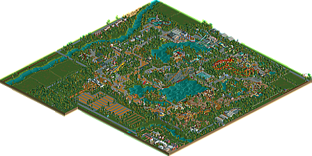
It's here, finally. My first New Element release. And I'm proud of it. I wanted to create something different, to create an atmosphere of tranquillity and nature. That's why there aren't that many rides in it, or big buildings. For those who want to know the main inspiration: it's the Belgian zoos of Pairi Daiza and Planckendael. I hope you enjoy a nice, quiet stroll trough the park, and can appreciate my work.
-
4 fans
 Fans of this park
-
 Download Park
907
-
 Objects
467
-
 Tags
Tags
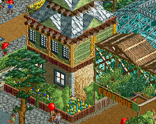
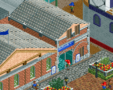
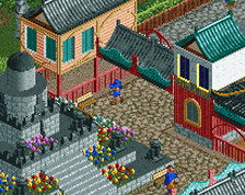
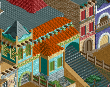
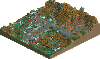
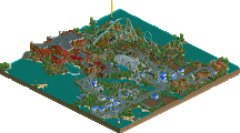
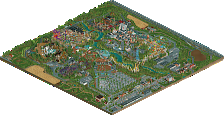
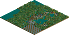
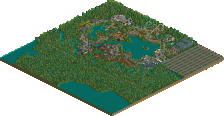
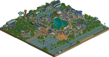
But no-one did vote a bit less, hence the park got silver. Low silver is accurate in my opinion, architecture was adequate but quite small and therefore got lost in the foliage. Speaking of which, it was very messy in a bad way [it's "just" foliage, but everything that gets built in RCT is an aesthetic choice and should read that way] in the sense that trees and bushes were placed too haphazardly in my opinion. Try to get the transition from forested area to grass a little more gradual through use of underbrush and make use of larger trees [2x2, 2x1].
I did like the animal pens and there was certainly a sense of calmness that I enjoyed whilst looking at this. Silver is by no means a poor score; keep working at it and try to increase the scale of your architecture because that will help guide people's focus towards more interesting things instead of the foliage overpowering and hiding it. This is what Paul does extremely well by the way Wouter.
Eh, personally i dislike his scale in architecture and i loved how small it was here, so i'll have to disagree with that.
Silver is indeed not a poor score. But we all (including you) know there's two different classes for each accolade, low and high. I personally felt like expressing that i feel it's more of a high or at least in the middle for pulling everything off so well, that's it.
The architectural scale is a very "mainland European" style that has been around for forever. It's not bad and it's not the cause of the low score. What brought this so low, in my eyes, was that:
- The map is too big for its own good. There is this tendency to include huge, open, empty fields surrounding parks and if that's all it's going to be, why bother? I have the same gripe with Paul 999's work.
- The park itself is too big for its own good. Lots of long hallway-like paths to try to string together the places that actually have stuff built. The right side of the park (bottom corner when you first open it) is probably the worst transgressor here.
- Foliage is lacking, mostly just because it's a huge palette of trees used as space filler and little else. Also very little in the way of underbrush.
- Coaster layouts were all sub-par. This was what almost pushed me into voting it Bronze - the layouts are simultaneously unimaginative yet lack flow. The loop straight into a corkscrew on Air was particularly painful to watch Little Winny was probably the best, simply by virtue of it being the most boring/standard layout.
- The style is not very detail-oriented. I tend to like this because it means you can get more on the map with less effort, and thus your areas tend to be more diverse and it's no less fun to look at. However, as more detail-oriented styles push the barrier to entry higher and higher for accolade scores, this will happen (and has been for years).
The panel is designed to be representative of informed opinions on the site, which is why positions are given to people who can be trusted to look through a park carefully, have a background with the site, and have a good amount of experience themselves to give perspective. There are even votes in the realm of the score you are suggesting, Wouter (mid-/high-Gold), and most everyone else seems to at least agree with the average. So the scoring seems to be very accurate.
EDIT: Interestingly, I voted the same way on both parks. I have similar gripes with each, but I do recall Attractiepark-Kirkland having a slightly better overall flow and better ride layouts. But the issue with surroundings was more exaggerated.
Well, there actually is a reason why I include those fields and surroundings: I like to create an impression on the location of where the park might be situated. I find it more fun than just using blacktiles. I do this in all my parks... The rest of the criticism, I can come in to, and will try to improve on.
I know why parkmakers do it. It's a pretty common thing. But I don't like it. Context for a park is fantastic, but this is just empty space, like people used to do before we had black tiles (or at least before it became commonplace to trim your map with them). Maybe I've just never seen a park like this in real life so it doesn't seem like a "normal" setting for a park. They're always surrounded by dense urban infrastructure (Disneyland, Knott's, Blackpool), rolling hills (SFMM, that one SF park in Seattle), water (Cedar Point), forest (Knoebel's, BGE I think...), a village (Alton)... never just empty fields, you know?
Never by farmlands? We have no hills here. There are way less forests here than in the US, because Europe is much much denser. We tend to build theme parks away from urban environments. Hence why a lot of parks in this region are in places like this...
I love park surroundings like this. The more the better. Surroundings give a sense of place, and greatly contribute to the credibility of the park.
I don't see how anyone could say Kirkland was less good than this. Kirkland had some masterful stuff. A lot of intent and deliberate design choices, whereas this park feels like an endless sprawl of tiny buildings. I like it, but bronze or silver is perfect.
Just check out the surroundings of my 'home park' Ling. Nothing but grass and empty farmland.
https://www.google.n...a,20y,90h/data=
I do have to say, people seem to look at it the wrong way. Think of it more of as a nature park, which is the main focus, instead of an amusement park. The rides aren't supposed to be the main focus, the landscape and the animals are. But even then, I know now there is still a lot of room for improvement, and I'll do my best to do just that. Thank you all for the advice!