Park / Avonturenpark Vossendal
-
 09-June 15
-
 Avonturenpark Vossendal
- Views 5,429
- Downloads 807
- Fans 4
- Comments 28
-
 60.00%(required: 60%)
 Silver

Poke 75% 5dave 65% Faas 65% wheres_walto 65% Cocoa 60% Ling 60% chorkiel 55% FredD 55% inthemanual 55% MCI 55% 60.00% -
 Description
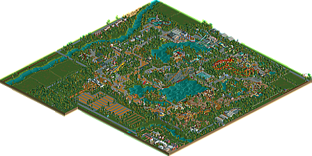
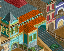
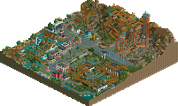
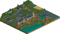
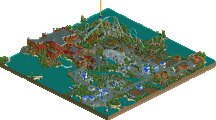
It's here, finally. My first New Element release. And I'm proud of it. I wanted to create something different, to create an atmosphere of tranquillity and nature. That's why there aren't that many rides in it, or big buildings. For those who want to know the main inspiration: it's the Belgian zoos of Pairi Daiza and Planckendael. I hope you enjoy a nice, quiet stroll trough the park, and can appreciate my work.
-
4 fans
 Fans of this park
-
 Download Park
807
-
 Objects
467
-
 Tags
Tags
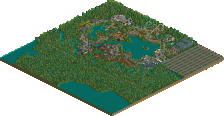
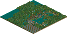
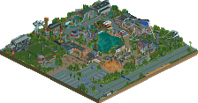


This deserves some reviews and downloads.
I think you nailed park design and atmosphere. Really cool concepts and fun ideas.
The main thing I think you need to improve is coaster design. The corkscrews right after the looping looked horrible and overall your layout were not that good. Also try to have more ride interaction and make the queue lines for coasters longer and more interesting.
Overall I felt this park was a breath of fresh air. I think if you elaborate on themes a bit more and maybe build some bigger buildings (look who's talking) you can be a very good player.
Looking forward to more of your work.
I also quite enjoyed it, definitely had an old school feel with some new inflection. Lots of diversity in the attractions and themes, especially liked the Zoo areas, they all had lots of atmosphere. Looking forward to seeing more of your work, I think you should try to experiment more and move outside your comfort zone if you really want to improve.
Thank you! Will take your criticism into account.
Wow, this is a really nice park. I agree with Faas about the layouts (The invert starts out well but then meanders around without doing much and the corkscrew right after the loop on the Arrow is a big no-no) but there are some nice architectural details and a great European style atmosphere.
By the way, I sometimes love when people don't hack away ride huts and instead come up with clever ways to work around them because it forces you to build some really cool things.
Nice work, I think this is bronze or even low silver quality.
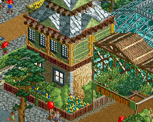
very nice work. quaint and classic european parkmaking. There were some really well put together bits, like the ship and its area, and the african stuff was also really believable. had a nice zoo-like atmosphere that I totally buy.overall pleasant work, a bit boring in places (the park itself is huge) but whatever. the outside the park stuff was also done quite well. 60 from me.
This is a great park Jappy, well done.
Pros
- Really quaint and beautiful atmosphere.
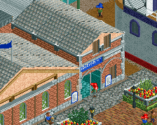
- Lots of restaurants and different buildings to explore.
- Convincing zoo area, really immersive.
- The way you built your own ride huts was really great.
- Lots of realistic touches and details
- I enjoyed the surroundings, really beautiful.
Cons
- Layouts were quite poor, lacked flow.
- Maybe a few more path varieties? You used the grey paving a lot.
Next time?
- More bigger structures for interior rides and the such.
- More roller coasters and rides.
- Perhaps more themed areas.
Overall great stuff. You're an upcoming Paul 999 and I can't wait for more.
Thanks Poke, glad you liked it!
My next park, La Fôret des Frissons, does share some similarities with this: mostly small buildings, lots of grey paving (is a personal favorite, can't help it!) and a generally more traditional feel. So most of the tips won't be seen there, since it would mean a complete redesign and rebuild. But my project after that should be a collab with Thirteen, and it's going to be something completely different!
This park featured a lot of great ideas and it really does show a lot of promise. You got the quantity part down. Now let's focus a bit on the quality.
I don't know too much about layouts so I'll leave that to other people. Your foliage, was in my opinion your weakest aspect. To start of, I suggest you to look more at underbrush. And next to that, try planning your park a bit more. I got the feeling like you just started building and picked up where you left. Which isn't a bad thing, but at least try to look a bit more about where that's going to leave you later. Some areas, for example, felt very much crammed to the edge of the map while on the other side of the map you had the space to build huge patches of grass and forests.
You're off to a good start. Keep building and you'll certainly get there! Very interested to see what you and thirteen can come up with.
Thank you. Will try to improve on foliage.
Apparently, my crummy little park will soon face the fearsome Accolade Panel! Fingers crossed!
Congrats!
Wow, I forgot about this... Nice clean 60.00. Congratulations on the Silver.
Only JUST silver? Okay, now what happened? This is worth way more than just low silver.
Why is this low gold and Vossendal just silver? Okay, the scale is debateable. But even from the overview alone you can clearly tell it's mostly been filled up with grey path. Pauls work i feel just doesn't have any life. Where other people complain about a roof not having enough stuff on it like air conditioning pipes and stuff like that, he just leaves a roof empty and then calls it "paulism". If i can be honest, i feel like Paul's detail has not all that much skill in it.
The detail in Vossendal though is still in that paulism style, but it's on a much smaller scale and it feels fitting and cute, and also Faas-ish. I feel like this park is better. It's also minimalistic, filled with stuff, and realistic, but so much better, and it's just not right to see this get such a low score. It should get at least 65 or something above.
Oh, and if you're gonna say "well but pauls park has gud rides", okay, that's debateable too. But then again, this park has better architecture, and way more life. And that is what makes this park for me.
It's actually what I expected to get. Either silver or bronze. Thank you Wouter for thinking I could have gotten gold with this, that's a really nice compliment.
Anyway, I'm very happy with my score, and my next park is already waiting to be submitted to the database. Thank you all!
I haven't said that it instantly deserved gold, i mean, the critisism posted before is fair. But if only one person voted a bit less, it would've been bronze. It should be higher silver at least. It's not close to bronze and the score shouldn't be either.
It should be exactly this Wouter because that's the average panelist score it got. Stop complaining and especially stop involving other builders like Paul in this discussion that have nothing to do with it. Stop giving your opinions like they are facts.
Congrats on the silver Jappy! Deserved just that in my opinion. Let's see if the next park can get you more than this one!
Great park, good job!
What i liked:
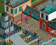
+ architecture: Really solid great work, some buildings could have been a little bit higher, but the difference of the buildings while fitting although together is really nice.
+ atmosphere is awesome
+ custom music
+ Predator tour: nice idea, very well executed
+ Rapids, which are one of my favorite rides in this park
+ so many small details to explore
What was not good/what you could do better imo:
- path and layouts as already mentioned
- to much foilage, and the foilage needs more work in terms of difference and realism, you could also place some rocks here and there
- water, great lakes are always boring, you need to do something with them like giving them a purpose with placing boats or a boat hire, or placing underwater foilage.
All in all, i really liked this park, and im looking forwart to what youre doing next. Congrats on the Silver!
Faas, on 01 Jul 2015 - 11:47 AM, said:
That seems obvious.
But i'm just saying that i don't get why it got so low, because i feel like it deserves a better score. Is that bad? I'm not saying that people should've voted higher just because i wanted so. I'm just saying that i don't know why they didn't.
It's clearly a lot like Pauls and everyone who has tried doing that Paulism thing's work. I'm not very excited about that sort of underdetailed realism for reasons explained. But i think this is a very good take on it, and it makes me think of the style a lot. Is it bad that i compare them? It's probably the best comparison you can make for this park.
This park isn't bronze quality, it's better. To have it seperated one vote from bronze is just a disgrace to the park i feel, because it's better than that. That's just my opinion.
I see a lot of remarks about the foliage in my park, which seems odd, as I thought it wasn't that bad in my opinion. What do you nice people suggest to improve it in future parks?
there's a ton of compositional errors with this, a great deal of poor design choices, and a park layout that is hardly readable
that being said the ride design was ok and the park is atmospheric
It wouldda been a bronze from me