Park / Port Azure
-
 11-January 06
- Views 6,987
- Downloads 796
- Fans 1
- Comments 35
-
 71.25%(required: none)
 Silver

inthemanual 80% posix 80% Cocoa 75% Liampie 75% trav 75% G Force 70% 5dave 65% alex 65% MCI 65% Stoksy 65% 71.25% -
1 fan
 Fans of this park
-
 Download Park
796
-
 Objects
285
-
 Tags
Tags
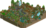
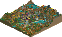
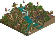
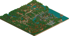
I hadn't really expected that "Arabian Village" would be disliked so bad like this cause I still thought it was really nice. It wasn't my favourite either but I still thought it was quite nice. Ah well it was the first area which I built and I've improved since...so my next park will feature a better entrance area.
HandyAndyG, I now that my work isn't the most creative and original and I'm not denying that but that "it looked like he copied some of his work straight from the source" is something I can't agree with...because that's simply not true. I have been experimenting with some different styles of parkmaking in P.A just for fun and to see what I like the most. Now I have seen what does and doesn't suit me, the styles used in Waterfront and The Jungle do suit me. While the others don't...but I still don't see what I copied straight from the source. However being critical about things isn't bad HandyAndyG so I'll leave it like this. Just keep in mind that not everyone is the next Pathage or Mala.
The little things, yes well...true. I thought about putting real shops everywhere and giving them a name...but my hastiness didn't allow that. Something to think about for my next park.
So I will probbably be back with another park if time allows me. This is my last school year and my life is pretty busy and after that I'm of to university. I would really want to build another park but simply don't know if I will manage. So just wait and see.
Edited by Splash-0, 14 January 2006 - 07:23 AM.
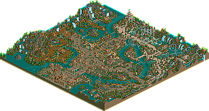
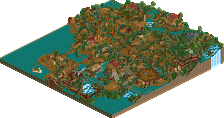
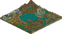
A quick look through the park...When I first saw the entrance I was like, "Whoa" but after a while I started to notice the repetitive style you had going on, could do with a better variation of colors and textures. "The Jungle" was great, especially the woodie, which was outstanding. Very nice use of land blocks in the area, as well. "The Waterfront" lived up to the hype that Corky gave it, with a very refreshing style (and color selection) that reminded me of a mix between Kevin and Artist. "Land of Nature" was alright, but not as strong as the other two areas in my opinion. I'm not sure about the flowers you had, but the coaster was good.
In conclusion, this was a very refreshing park that is definitely NOT conformist as some others have mentioned. Splash-O managed to experiment with a few different styles and I think that paid off. A very strong runner up (that I preferred over a few Super's.)
There is just one way.
Do not look at parks.
Although the Arabian Village was weak in some parts, the overall park was very neat. The Waterfront was near perfection, and the architecture was excellent.
Great job.
~Jazz~
Magnus:
That's not true IMO.
a)There are many parkmakers who've got entirely their own style and do look at other parks
b)You're style isn't That different from others
If you always look at every park which is released, you might want to build a park in a completely different style than any other. Because you know what all the styles are so you can build something different. However, if you never look at one you don't know about any other styles and you might end up copying that style but being unaware
Anyway I'm probably talking nonsense and it's pretty offtopic.
No offense, but comments like that make me wonder what exactly it is about this place that attracts you so, if you consider the sharing of parks (the entire concept behind NE and the RCT community) such an evil.
-ACE
Corkscrewed Offline
It's a philosophy that he and I definitely disagree on, but everyone's entitled to his opinion.
Besides, everytime he brings it up, I remind him that neither he nor posix has completed a park since adopting such a viewpoint.
Oops.
In that case - Magnus, you've got to be kidding me. Do you think we'd see quality parks without the sharing of ideas that comes from looking at and learning from other's parks?
Oh, and the whole 'ripped direct from source' is bullshit. Something I have said before and say again now: No two parks are the same, so stop acting like inspiration is highway robbery.
-ACE
congrats on the runner-up, splash, hopefully next time you'll get spotlight.
ps, i don't mean to sound so condescending, and i apologize if it sounds that way. i just didn' think it was as good as everyone has been saying.
I've been working over the last year to change my style in a sort of evolutionary way. The sad thing is that my "style" was really more original back in the last PT-era than it is now. I guess my love of a few certain parkmakers and parks is the cause, not it's any excuse.
Originality is always a struggle. The need to build something beautiful based on what you've seen Vs. building something you've never seen and can only vaguely imagine always in a struggle. The easy way out is always the former, but if you can pull off the latter you'll join the ranks of legends.
ride6
we'll talk after the pt2 !!!
(i didn't know posix is thinking the same way and didn't he finish this totally awesome rct2 design?)
its weird going back where every parks accolade is just the decision of one guy. This is a really fantastic park! I would have given it an easy gold, especially compared to the spotlights of the time.
The Arabian Village also had some major detailing problems. I don't know if you remember Foozy's RCT2 park that never was, but this surpasses it in terms of visual chaos, without actually offering much. Foozy's chaos meets posix' minimalism. Arabian Market with thousands of trims and actual rides. I liked that invert, though.
I have to look up the names of the areas, which says something about how similar they are... Found them: Water Front, Land of Nature and The Jungle. The names foreshadow the content: a lack of inspiration.
Land of Nature is a sloB ripoff, and a generic looking one too. Is there a theme at all? I can't pinpoint a single inspiration source for The Jungle, but it's definitely something from the artist-X250-Turtle-sloB school. Both areas are very good looking, however.
The Water Front is the best area. Again a ripoff, this time from Rivers of Babylon obviously, but the execution is great. Even the coaster Beyond the Blue Sky is strikingly similar. Actually I think the Water Front surpasses RoB's Lemuria here in one aspect, by the way: the use of colour. Don't get me wrong, Lemuria is masterful, but I can't deny that the way all these pink flowers make the Water Front pop is just great. The foliage overall is fantastic here.
All in all, no lack of skill, but a lack of inspiration. Similarly to how Faceman was denied a spotlight with Paradise Island. Shame Splash-0 nor Faceman ever found the inspiration and motivation to accomplish something worthy of their skill...