Park / Mineral Springs
-
 25-February 15
- Views 6,038
- Downloads 836
- Fans 1
- Comments 27
-

-
 65.00%(required: 60%)
 Silver

robbie92 75% Xeccah 75% inthemanual 70% Liampie 70% 5dave 65% geewhzz 65% Ling 60% ][ntamin22 60% FredD 55% posix 40% 65.00% -
 Description
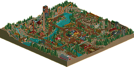
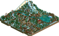
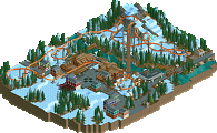
Mineral Springs is a small western themed family park located in a natural quarry.
The focal point of the park is the antique steam train which circles the park and offers tours of the trains and rail yard much to the delight of kids and railroad enthusiasts.
In addition to the train and family friendly rides and attractions the park features 2 highly themed coasters for thrill seekers. Mineral Mine takes guests on a high speed tour of the natural quarry through twists, turns and tunnels while nearly missing nearby rocks and waterfalls.
Diamond Diver takes guests up a mine shaft and then plunges them down a terrifying 108 foot vertical drop into a tunnel. The thrills aren't over yet as riders are then treated to a series of high flying loops before finally careening through a thrilling splashdown finale.
From thrill rides to family rides to great tours and scenery, Mineral Springs has something for everyone! -
1 fan
 Fans of this park
-
 Full-Size Map
-
 Download Park
836
-
 Objects
212
-
 Tags
Tags
Thanks ITM for approving this and ][ntamin22 for making the maps.
Enjoy everyone! I look forward to hearing your feedback.
1K Ruins: The Park
Seriously though, very cute little park. I think the 1K ruins actually got a little repetitive and maybe could have been varied a bit more. The brown paths could also probably have been some black dirt or crazy paths at points. But the architecture and rides were excellent (I loved the splash effect on the dive coaster, very clever), and the park was very cohesive.
Not quite gold quality in my opinion.
I did enjoy this for the most part, obviously you went a little crazy with the 1k ruins. Obviously this is a little to do with the bench that you were using, but I think this is the reason that people have begun using the colourable LOTR rocks, which I feel would have really helped the landscaping.
There were some great touches such as the green bridges for the train, and the custom splashdown for the diver. The mine train coaster felt a little short to me, as did the diver for that matter. Park map was small, granted, but I certainly prefer your longer layouts.
The amount of brown was a problem certainly, partly because of all the 1k ruins and partly because of the less-than-unique pathing choices. I felt that even some brick path would have helped a lot in improving the rather dull feel that I got from this. I just think that the dark red/brown path didn't quite work as well as I think it could.
Architecture is still not quite up to par with everything else that you build at the moment. You suffered the same problem with Sunset Vista in that it's just too small. I would really love you see you up the scale and try to build larger buildings in your next park/H2H. I think your game would benefit hugely from it and take your parkmaking up to the next level.
60% from me.
well, I was going to give you a review, but the page crashed, and I lost it.
Basically, I think this is a lot better than Sunset Vista, which I would have voted 65, while I've voted this 70. I think stoksy's right about a lot of what you could work on, but I also appreciate a lot of the improvements you've made since sunset vista.
Your work is very solid on a macro scale, but as you look smaller, you could definitely improve.
Also, the hacking in this was quite amazing. have you not seen that splashdown? That alone deserves an accolade.
What I like:
colorful buildings and peeps
sweet little hacks
macro look-good organisation
happy atmosphere-peep friendly
Thanks for the feedback guys. Since this was a Reddit contest bench we weren't allowed to parkdat anything in or out. There were some points where I was begging and pleading for a path tile but sadly that wasn't an option. lol
Speaking of the Reddit bench, ITM made a great snow themed map to use for this contest. I feel a little bad as I completely bastardized it and turned it into a rock quarry and a southwestern theme. lol
The timed B&m diver splash section is an award worthy idea. Help us remember Bill.
For some reason this park reminds me of the old days of TRP, back where there were actually some good builders on the site. Just something about the colors, and atmosphere. I really enjoyed this this, unique, fun, some nice detail, glad to see it finally released.
I'm torn. The park is very messy and the 1K ruins are everywhere, but the splashdown has a lovely layout (isn't this supposed to be for the February competition? what about interaction?) and Diamond Diver's splash event is a stroke of genius. The mine train was also lovely. Everything else was okay but not great. The way the path has to squeeze around the railroad and major rides feels odd. Constricted but not in a natural way. The brown palette and alpine foliage give a mountain-town vibe that feels just a little weak. It could be because, on the whole, there isn't much land height variation save for the massive expanses of 1K ruins which aren't a great substitute, and the space between rides feels wide open. Perhaps wider paths nestled amongst more densely intertwined rides would have worked better? It's difficult to pinpoint.
I fear I may be the low vote on this one, but a solid silver ~60% is my vote.
Ling, it was January, not February. He just murdered my landscape.
I didn't murder it, I just made it rockier... and browner.
So basically you shat all over it?
<3
Apparently my vote just triggered a Silver for this, and I'm the low vote, too.
Sorry, but this just wasn't really for me. There's only so many rock ojects you can use that still look good. In this case it's like a gimmick you chose to go for that didn't work out.
I'm surprised that the two detail-heavy guys were the high votes and the folks with more relaxed styles were the low votes. I do think the rocks had a lot to do with it, and I also think 65% is more than fair for something this size.
3 different accolades in 3 weeks. good job bill
I'm very happy with a silver personally. I never thought it was large enough for Gold but I really appreciate getting so many 70%+ votes.
Thanks to everyone for taking the time to check this out!
EDIT: ITM, you're a machine with those accolade tags. Lightning fast...
There are some good moments in there, and the layouts of the rides were interesting - something unusual which is nice. Not particularly impressed with the entrance area, and the overuse of brown stone killed the atmosphere for me. Overall though I would say the work is more on par with bronze than silver for me, but congrats on the accolade!