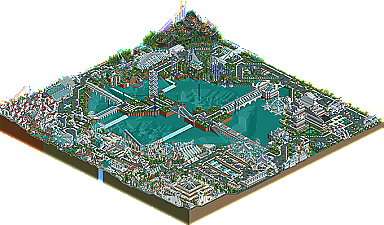
Park / PARK 360
-
 14-March 05
- Views 8,939
- Downloads 725
- Fans 7
- Comments 25
-
 64.38%(required: none)
 Silver

alex 75% Cocoa 70% Jaguar 70% 5dave 65% MCI 65% Sulakke 65% G Force 60% Liampie 60% Stoksy 60% posix 55% 64.38% -
7 fans
 Fans of this park
-
 Download Park
725
-
 Objects
398
-
 Tags
Tags
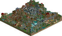
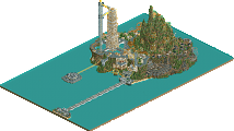
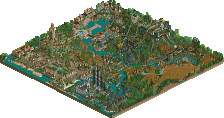
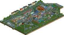
Park 360 by Beejer
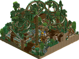
Mystic Sands by JKay and Richie
Mystic Sands: I do actually like better - I have a soft spot for colorful parks, and I loved the invert in this park especially. The hotel is fucking amazing... I HAVE to stay there sometime... all I need is a shrink ray and some kind of teleport thingy to get into the game...
Park 360 is great, and has amazing detail. Beejer has his own style, and i like it. But that purple is just starting to get on my nerves. Its in every screen i have seen from him. Repetative, but amazing nonetheless.
Mystic Sands....im speechless. The hotel is amazing. JKay is my favorite active parkmaker right now. Richie's work is awesome as well. I loved the feel of this park.
Great Job Guys.
For those who don't like to download, you can check-out some more screen shots of "360" from the link below.
RCT2 LIBRARY
Richie, we have to do another sometime
A Duo sounds great, just not sure what it is exactly!
mystic sands: I could kinda sense the seperation where jkay had themed and where richie themed, but it ended up working out okay, like corky said, giving the park balance. All of the coaster had great layouts imo, I liked the mine ride w/ loop and the water coaster the best. Jkays hotel is sooo old but still really good. Great to see released!
Beejer: definately something different, some of that stuff must have taken ages. I really liked the mouser, and all of the buildings were crazy.
anyway, neither of the parks are for me.
JKays and Richies park wasn't really all that good next to Beejers park imo.
Now i have many objects double!!
Man, that sux!
Well i only looked at MS because i really dont want all those objects in Beejer`s park, i know it's lame, sorry. Looks great though.
MS - well you two basicly know what i think but i will say here.
Each area was great, my favourites were richies area with that great inverter, the hotel/entrance that piece of architechture was totally amazing and the watercoaster area, great colors there. I just think you need work on making each area fit together well, they dont flow that well.
Beejer's park, has crazy architecture which looks great from overview. Fabulous structures, just not my taste, still, great job on runner-up!
-X-
I don't care what you say about his odd object selection the man knows how to make beauty out of all of it. It love park 360 and I can already tell that I'm going to get hours more of enjoyment from it. The coasters are all a bit odd but I can sense that they'll clean themselfs up a bit over time. Their layouts being big, creative and unusual was all good with me since they flowed nicely. Basically I love it through and through.
Mystic Sands is a park that I'll have to give a 2nd look since I didn't really like it. Basically the colors and textures seemed to build up on eachother to make the whole thing look artificially light or bright. The hotel avoided this but so far that was the only part I liked and since I know JKay has done better even that didn't get me excited. The detail and effort you two put into this park still desirves credit though so let me go through the park a 2nd time and give a proper response.
ride6
For those complaining about having excess objects after downloading my park, or any park for that matter, this is your solution and a way to exercise control over the amount of objects in your "Object folder".
Anytime you download anything and are going to use it in your computer/program, always make a copy of your "Obj folder". Simply "copy and paste". Then go ahead, start the game, load the file and look around.
After you're done checkin' things out, quit the game, go to the RCT2 folder and throw away the whole "Obj folder". Then find the file you "pasted" called "Copy of Obj folder" and re-name it to "Obj folder".
Just remember NOT to change or edit any of your object files until you've restored your original Obj folder. And that's it.!