Park / World of Color Resort
-
 25-December 14
- Views 7,823
- Downloads 1,097
- Fans 3
- Comments 12
-

-
 60.63%(required: 60%)
 Silver

Cocoa 75% 5dave 65% FredD 65% tyandor 65% bigshootergill 60% G Force 60% geewhzz 60% inthemanual 55% Stoksy 55% Xeccah 50% 60.63% -
 Description
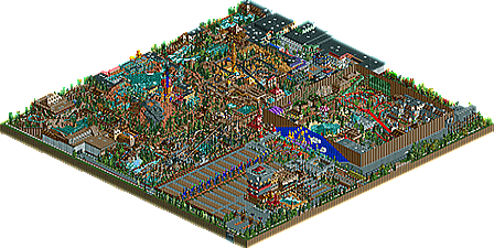
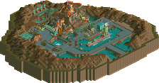
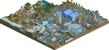
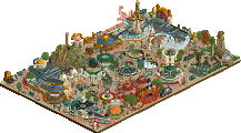
World of Color, located in Wakkernoot (Netherlands), started as just a simple indoor complex with a handful of rides and entertainment. It's founder and CEO, Peter Sely, was already know in the amusement industry and he thought it would be a great idea to start a brand new indoor and outdoor themepark . The park quickly expanded from a small indoor attraction park, to a combination of an indoor and outdoor themepark with breathtaking theming and unique attractions.
World of Color has six themed areas:
- Lord Land (Indoor part): Themed to a Medieval village with castles, dragons and a dark forest!
- Color Village: The outdoor entrance to the park and a small Mainstreet with shops and beautiful facade.
- Mystery Forest: Deep in the woods, you can find an abandoned castle of the evil Mister Flemming who awoken the great Phoenix! Or you can take a wild ride on the parks crazy mine train ride and logflume!
- Lost City: Can you discover the secret of this lost and forgotten city? But be careful for The Curse of El Dorado!
- Roaring New Orleans: Discover New Orleans on a whole new level! A fantastic mainstreet with innovative rides and of course, the Honey Swamps Rapid River!
- Verne's Discovery: Land based on the novels of Jules Verne.
This park is project that kept me busy for the last 3 years. At first it was just one of those parks I created to experiment with Custom Scenery, because I've never done that before. But sooner ore later, I decided to make a full scale indoor/outdoor themepark.
I've got my inspiration from Toverland (NL), Phantasialand (D) and Disney.
I know it isn't the best, but it's my very first 'full scale CS project'.
Note: Sadly, you need both expansion packs to download this park. Sorry for that. -
3 fans
 Fans of this park
-
 Download Park
1,097
-
 Objects
395
-
 Tags
Tags
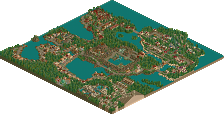
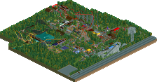
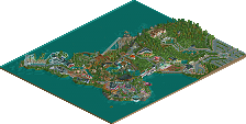
I quite liked it, though it was a bit too crammed. A bit more space would be nice. I liked the Jules Verne theme the most. I think you have potential, the coaster layouts were good and you have a feeling for theming.
I know it's your first time with CS, if you get to know those objects more I think we can expect some from you!
I actually really enjoyed this. Like, a lot.
You can really see all the influences in this park, its a wonderful blend. The entrance area is particularly nice, with the toverland-esque facade. Also the big castle building is crazy but sort of works. The interior is great, really felt real to me as an indoor section of a park.
Outside gets a bit crazy; I found it hard to follow paths until I realized that one tile paths could be the main path. Also, maybe some more space between areas or more drastic style changes would help us distinguish when I move onto an area (occasionally, the name of a coaster would tell me what theme I'm looking at, opposed to the theme itself being obvious when it starts and stops). That said, I still loved it all. Some fantastic themeing work and really creative stuff. I'm one for cramped and chaotic so this sort of park really does work for me. And that was a noble attempt at New Orleans, well done. I loved the mini section that contained the rapids, as well as the mysterious island section. I did love how every section elicited a different park's inspiration.
Anyway, easily silver for me. Really got into the vibe and movement in this park, you could go far.
can't open it because i lost my WW and TT disks, can somebody please make an overview?
Here you go:
thanks! this looks like a very cool park! did you submit it as a spotlight?
it shows a good bit of skill especially for a first-time release onto NE. probably at the bronze level, i really liked the verne area though
I didn't mind this at all. Certainly bronze-worthy in my opinion.
My main gripe with the park was that it was very cramped, which kind of took away from everything else. Things were difficult to see and therefore I couldn't appreciate what was there as much as I should. This would have been quite easily fixed with larger paths as Cocoa alluded to; in that there was little direction in the park because the main paths were so small.
I agree with everyone else about the Jules Verne area, gave off a bit of a Levis/Starflight feel which was awesome! It'd be nice to see this area expanded on or a little larger as it was the strongest in my opinion.
Solid release, 55% from me.
This just looks awesome. Really old school and unrefined, but definitely shows skill.
I really want to see this and vote on this, but WW and TT...
Congrats with the silver! Funny I'm one of the panelists here, it's so long ago this was submitted
i still really like this!