Park / A Study in Mountain Composition
-
 25-December 14
-
 A Study in Mountain Composition
- Views 4,064
- Downloads 809
- Fans 2
- Comments 18
-
 61.25%(required: 60%)
 Silver

][ntamin22 70% inthemanual 65% Liampie 65% Ling 65% 5dave 60% Airtime 60% posix 60% tyandor 60% Poke 55% RMM 55% 61.25% -
 Description
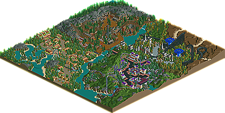
Some good ol' LL fun. Completed over the last few months.
-
2 fans
 Fans of this park
-
 Full-Size Map
-
 Download Park
809
-
 Tags
Tags
![park_3805 [NEDC4 9/15] Caelipotens](https://www.nedesigns.com/uploads/parks/3805/aerialt3439.png)
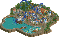
Lovely foliage, lovely landscaping, and wonderful use of empty space. The layouts and architecture are maybe a little on the simple side, but overall this is a hugely enjoyable and pleasant park. Mid-silver for me.
Very quaint. i love the area with the minetrain.
Yeah, its pretty nice. The landscaping was certainly the highlight, and was quite pleasant. Nothing especially stands out to me as particularly good or bad otherwise. The minetrain area was probably the most unique and best area, otherwise its pretty standard stuff.
As reflected by the name, this is a great example of the atmosphere brought to parks with just a good landscape and foliage. Really pleasant to look at. Can't view in game, but the mine train and purple coaster stood out most. Overall, really nice, I enjoy this style a lot!
The landscaping and foliage were good. The rest was just safe and simple. Nothing really held my attention for long. I liked the drug area the most because of its originality.
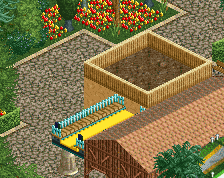
The bright, fresh color accents really set up cool little nuggets of architecture. The aesthetic sense of setting off the warm neutral buildings with the neon lemonade stand colors is very smart. I feel like the area is a touch too cramped, which might be because the path layout doesn't point to much in particular or because the foliage really goes from 0-100 in a hurry. A few more judicious tiles of empty green like you used brilliantly elsewhere in the park might go along way here rather than walling the paths in with trees entirely. Love the lagoon cruisers, but I wish they had some more discrete theming. The launch coaster is also a little flat; you could have really made it sparkle by clearing out the area near the launch track for a spectator zone, maybe some custom supports or a (Stealth-like) gradient paintjob. Overall the area has a great cozy tropical feel that needs a little more direction to be memorable.
Crazy mushroom area:
The Psilocybe station building is magnificent. The architecture in the rest of the area doesn't feel quite as put-together or purposeful, and I would have preferred to see more of the rapids track love shared with the other structures. Great ride design here. I love the sprawling layout that dives in and out of the terrain and buildings to keep even just a basic loop exciting to watch. The bare hillside feels like juuust a hair too much; it would be nice to have a few more patches of trees/flowers to draw attention or a few less terrain transitions so the slopes were smoother and less distracting. I might be alone in liking the foliage mix, but I like that you stuck to a palette and made excellent use of the shrubs and flowers to show undergrowth. It works best the way you placed it in most of the area, along the path borders, and doesn't work so well in the large patch behind the enterprise. I think you probably could have done without the red checker path.
Castle mushroom area:
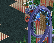
Nightjar has a great layout, and a cool concept. The shroom sculptures aren't my favorite depictions of giant mushrooms in LL, but they are pretty solidly executed. The landscape work here is really cool; the small sand channels leading into the tree-filled basin make all the difference between boring flat emptiness and an appealing environment. Also a big fan of the grass clearing near Nightjar's final helix- just really pleasant to look at.
Mines:
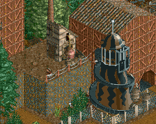
Fun coaster, fun landscape to explore, ho-hum architecture that makes the whole area lifeless. The foliage is creeping in a little too close for comfort here as well, but it feels a little more intentionally atmospheric than the Lemon Lagoon. It feels a little strange to have this be the only area with fencing up around the majority of the main path, but I'm not super picky about that. What does bother me some is the emptiness of the back half of the area, which just dead-ends into a bunch of blank storefronts. I guess the lesson is that if you have to design a dead-end path, at least make it dead-end into something worth going to - an attraction entrance, a scenic viewpoint, a portal to hell, even just a nice seating area. The highlights here are definitely the little touches; the bumpers at the end of the mine tracks, the coal lift, the dynamite sign. Not the strongest area, but a decent one.
I'd have to agree with Cocoa and PCE's assessments that the composition, as it were, feels a little safe and never quite blossoms into a really drool-worthy view. "Safe" certainly doesn't mean bad, though - everything is definitely pleasant and nothing really jumps out as being in need of work. The park planning, architecture, foliage and layouts are all good, even great in spots, but it doesn't come together quite strongly enough to be outstanding. High silver from me.
I opened this up last night and really enjoyed it. I wish the park had a real name as it deserves one...Lemon lagoon had a very nice feel to it though the coaster itself was uninteresting. I enjoyed the little raft ride quite a bit. Nothing amazing but very aesthetically pleasing.
The other layouts were nice... this park wasn't really about coaster layouts obviously as the name suggests but the coasters did their part to enhance the areas they were in. I'm a fan of all 4 major areas, the landscaping is very different in each but you blended them together well and they all work for their respective areas.
Overall this was really nice and had some nice little details like the dynamite sign and mushrooms that really helped bring it to life. 65% from me. Nice work.
Thanks for the comments, it's a shame the LL releases aren't getting too much attention.
Due to lack of readme, here's some information about the park.
I started with the mushroom forest area. The schwarzkopf was the first thing built, along with a few buildings. It's station is probably the most-codexed thing in the park, I tried not to use it too much. The idea for the architecture and color scheme in that area sort of just popped into my head one day (which is where a lot of my ideas come from, actually). Worked on it for a few hours one day then sort of just forgot about it.
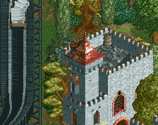
I built the wooden coaster a few weeks later, with the big blue mushrooms. (I take it back, those are the most-codexed thing in the park, by far.) For some reason I decided to have some giant mushrooms in a different area than the mushroom forest. Don't ask me why; a lot of my parkmaking decisions don't make too much sense. Anyways, I went for an old castle theme with the "spooky" trees, because I really like them. Probably most parks you'll see from me will have an area full of those trees. Built a little castle thingy, because castle. (castle week?) That was the progress I made...for a while the file sat untouched, since probably last summer, actually.
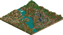
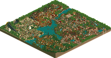
Then I decided to pick it up right after I finished Capricorn Coast and built a little mine town. Nothing too special there, except the architecture is pretty crappy, even by my standards. Around this time I came up with the idea of the park being a study of different mountain "types", as in completely bare vs. sparse vegetation, and dirt vs. rocks vs. rolling hills/grass.
Last to be built was the lagoon. I put in the river ride first, with a colorful station, and built from there. The lemonade stalls gave the area its name. I decided I needed a coaster in the area, but I was running out of room, so I put in a dorky little launcher. Filled in the blank spots with trees, and there you go.
Then I had to name everything. Which is not exactly my forte. That's why my themes might seem inconsistent, because I assign rides arbitrary or unrelated names. The mushroom forest wasn't intended to have a "drugs" theme, but well...whatever.
There's all the unnecessary information about this "park". The focus was not the rides or buildings, but the mountains and foliage work around the map. For that reason I wanted to submit it non-competitively, but I decided against it because ACCOLADES ARE FUN!
Will this park ever receive ten panelist votes? Nobody knows...
It took "Thoughts" like 6 months to get 10 panelist votes and it only happened because someone brought it up in a thread. Hopefully it doesn't take this park that long... it really deserves an accolade.
i'd vote if i finally got that panelist spot
values are useless when you have the honour of worshipping my might
Congrats on Silver!
Very nice old school park. I really liked the medieval area and the entry. The landscaping was good too. Congrats on another accolade.
Congratulations on the accolade. I hope what you bring next is a bit more groundbreaking still keeping your great old school style.
I just realized how you've been playing Morrowind, then drop a park with giant mushrooms. The inspiration is clear
Started playing morrowind about a month after I finished this, but I'm not going to complain about that comparison.