Park / Temple of Doom
-
 25-December 14
- Views 4,925
- Downloads 792
- Fans 3
- Comments 17
-
 71.88%(required: 65%)
 Design

FredD 80% CedarPoint6 75% disneylandian192 75% Ling 75% posix 75% Cocoa 70% geewhzz 70% inthemanual 70% Liampie 65% Poke 55% 71.88% -
 Description
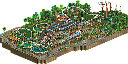
My winning entry from reddits dark ride contest in October 2014! Enjoy
-
3 fans
 Fans of this park
-
 Full-Size Map
-
 Download Park
792
-
 Objects
244
-
 Tags
Tags
![park_3211 [MM2014 R3] Heart of Darkness](https://www.nedesigns.com/uploads/parks/3211/aerialt2825.png)
jay jimmy! this looks really good, some great landscaping and foliage too. though i do miss some surrounding buildings to make it even better, but just looking at the coaster this is absolutely great.
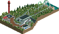
Looking at the overview, this is really cool. The scenery looks very well done and the flow of the coaster likewise is impressive. I'm guessing you were going for a Cheetah Hunt/Maverick look, right?
Very nice. Clean, well themed, realistic, good flow.
Would have loved you to have done more with the surrounding path, more buildings, landscaping, park stuff, etc. Its just a little bit too small at the moment, I think. But don't get me wrong, the ride itself is fantastic, and I could totally see it in real life. Also, I think the first outdoor section of the ride would be better not in box track but in mini coaster track.
so good work, still figuring out if its enough for design in my eyes.
I'm actually making a similar section in my park project. Therefore I did not want to spend too much more time on this. So sorry no additional buildings:)
There was a size requirement for this competition. The better entries generally felt quite squeezed for space in this way.
That's probably the best station I've seen in recent memory - looks absolutely wonderful.
yay! I think I must have been one of the last votes, I just voted a couple of hours ago and its here. nice work kiddo
I finally had a chance to view this in game and I really enjoyed it. I think my favorite bits were the station, the queue, the entrance arch and the show building. You made a large building that would normally look really dull look very nice with all of the little details on the roof and the rock work and raised terrain around it.
Great work and congrats!
I'd be interested to hear FredD and PokeCoasterEmpires give their takes on this, as the outliers.
congrats jim! it's an excellent coaster, but i still think you could've pushed this up to 75% if you would've added in some buildings after the contest
Looking back at this, I would've probably changed my vote to 60% but it doesn't really matter in the end. I think I just needed more surroundings to view it as design worthy.
I first wanted to vote this 60%, but then felt it had a strong atmosphere to it, given its small scale. I then went further up because I realised the theming of the station was really well done. Convincing yet beautiful theming is the hardest thing to do in the game, and you did it well.
Please don't waste your time on reddit. You belong to the top players you will only find on NE. Congrats on your first accolade.
I did enjoy this! However, I tend to agree with PokeCoasterEmpires regarding the necessity for more surroundings. The layout itself was decent, if a little slow pre-launch in my opinion.
The station, queue, and ride sign were incredible; the latter something that a lot of people seem to forget which you've completely nailed here. The integration of the station with the landscaped indoor section was definitely my favourite part of the design.
Agree completely with Cocoa about trying to do more with the surroundings though; whilst I completely get that this was for the contest I still feel that it would have been worthwhile to try and add some more before submitting to push this up towards the 80-range. Would have gone 70% as it is.
I really liked it. I didn't care for the scale, you sure have potential so I'd like to see something more and bigger from you. But what's built here, is very good and it doesn't need to be bigger. What's there is great, and that's what matters in my eyes.
The coaster lay-out was great, archy super! The detailing is good and also the foliage and landscaping were great. I think 80% is a fair score.
The elitism is strong on this one.
have to agree with that one, if it generated this awesome coaster then why was the time wasted?
A+ would buy again