Park / Vitaminland
-
 11-November 14
- Views 8,678
- Downloads 1,089
- Fans 1
- Comments 37
-
 71.88%(required: 70%)
 Gold
Gold

FredD 85% csw 75% disneylandian192 75% Maverix 75% Poke 75% inthemanual 70% Liampie 70% Xeccah 70% Ling 65% BelgianGuy 60% 71.88% -
 Description
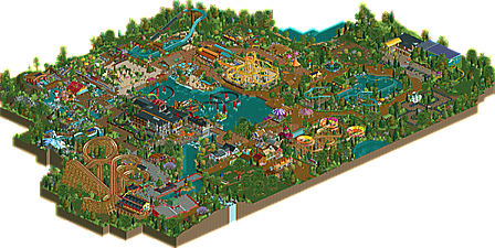
A park based around teaching visitors about a healthy lifestyle and the dangers of an unhealthy lifestyle. Some rides are solar or hydro powered, to keep the ecological footprint of this park as small as possible. Enjoy, and don't forget to eat your fruits and vegetables!
-
1 fan
 Fans of this park
-
 Full-Size Map
-
 Download Park
1,089
-
 Objects
478
-
 Tags
Tags
![park_3192 [MM2014 R2] The Inspiration Well](https://www.nedesigns.com/uploads/parks/3192/aerialt2803.png)

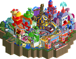
Wow! Gold! Cool!
Thanks for voting and commenting everyone! I'll reply to some comments now.
bigshootergrill: Thanks man, I agree about the layouts, but I always try to keep those simple and make them stand out with the use of their surroundings.
Wouter: I agree with you about the presentation, at the point of finishing this park I got the feeling more and more that I just wanted to release it, so my plans of renaming everything and naming the staff etc, went overboard. (this reply also counts for inthemanual)
Coasterbill: Thanks for such an elaborate reply packed with compliments, I can find myself in the criticism, I will check on things like dispatch time in the future, I guess I wasn't really bothered about that before.
stoksy: Those were my least favourite parts as well man, you're right, thanks for the elaborate reply!
Belgianguy: Was expecting this reply from you, and was also expecting you to be the lowest vote. Thanks for voting and commenting though.
disneysomethingnumbers: Zippo's is one of my favourite parks ever, so I take that as a huge compliment!
Fred: Wow, such a high vote! Thanks man! I hope you will enjoy my coming parks as much as this one.
Just did a review of the park on twitch and, I gotta say, I love it. Originally, I was skeptical of it at first. I figured the scale would ruin some of it but I was wrong fortunately. I'll keep it short
Pros:
-Foliage - phenomenal. You know it's good when you can scroll by and not notice anything wrong. I never had a problem with it which gave so much life to the park
-Architecture - loved the many cottages and restaurants around the park. Stations could have been better.
-Coasters - awesome layouts that were both realistic but still interesting. Well themed and everything, with a few minor complaints. Was the wooden coaster inspired by GCI's White Lightning or was it a standard GCI?
-Theme - First vitamin themed park ever at NE right? Minus the Asian themed area, everything fit really well with the vitamin theme. I did not believe you'd be able to make a whole park with this theme
-atmosphere- so good. The family atmosphere was perfect and it's so difficult to make a park with that atmosphere.
Cons:
-Architecture got a little repetitive
-No big coaster - not necessarily a bad thing, just I would have liked to see something else instead of that space disc thing ride in that corner. Then again, you might be sacrificing the family atmosphere had you done that
-Queues - sometimes were perfect, other times were lazy.
-Size - this is what holds me back from giving it an 80%: It's too small. Expand the park, and I'd give it that.
So I'm giving it a 75%. Well done, and congrats.
EDIT: I loved the sea monster and the bobsled. Both perfectly done,
Thanks man, it's a shame I can't watch the review you did.
I don't understand your question regarding the wooden roller coaster, it's not based on anything, I just built this layout and I liked it.
Wow this was the cutest park ever. Everything was exceucted very well to. Loved all the scenery and everything, charmtastic.
Please do more!
It reminded me of a GCI coaster but intended not to be as intense as some of their other rides. Never mind, doesn't matter. It looked awesome
Or you could step out of your comfort zone and stop caring about hacking so much. Just a thought!
Okay, so one point that hasn't been brought up yet:
I really, really dislike the fact that three of your coasters just ignore block system, which to me is a no-go in a "realistic" built park. I really liked the thming and the woody though.
I've downloaded the park, I've played the park, and it only reinforces my decision that this site is fast becoming a clique's echo-chamber.
Seriously, Faas could put a buttered-fart up for download and it would score at least a bronze.
Now this doesn't mean that the style effected my vote, just that I think that it may have reduced some others' perceptions about its quality.
if i voted my score wouldve probably been the same as BG's
http://www.nedesigns...rk/3240/de-val/
Apparently not everything Faas uploads gets an accolade. Vitaminland, however, was well deserving of one.
If anyone could pull off a butter and fart themed park, it'd probably be faas. Although, considering the shit he released in MM, liam might give him some competition there.
1) Not too impressed with any of the rides. Sure the colours were nice, but most were pretty standard. Realism is fine, but why go for complete realism in a simulation game that puts no limits on your potential imagination. Some rides seemed fairly pedestrian or rushed. The shoot-the-chutes in particular. Some rides blew up on opening. If you're going to go for that level of realism, don't kill your guests the second the park opens.
2) The architecture very quickly got 'samey' and/or sloppy. The Chinese theatre is a curvy box atop some stadium seating. The 'Scurvy Shores' building had a lot of potential, but just devolved into banks of windows in the corners. The entrance/main street was full of the '2x2' style I have seen you so often complain about on here. The beach huts were brown and insipid.
3) No breathing space between themed areas. A lot of them jarred against each other with little room for transition. The fact you tried to carry the food based theme throughout the park seemed to restrict the theming even though there is so much massive potential for it.
4) Waterfalls! I don't know how many theme parks you've been to that are on split-level bodies of water, but this is one of my key bugbears in RCT2 parks. People fill their maps with rivers flowing in from the edge that cascade gently into a central lake... with no outflow! Can anyone find me an example of a park this big or complex surrounding a natural cataract? What's to stop the central lake from overflowing?
Good points:
1) The palette of the park is largely excellent. It has a vibrancy displayed in real parks that's often very difficult to display with RCT2's limited colour options.
2) Excellent foliage. Provides volume without being oppressive and unusual/exotic detailing without devolving into randomly placed jungles.
3) Some good miniaturisation details i.e. the pirate ship and the hammocks.
Overall though the fact that it looked pretty from a distance didn't do it for me. I thought this theme had a lot more areas to explore and a lot more potential than you designed for. It seemed a long time coming, but not much planning behind it (and I mean pre-game planning).
Thanks for the elaborate reply, it was actually the whole 'clique's echo-chamber' I wanted you to explain, but this is even better since after all it's about the game.
I've never complained about 2x2 buildings, I love them, which you can see in all my parks. At first you complain about the fact that it is too realistic, and shortly after you elaborate on the fact that there is no realism with the waterfalls and the lake. I also don't expect go karts to have stunt jumps so I'm not really bothered about realism. Imagination is stopping the lake from overflowing. The rest of your comments I can totally agree on.
Congrats Fass, the park looks great. I know it's probably not your style but I think it would be great to see you make more mountainous terrains some time. Or just more height variation overall, as I think it will add another element to your game.
I somehwat agree with ar2910, both his analysis of your park and the echo chamber comment. I don't get how people can say this thing is near spotlight quality. That's accolade inflation. Luckily the panel is still critical, as they should be. 71% is a fair score, though I would give this silver if I were a Kumba anno 2007.
It's a good park, but not great. The theming is still quite messy and uncohesive, but what makes this better than your other work is that you've managed to blend it all together quite nicely. You're getting better at the parkmaking aspects other than rides and architecture; making sections of otherwise no content look interesting and organic. Do you know the melting pot versus and salad bowl comparison? In parkmaking a melting pot would be better than a salad bowl, but this is a very good salad. The key success factors here are the organic structure of the park (nice food parallel!), the lovely colours in some places (the flying turns is my favourite thing in the park) and the overall atmosphere.
Congratulations on the accolade Faas!
Thanks guys. I would have personally given this 70% if it wasn't made by myself so I think it's a fair score as well. I could have lived with silver, so gold was a nice surprise for me and I'm happy with it. I just still don't get the whole 'clique' thing. If anything, I always try to warn people for liking things because it is made by a certain someone and I always try to avoid building according to conventions.