Park / Vitaminland
-
 11-November 14
- Views 8,871
- Downloads 1,100
- Fans 1
- Comments 37
-
 71.88%(required: 70%)
 Gold
Gold

FredD 85% csw 75% disneylandian192 75% Maverix 75% Poke 75% inthemanual 70% Liampie 70% Xeccah 70% Ling 65% BelgianGuy 60% 71.88% -
 Description
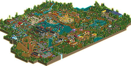
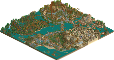
A park based around teaching visitors about a healthy lifestyle and the dangers of an unhealthy lifestyle. Some rides are solar or hydro powered, to keep the ecological footprint of this park as small as possible. Enjoy, and don't forget to eat your fruits and vegetables!
-
1 fan
 Fans of this park
-
 Full-Size Map
-
 Download Park
1,100
-
 Objects
478
-
 Tags
Tags
![park_3192 [MM2014 R2] The Inspiration Well](https://www.nedesigns.com/uploads/parks/3192/aerialt2803.png)

Vitamin D ash crashed =(
Yeah that ride kept crashing. Probably an overdrive of the solar panels. Goes to show how much power the sun has.
I'm glad it's finally released! Don't forget to rate and comment! Thanks!
Whoa! Vitaminland was quite a thrill. It is one jam packed, interesting little park. Everywhere you turn there seems to be something exciting happening. Actually it took me quite awhile to explore everything, but it was well worth the ride. I thought the architecture was great, an incredible variety, making the rides each unique in their own way. A lot of the ride layouts were quite simple, I think in a good way, but also it takes away a little from the park, I guess kind of one of those in between areas. And I found some of the pathways were tight in some areas, the guests were jammed up a little too much. But overall I thoroughly enjoyed it, a great park!
My vote is 75%
Cute! You are really enjoying the game, aren't you?
I need to take some more time to fully check this park, but so far... it's awesome, but i had no idea it was so small. Don't get me wrong, it's quite a big sized park but i thought it would be bigger. And i would've liked some more presentation. You did that so well with your screens, but there's nothing here. For example: "Eating some unhealthy Scurvy Burgers is the perfect way to get scurvy and die a painful death.", quoted from your screen. That was a good idea and it really fitted the theme. But there's no mention. I would've liked an extra bit of text about the areas of the park, what it's based around, the rides, food (such as that bit about Scurvy Burgers) and so on. But all there is is just the save of the park... I'm not saying i don't like it, but the presentation would've been very welcome and it's a minor disappointment. Then again, as i said, i need to check this park a little better.
For me this park lived up to all of the hype and is easily one of my favorite parks of the year. It's quite small but there's still a lot to explore.
When I opened it up I went right for the dive coaster as I expected this to be my favorite coaster in the park and it didn't disappoint. The moment with the sea monster is awesome, the ride is incredibly fun... you have a way with composition that it almost always seems to be perfect.
While I was expecting the dive coaster to be the best coaster in the park as I kept looking around I kept changing my mind because Pineapple Blaster is quite possibly the most aesthetically pleasing coaster I've seen all year between the layout, the pacing, the color scheme, the scale and the placement this really couldn't have been any better... I can say the same for the flying turns which completely nailed the pacing of the Knoebels ride which I had the pleasure of riding last month. It starts with a small lift and short track section and then proceeds to the larger lift where the pacing gets faster and faster as the ride goes on in a slow but awesome buildup. Again... the colors and pacing of that ride are phenomenal and incredibly fun. The pink yellow and orange track pieces are bold and not anything I would have thought to do but they really bring the ride to life.
Aside from those 3 things the rapids were also a major highlight. I love the way you take the default things in the game like the rapids waterfalls and ride huts that most people never use and come up with ways to make them look amazing. This kind of creativity is what makes your parks so much fun to look at but this park is miles ahead of anything you've released before. There's just so much to explore here.
Just so this doesn't seem like a review Faas paid me to write I'll point out a few things I thought could have been better. I loved the trampolines and the Radish Raceway but everything between them was a bit dull in relation to the rest of the park including that indoor / outdoor coaster which I didn't care for. I also wish you'd take a little bit of time to tweak the minimum dispatch times because now all of your ride vehicles are block stopping or in the case of the water rides almost running into eachother with most of the ride completely empty of any cars. This bothers me with a lot of NE parks though, it's not just you... and it's minor.
Overall I loved this, it's the best thing you've ever done and while it's probably a little small for Spotlight it deserves a very high gold. I spent 45 minutes viewing this before I even started making the map and I still feel like I didn't see everything. Bravo!
actually when looking at the park in game before i told you what was wrong with it if i remember properly. you had a second chainlift to get up a hill, but when it breaks down chainlifts stop too and one train crashes into the other
This park is amazing, like all of your work. Your style is one I love - fun, lively, great theming and not overly detailed. Nice layouts and the foliage is fantastic. I hope you build something bigger next time.
Yeah I changed that, so that wasn't the problem.
Thanks for the replies everyone! Will comment on them more in depth (or not) later.
The comment I see on your work most often is "fun". No doubt about it, this park is a whole lot of fun. But I also think you're starting to become a better parkmaker. Every area flowed together seamlessly, the ride selection was balanced, and the atmosphere as a whole was great. My only complaint is the smallish size of the park. A bit more content and this would be a 80%+ for sure.
Love the little bit of irony in that Vitamin D-ash is a dark-ride.
Would have liked to see more care towards naming things: you take the time to outfit your "Smart Dogs" stall with trim and a door, but then leave it as "Hot Dog Stall 1" in game. I understand that you're not too bothered with things like that, but I tend to find a lot of fun in those things.
Edit: Noticed after a bit that this isn't as big of a problem as I thought it was, but it still makes the park feel a bit incomplete to me.
The Yeti Splashdown actually fits in a LOT better than the screen of it implied, and I really like how that turned out. Really good use of color throughout the park, making it feel bright and vibrant without being overwhelming.
Lots of cool things in here. Was torn between 70 and 75, went with 70 because of the size and a few smaller issues that I thought brought it down a little. Very solid park, definitely your best work yet.
The concept behind this was interesting I thought, and having seen the screens I was looking forward to seeing this released. I must admit that I was a little disappointed with the size of the park but having personal experience with how difficult it is to finish something of substantial size I completely get that.
There were some really great areas such as Scurvy Shores and for the most part the area around Pineapple Blaster and Coconut Creek. However, you've then got the Chinese area and Vitamin D-ash which were not as good in my opinion.
There was a real lack of atmosphere in both areas I thought, China was lacking in real substance because of how few buildings there were [especially given the theme you were going for - the theatre for example was decent but the other buildings were even smaller than usual particularly the seemingly random cover over the path by the lake]. Vitamin D-ash was not bad, I just felt that a dark ride placed purely by itself without any real surroundings [it was almost purely foliage] sticks out in a bad way. I feel it would have been a lot better if there were more buildings around it, or even a purely open ride could have worked better [although I get that the ride was probably intentionally ironic that way].
I think that the flume station really shows why I'd really like you to up the scale a little; in that you've taken the time to add in the little gates for peeps yet the roof is so low that everyone would be hitting their head on that. Even if it's not meant to be strictly realistic, from a viewing perspective it's really difficult to appreciate the detailed work that's gone into something like this because they're so hard to see. For example I think that the Scurvy Shores wharf was probably my favourite thing in the entire park purely because there was a lovely clear view of a reasonably large expanse of solid architecture [also the ship was awesome!].
The problem was more because building with a smaller scale means that expanses of path that shouldn't look large, end up being exactly that. And whilst I am I huge fan of allowing a park to breath, this was almost too open in my opinion; where the architecture was few and far between and therefore makes the park look as if it lacks some substance.
The foliage was pretty good, the layouts were acceptable [not great in my opinion, but by no means poor], and the architecture that was there although small was quite lovely to look at [nice colours and details].
Overall this was really solid in my opinion. There were some lovely things to look at as well as some pretty interesting ideas that you executed quite brilliantly [eg the carrot trampoline]. Was torn between 65% and 70% mainly because I really wish that you'd maybe up the scale that you build in slightly. This is just my personal opinion though, and you've managed to develop quite a unique style where everything you build does have that 'fun' element that many parks do lack.
Went with 70% because I do think this edges gold quality and is certainly an improvement on some of your older work, but did lack some of the things that would really edge this higher.
Also, whilst I completely get that you dislike hacking for the most part; I think that it is at the very least worth giving a shot as I think it has the ability to open up a lot of interesting possibilities for future parks.
Idea was great but overall parkmaking felt lacking for me.
I mean the ideas for the names came of really repetitive and I know it's all about fun but I missed some "skills" in this park like the fact that huts are not properly hacked away where it would've looked better. Buildings where very basic and never had enough depth to keep my eye on them for long.
This could've better in terms of skills and immersion but still a neat little park. I'd try to go outside that comfortzone next time and try to actually get some things in order like hacking even if it's only functional hacking like turning a hut or making them invisible, (we have the technology) and I think you can build from there aesthetic-wise since you don't have to find another way of masking away the ugly in-game huts.
Your style has matured but maintained the playfulness that I have always loved. Sure the hacking wasn't up to current norms, but the composition that was there was excellent. Great colors, endearing themes, and an overall feel of whimsy that reminded me of Zippo's. Your best work yet, I would be honored to build with you someday!
Congrats on Gold.
Didn't get a chance to vote, still haven't had a chance to look at it either, but the Gold is a testament to how much you have improved.
Congrats on the well deserved gold!
A bit surprised that I was such a low vote. I agree with everything BelgianGuy and Stoksy said so I won't beat all of the criticisms to death. Of course this was lovely and fun, but I don't feel this is nudging Spotlight territory. I did really like the vertical drop coaster and its surroundings.
Lovely little park and a deserved score.
Congrats!
For me this is spotlight quality, therefore I gave this a 85%. Well deserved in my opinion. The concept is gold, just brilliant! Only that is worth a higher rating because originality is also important.
It was a lot of the Faas cuteness we're used to. But you've stepped your game up and the execution was very good. The archy around Keelhauled was really, but really good. And so much little but fun details like the little carrot, pineapple,... Overall, this park has so much aymosphere. Great job.
In fact, the only thing I dislike is the steel hall from Vitamn Dash. I think you could do better with that building, now it's even a little bit disturbing. I didn't bother the entrance huts, they fit in well, or the lack of some complex hacking. They should be used for creating an atmospheric park, and not be used just for the sake of it.