Park / De Val
-
 05-October 14
- Views 3,026
- Downloads 552
- Fans 0
- Comments 15
-
 58.75%(required: 65%)
 Design Submission

geewhzz 65% disneylandian192 60% inthemanual 60% Liampie 60% Ling 60% Pacificoaster 60% tyandor 60% Maverix 55% posix 55% robbie92 45% 58.75% -
 Description
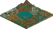
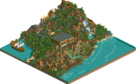
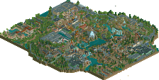
Made for a contest on a Dutch themepark site. The objective was to make your interpretation of the new Dive Coaster that De Efteling announced for 2015.
-
 No fans of this park
-
 Full-Size Map
-
 Download Park
552
-
 Objects
1
-
 Tags
Tags
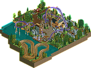
I really like this... the layout, colors and composition are all excellent and as is always the case with your work it gives off a very fun atmosphere.
I really wish there was more here and that you had more time to finish the supports but besides that it doesn't feel unfinished even though you said you were rushed on it.
Very nice.
It's quite interesting how a screen that pretty much showed the whole thing is currently sitting at 83% or so, while the actual release is currently at 64%.
I haven't had a look in game yet, but even from the other screenshot, I don't like this as much as your other work. The castle is nice, but there's no 'fun' in the surroundings. It just looks stale in comparison.
To be honest I think that was just because the screen was hugely overrated. I didn't want to send this in as design originally, but because the rating on the screen basically proved it to be spotlight quality, I thaught why not.
I do appreciate people downloading this and giving comments though, enjoy!
I don't know...I kind of felt that the layout wasn't too great. I think that, personally, I like to see an inversion or two on a dive coaster; just having drops is a little boring to me regardless of how well the surrounding theming is.
Nonetheless, I actually quite liked what little architecture there was, although your small, fun style of building takes away from the imposing feel that a coaster should have in my opinion. However, there were some lovely touches here; I thought the station itself was really well done and for some reason I loved the coaster colours.
Surroundings weren't great though, the rockwork didn't fit with the foliage as well as it should. I would have preferred [as I assume the mine theme is what people were going for here] more separation between the two. Whether that be separate areas or just much sparser foliage around the rocks to show that this is part of the theme rather than the surroundings.
This still doesn't have 10 votes? Come on people...
The screen was received a bit more enthousiastically.
I don't know what it is. Since MM people have barely been downloading, voting and commenting.
Judging by the overview (I will download this tonight most likely), it's some of my most favorite work from you. Nice deviation from your small, cutesy stuff that I really wasn't able to get into unlike what seems to be most of NE. I rather liked the layout; nice to see a non-inverting dive machine these days, and the courtyard the coaster circled around was well composed. Queue could've been better and the landscape a little subtler, I feel, but they were still good work. I just wish you'll break through your niche of building 1x2, 2x2 and 2x3 buildings and gave them a more complex, and realistic context.
Nice job Faas, I could really see this being added to the Efteling.
It's also a really smooth ride, I love the dip right before the second drop and I love that it hangs there too for a little while before the drop.
It's beautiful and lovely in every way, but there's just so little on this map. And maybe the queue could be just a little longer with a little more going on? The coaster itself also sits in a kind of weird long, drawn-out cul de sac of path.
It's a solid slice of park, for sure. There's just not nearly enough there to warrant an accolade.
I would've voted 55%
Thanks guys. I didn't expect this to score design at all. But since the screen of it currently sits at 85% with 13 votes I thought why not give it a try and send it in as design.
I would have submitted it too with the performance of the screen. I can see why it didn't win of course, it's very small and a little unfinished but the content you do have is really good.
I'm crossing my fingers you get bored one day and "Vogelvallei" this and put it in a park.
Would be cool to go all Vogelvallei on this one day.
that would be cool. also i really like those supports on the lifthill, really something i didn't expect coming from you, nice job