Park / Park Valo
-
 08-November 14
- Views 6,621
- Downloads 894
- Fans 9
- Comments 21
-
-
 64.38%(required: 60%)
 Silver

Coupon 70% Maverix 70% Xeccah 70% Faas 65% geewhzz 65% Liampie 65% FredD 60% inthemanual 60% Ling 60% MCI 60% 64.38% -
 Description
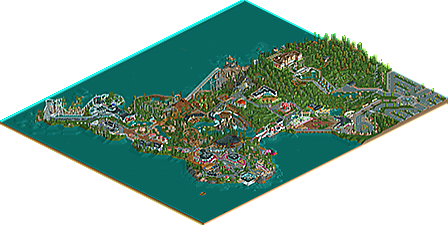
I have always loved the game and since I found some time and motivation to learn hacking etc I decided to build a park:
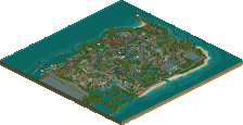
A head of a company wanted to achieve his childhood dream and build a themepark. Luckily he already had the land available for the park next to his mansion. This is park Valo.
I hope you enjoy it, it was a fun ride to build. -
9 fans
 Fans of this park
-
 Full-Size Map
-
 Download Park
894
-
 Objects
545
-
 Tags
Tags
Wow. This came out of nowhere. The scale is small, but it's consistent and it works. Some parts were a little messy, but this is really good. I really liked the haunted house and the station for the launched coaster.
You definitely have some RCT2 wisdom. I've been at it for 8 months now and I'm not near your skill yet. I was thoroughly impressed with your ability to effectively use 8cars without a bunch of advice from others. Kudos to you for that. Your attention to small details is impressive, and a really nice use of color, and a great use of various foliage elements.
I'm not an accolage panelist, but based on what I've seen on the site, I'd say you're in the silver range for this park. Well done! Hopefully you'll stick around, I'd love to see more from you.
PS - Also, first park I've seen with Coke machines, which I'll definitely utilize. No park of mine will serve Pepsi to it's customers!
This was pretty cool man. I hope you finnish (see what I did there?) more parks like this in the future. Somehow it feels like a breath of fresh air.
I especially liked your Eurofighter station, really cool.
i agree with faas, i love the style of this. everything feels really open and breathing.
park was disjointed and felt unplanned in places, but shit holy motherfucking balls shit shit fuck that eurofighter station!!!!
and those white and magenta buildings!!!
I really liked this actually. A lot of technical skill and unique atmosphere. Its occasionally a bit disjointed and lacks flow of themes and ideas and realism, but its an amazing first foray into the community and really a great piece of work. I'd give it silver.
Thanks for the comments guys.
The overall layout didn't end up that great and I would replace the river rapids that doesn't really fit in with something else and a path across the area.
Should I have included the park overview in the zip or is it done mechanically? I was expecting I could submit it at some point. Also the unnoticed black hole should look like this:
This was more like a one-time project I wanted to try so probably not building more in the future but let's see.
there's a team of map-makers that makes the overviews.
And I really liked the rapids, I thought they were well done. Perhaps they didn't fit well, like you said, but I liked them.
That's a terrible shame because you have a lot of potential. It's always exciting to see new members here especially with this kind of talent.
I really enjoyed this park. Eurofighter was great, I loved the station and the entire layout... it was absolutely the highlight but I liked pathfinder as well.
The park was slightly disjointed but there were great touches everywhere (that Voltage sign, the grey ruins of a house). There was a lot of creativity here.
I gave this a 65% and think it's a definite silver. With a little more cohesion you easily have gold potential. I really hope you end up building more in the future.
This park is confusing for me. The idea is interesting, with this small hillside park built on an already-existing estate, but nothing feels like it fits. The entrance building is random and lacks form. Pathfinder's station is a mess. The roof on the tan and black building doesn't work at all.
That isn't to say this park doesn't have its brilliant touches. The seaside arm of the white/magenta building is fantastic, as is the boardwalk beneath it. Eurofighter's station is awesome. The plaza at the far end of the park is a great little spot with good colors, but I can't help feeling that's entirely the wrong spot for a carousel - it and the swinger at the front should definitely have been swapped.
Rapids Adventure is lovely and fits into the landscape like it belongs there. Pathfinder seems out-of-scale and, for being such an enormous E-ticket attraction, just isn't that interesting somehow. You also have this "deep woods"-y feeling on that section of the map that I wish was committed to just a little bit harder with denser foliage and more rustic-looking buildings. Likewise, an additional building or ride (motion simulator perhaps?) by Eurofighter would have made it feel like an area of its own.
On the whole, I do like this park. It's a little weird and its pieces don't quite fit together. It fits right on the border between high Bronze and low Silver for me, so I voted 60%.
When Ver-co meets Fass.
Most interesting park of the year, you fucking talented.
Congrats on the silver! Now come back and build more!
Congratulations!
Wow this was really awesome. Had a few bits that could have used some refinemtne but I liked a lot.
Favorite parts
-The Eurofighter station. Had a lot going on, was interesting, and looked good from all 4 angles to. I also liked how the coaster's main element was situated on the penninsula daigonally. The layout as a whole was short though.
-The Rapids. Kinda the same story, good setting and awesome station, but the ride itself was short.
-The Mansion. Had some cool details and the building as a whole looked great. Love how it's up on the hill and how it adds to the story. In general, the whole context of the park is really good and I always appreciate folks who provide an idea of the surroundings their parks are in.
-Cafe Val. Loved the sun sunshine.
Your hacking skills in general are also evidently very good.
I think maybe you need to work on getting some better layouts for your bigger coasters and rides, and working on textures a bit, like that big staircase in front of the swings was'nt super pretty. In some of the architecure you used some objects that did'nt look super good or were questionable as to why they were there. I also think your foliage was lacking throughout.
Overall very good park and perfect silver, looking forward to more
P.S. IDK if you know who Kari Lehtonen is but my city here is very thankful for his Finnish self
I love this park. great atmosphere in all the small areas, very different but unique. I love the coasters, the small ride with the black haunted house look is lovely. The villa itself is amazing. I'd love to live there on a cliff with a small watchtower.
I think its great and I want more!
I'm pleasently surprised that this got score so high since I was aiming for bronze when I started to build the park. Thanks for the feedback.
This looks interesting indeed. Proper way to introduce yourself to the community.
Has a little bit of a gijssie1234 smell to me. Hope to see more from you soon.
oh my goodness i am in love with how you build
this was deserving gold imo...
felt so much better than previous releases, also the landscape was so much more interesting that anything I've seen for a while.
good stuff man, good stuff