Park / Ethereal
-
 05-October 14
-
 Schwarzkopf Design
- Views 5,453
- Downloads 896
- Fans 1
- Comments 13
-
 73.13%(required: 65%)
 Design

tyandor 85% Kumba 80% FredD 75% Ling 75% Maverix 75% robbie92 75% Faas 70% Liampie 70% inthemanual 65% Corkscrewy 55% 73.13% -
 Description
A schwarzkopf looper set in a haunted forest. Featuring supporting rides; river rapids, bumper cars, and haunted castle maze.
-
1 fan
 Fans of this park
-
 Full-Size Map
-
 Download Park
896
-
 Objects
1
-
 Tags
Tags
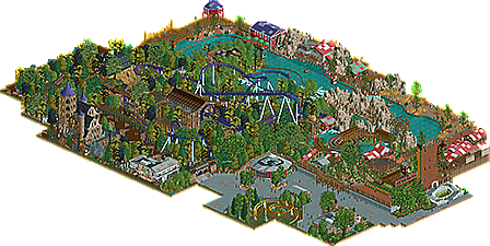
![park_3112 [MM2014 R1] The Haunted Estate of the Fantastical Lord Fredrick Kent](https://www.nedesigns.com/uploads/parks/3112/aerialt2743.png)
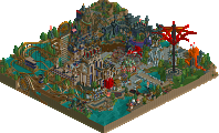

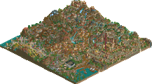
Massive thanks to the prep team for getting this released! [and again, apologies about the scenery export issues that I had].
Really glad to get a, in my opinion, high quality release finished. It's taken a long time, but I really think that I've improved immensely since my first foray into NE.
I look forward to any and all feedback/criticism to help improve my game even further.
There are some weird things going on, particularly with the path. The weird raised wrap-around for the rapids exit seems unnecessary, as does the brightly colored three-level stair thing in the bottom right of the map. Not enough of the coaster is visible from the path in my opinion - the turnaround over the entrance is fantastic, but almost the entire rest of the ride is 100% hidden from view. I do wish the map had a little more context as well, everything feels so squished right up against the edge, but this is still more than design-worthy in my mind.
Pros: Coaster layout had flow, atmosphere was brilliantly spooky, and architecture was spot-on.
Cons: Foliage was a bit off color-wise and the rockwork was a bit ugly. Also it was a bit too cluttered in general, and the non-spooky section of the map seemed a bit forced.
Agree with Ling, design worthy.
nice job on the dreamworld inspire rapids (i believe thats where inspiration came from) and everything else was cool
Wow Stoksy, I really really enjoy this. I can't put my finger on what it is, other than that it feels real. I still need to view in game, but some preliminary thoughts:
Pros:
- Great layout of a rarer coaster type, probably my favorite terrain Schwarzkopf. The ending after the second loop just looks so fun the way it weaves through the landscape.
- Atmosphere. Wow, the area around the rapids station is just phenomenal, and the dark/haunted vibe around Ethereal is great.
- Real Feel. I can so easily picture myself in this park. It's got some weird aspects, like the exit queue of the rapids, but that makes this even more believable IMO. When parks build IRL, they face constraints that we don't usually have when building in this game. This looks like that. The whole bottom right is just fabulous in this way. I'm not sure whether you even did it on purpose, but it works incredibly well for me. This is just one example, but your whole entry feels like this to me.
Things that could use improvement:
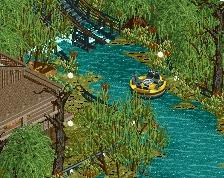
-The long flat parts of the rapids. These really make about 75% of the ride look really boring. The fact that the guide rails are really wide most of the time isn't helping. IIRC, you added some height variation at the beginning, which is an improvement, but as it is, it just feels too drawn out. Either there needed to be more interesting elements scattered throughout, or it needed to be shortened.
-Clutter of the haunted area. I get the feeling you were going for, but unfortunately it just feels slightly cluttered to me. Perhaps a more strategic placement of foliage clumps, with some open space left, would have improved this. You've got a great station and a fabulous queue, I just wish they had a little breathing room. On this note, the color of the foliage is great.
Ultimately, this is what a design should look like to me. A complete and thought-out coaster, with a strong supporting area and ride, some larger and well-constructed bits of architecture, and supporting details.
Though I won't vote until I view in-game, I'd say this about 85% from me right now. Excellent job man, can't wait to see your next project
I think this is spectacular.
Haunted Hollow gives off a very creepy vibe but does it without being too dark which is a tough balancing act. I know some people disagree on the foliage here but I think Haunted Hollow was a very strong and very cool area.
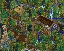
I'm also in love with the queue and boarding area for the Rapids ride. I love the building with the frozen rapids boat and the next set of switchbacks under the mesh cover. Both of those are areas are flawless. The buildings in back of that second queue area and behind the boarding area are great and frame everything beautifully.
My only complaints about this are the other areas. I know the area around the bumper cars is in a different themed area of the park but the change from one theme to the next is really abrupt. I also don't care for the high grey wall as it would look pretty ugly from the lower level of this park. I love the bumper cars themselves but the rest of that area is probably the weak point of the design. The area along the far turn of the rapids (across the bridge from Haunted Hollow) also seems drastically different from the area near the Rapids entrance which I assume is the same themed area. It's nice but it feels like it's missing something.
Still, those are two small areas. As I said Haunted Hill is amazing, the rapids entrance is amazing and this is absolutely my favorite thing you've ever done. I think this absolutely design worthy and it makes me really excited for your future work.
Well done!
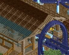
This was pretty cool overall, but there was one big con for me: the overuse of steel roofs.
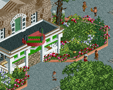
I loved the outback steakhouse and the haunted castle, these were awesome, but your buildings around the rapids had really ugly roofs I think. You could have used more wooden roofs and for for example the mansion in the haunted forest you should have used tile roofs in stead of the (mostly ugly) steel roofing. I think those roofs are only appropriate for stations of really big modern coasters or whatever, but not for 'scenery' buildings. I did like the other architecture as I said very much and the coaster and its surroundings were awesome!
70% for me.
Maybe get Goliath too if he's still alive
i made a comment on this already haha wth
But, that's an awesome park!
Wooo
@Ling: Definitely fair comments; I think that in retrospect the use of white for the stair railing was perhaps ill-advised. I think that grey would have served its purpose fine. With regards to how squished the park looked; I can agree in some respect. However, I think that it only looks that way because the park is almost completely framed by path which was more to accommodate peeps rather than adding to the park itself. Having the entire ride hidden from view was partly intentional, in that I only wanted small parts of the ride to be visible in order to get the dark, haunted theme that I was going for. Will definitely consider this in future stuff that I make though.
@csw: Really glad that you liked the layout; it came about quite unexpectedly as I was just playing around with coaster layouts and ended up with something that I really liked. With regards to the rockwork, it was an attempt to try to combine the LotR rocks [which I actually quite like] and 1k ruins so that it would 'fit' with RCT. However, I think that I would be better off using the colourable rocks [like Ling and geewhzz] in future. My foliage is certainly an area that I need to improve, it was only after I'd done most of the foliage that I realised the importance of breathing room [which you can kind of see near the brake run and the junior coaster]. Hopefully in future releases I'll be able to address this.
@Goliath123: Trust the Australian to catch the inspiration Glad that you saw it and enjoyed the design.
Hepta: Thanks for the review man! Really happy that you enjoyed this so much. I think that the positives mentioned really nailed what I was going for with this park. The straight section of the rapids I honestly didn't realise how boring it was while doing the surroundings; but looking back I can definitely see the problem. I would actually agree that it was a little too drawn out, the issue was that I wanted it to interact somewhat with the coaster but because the theme that I wanted for it conflicted I had to extend the ride [perhaps too much] to get the interaction I was looking for. Foliage clumps is hopefully what future releases will have; it's something that I'm really trying to improve at the moment.
@Coasterbill: I know that you've seen a bit more of the progress of this than some other people, and the feedback you gave during that was really useful for me. Really pleased that you liked the layout, and the queue line took a long time but I'm also really happy with how it turned out. The intention of the grey wall was partly to break the brown of the land [I would have used the stone wall object, but colour it brown] but also to suggest that the generic area was cutaway from the mountain by the park and therefore needed extra support to keep it up. I think that I maybe intended for the grey of the path to help a little so that it didn't look so out of place. The generic area was an attempted plaza of sorts, like a hub where people would go to and then travel to the themed areas. Interesting comment about the difference in themeing; I personally think that the mine area is sufficiently similar in theme, and the intention of the swamp was having the haunted area kind of seeping out into the river. Suggesting that the haunted hollow was there first, and then with the new area there was an attempt to 'clean-up' the swamp for the rapids.
@Faas: At first I didn't really understand what building you were talking about, but I can see now haha. I think that I had a problem with the texture of the wooden roofs when considering what to do for that mansion. I'll definitely try to use a wider variety of roofing in future. I just really like the object to be honest. Glad that you liked the rest though!
@Cocoa: I'd be up for it!
@GammaZero: Thanks for that
Thanks for all the feedback; would love to hear some thoughts from the judges if possible [whether here or via pm].
Congrats on the accolade! You deserve it... this was a great design.
awesome atmosphere