Park / Hurricane
-
 02-September 14
- Views 5,891
- Downloads 861
- Fans 1
- Comments 13
-

-
 66.88%(required: 65%)
 Design

FredD 75% geewhzz 75% Liampie 75% Ling 75% Maverix 70% Corkscrewy 60% Faas 60% pierrot 60% Poke 60% wheres_walto 60% 66.88% -
 Description
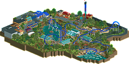
Tropical themed design that was all about me having fun building again... no real backstory just a random selection of ideas that popped into my head concerning the theme. don't overthink this while viewing and just enjoy it as I did building this!
-
1 fan
 Fans of this park
-
 Full-Size Map
-
 Download Park
861
-
 Objects
339
-
 Tags
Tags


![park_4086 [H2H8 R1] Tahendo Zoo](https://www.nedesigns.com/uploads/parks/4086/aerialt3817.png)
i really like this . It`s really smart and realistic . The foliage is really nice in my opinion and also the atmosphere is lovely. The buildings are easy but also really nice.
The Layout of the coaster reminds me a bit of manta [MAck rides]
with some nice features and inversions. The only thing i don`t really like about the map was the base plate under the second launch. might be a bit lifeless and idealess there could be more rocks and and a little waterfall .
Edit: smart,lovely,nice atmosphere . I really like and enjoyed this map / coaster
*mfg pizza
Really nice to see you releasing things again, can't wait for Jaguar.
Overall this was nice. Architecture was good and gave a nice sea side vibe and the foliage complimented it well, although maybe was a bit to think in some areas.
The layout wasn't bad, I really like the pacing up to the mid course brake run but it felt like the ride just meandered out after that but overall it was a solid ride.
meznator Offline
Really nice layout and atmosphere!
Love the popcorn machine as well.
Definitely worthy of design!
I loved the lagoon and the overall color scheme. Parts of it did feel a bit incongruous - even though you addressed that in the readme. The ship was a nice setpiece but why not have it closer to water?
It's built as a park but it just feels so small for such an enormous centerpiece coaster. The path could have wrapped around more to give slots for other rides to give more context to the main coaster.
I like this a lot. The coaster layout itself is great and it reminds me a bit of Cheetah Hunt with the slow first section and then the powerful second launch.
I also really appreciateded the little touches throughout like the treehouse over by the bengal and the awesome popcorn machine. The entrance signs / sculptures for the coaster and Leviathan Plunge are very nice as well.
If I had to critique anything I guess it would be the old unused train in the transfer area. I don't understand why this would be a different type of train than what's currently used. If it's old and they've upgraded the trains it wouldn't be in the transfer. I also don't buy that they would have upgraded the trains on a new ride which this would seem to be as it's a pretty new style.
Still that's a very minor critique... overall this is great and is absolutely design worthy.
Never found where your name was located and I looked for a longtime...which probably was your goal so I could appreciate everything better.
Nice job on this. The layout had a few wonky moments that looked weird from some angles but overall it was solid. The pacing wasn't great but that can be overlooked by the incredible architecture, atmosphere, and little details (treehouse and popcorn thing). Leviathan was a great complimentary ride.
What confused me were the backroads that surrounded the design. I understand that it's meant to make it seem like it's incorporated in a park but there were no paths that left this map as if suggesting more to the park. For example, if memory serves the entrance was a dead-end and so was Leviathan.
No big deal though. Excellent job.
Not up to the standards that I'd expect from you BG (ie Jaguar/Ayres) but still a nice design.
Personally found the layout a little meh; especially the after the turnaround into the brake run. Nonetheless, as is a staple of your work I think the foliage and most of the 'natural' features of the design were really great. I didn't find the selection of ideas too random and felt that they were suitably integrated with the design as a whole.
However, it certainly could have been better. Although you had some incredible ideas such as the signs for the coaster and flat ride, the life boat, and the ruined ship, I didn't get that 'wow' factor that you find in really memorable designs.
Unfortunately I'm writing this after the panel voted (so gratz on the design), but would have voted this 65-70%.
Congrats on the Design. I can't wait for Jaguar!
i just though this was great, honestly better than 66.88! sure the architecture was a tad simple at points but i liked that, none of the busy stuff you see a lot that diverts your view from the coaster. but congrats on the design anyways BG!
I definitely think it's too low. This isn't really barely a design, right? I really think it's a strong design with lovely buildings and theming. I understand everyone that says that it doesn't pop out that much as a ride, it's not a big imposing ride or anything but it's definitely not awful right? The whole design/park is very cohesive and well-constructed and i loved it.
Congrats on the design.
I was one of those lower votes and I'll expain why.
Overall I think the atmosphere wasn't as warm and tropical as it should be with all the steel, concrete and generic corrugated roof buildings (ugh).
I wished more of the map would be like the section where the drop tower is, since that showed a lot more creativity and atmosphere than the coaster part and other parts. I liked the turnarounds in the layout and the little things like the popcorn machine, but I think the overall atmoshpere could benefit a lot more from more colourful sections which things like flowers could have achieved.
I do agree we can expect more from you, but that doesn't mean this design is bad. I liked it, there wasn't really something wrong with it. I didn't feel a lack of atmosphere, I felt like this could be a zone in a SeaWorld park. The archy was good, but the station and buildings in the queue could be done better I think.
Coaster layout was fantastic, great job on that. Foliage was also good.
any chance of getting a download of just the park? my internet currently can't handle 30 mb files at any decent speed.