Park / Constantopia
-
 31-August 14
-
 Project Constant
- Views 4,997
- Downloads 847
- Fans 1
- Comments 17
-

-
 75.00%(required: 70%)
 Gold
Gold

Kumba 85% Loopy 80% tyandor 80% ][ntamin22 80% 5dave 75% Ling 75% csw 70% inthemanual 70% posix 70% Poke 60% 75.00% -
 Description
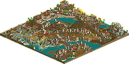
Welcome to Istanbul's latest attraction. This Ottoman Empire themed park contains recreations of some of the empires best known landmarks and contains thrilling rides your ancestors could only dream of.
Come and experience the rise and fall of one of the worlds greatest empires and discover the myths and monsters that the people feared.
Don't forget to read your guidebook.
PS: Thanks to 5Dave for the logo. -
1 fan
 Fans of this park
-
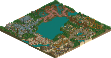
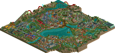
 Full-Size Map
-
 Download Park
847
-
 Tags
Tags

OH MY GAWD YES CHECKING NOW
Very well-executed and atmospheric. I'm jealous of all the places you've been, that's for sure.
tdub96 Offline
Don't have LL on me at school, but solely from the overview this should at least be a silver.
this was great roomie, a lot better than some of your other stuff in my eyes. well done.
That entrance area is utterly fantastic. The bridge is a bit out of scale but I love the shape.
6ca Offline
This is gorgeous. And I usually dislike SLCs but the layout of this one is fantastic.
Thanks for the comments guys. Although a little sad (For LL in general not really for me) that an LL park these days gets 16 downloads off of 400 views
This park was fun to make and drawing from experiences in my travels was a nice way to combine my 2 passions in life.
Off to China in a few weeks so maybe a China park next? although you might not be able to see it through the smog layer.
I'm also disappointed...5 votes in 10 days?
The atmosphere here is lovely. It's one of those things that could probably be done with RCT2 but it wouldn't have the same look and feel as it does with LL.
When I look at most LL parks I feel like there were a lot of times it was hurt by the fact that it wasn't RCT2 and a lot of compromises had to be made but I didn't feel that way here and that's really nice to see.
I'll admit that I can't view this in game but I spent a lot of time staring at the overview. Little details like the pizza stand roofs, the hedge maze edge under the path by the water and that bridge by the log flume are amazing. Your use of the wood coaster trackitecture is flawless throughout. I love the bridge, the dive coaster station and the mosques.
When I get Loopy Landscapes working I'll be sure to look at this in game but I wanted to give my feedback based on the overview as this is a fantastic parks and deserves more recognition than it's getting.
I agree with Gee that it's got some qualities you usually don't show. Well done on the wooden track use. It works really well.
I'm going to build my own Ottoman Empire theme park...with blackjack...and hookers
That vote percentage is so satisfying.
Thanks for the votes everyone. I'm ecstatic this has finally got enough votes
I really enjoyed working on this and it made a nice change from my usual style.
You'd never finish it though
Congrats on the gold!
,
Drexler is compatible with Deluxe. You need it.
Don't think I wasn't going to comment on this great little park! As I announced on Facebook two months back, this might very well be your best work yet so it deserves a in-depth review.
First there's the entrance area; my favourite bit of the map. I love how textured and layered the architecture is. Architecture has never been your strongest point, but it's fantastic here. Great combination of classic building principles, codex techniques and I've never seen a more fitting use of pizza stalls. The two rides keep this area from being boring. Kut is Dutch for pussy or cunt, so to Dutch speakers Siege of Kut becomes something different from what you intended. Unless it was intentional. Of course Roomie likes to lay siege to Kut every once in a while. Anyway, there's just enough going on. Only one of the back facades just really work for me, because of the trackitecture roofs. I also think the area would be better off without the red cafe track roof. But still a very very good area! And the transition to the other side of the water is also great: that bridge!
The log flume looks like an afterthought to me, but it's nicely embedded in some places. I love how the lift appears from a tunnel under the path. If only the parts built over water were inspired like that. Again, some nice archy and some good supporting rides. Towards the mosque we find a nod to Loopy's Silver Valley, some nice diagonal facades (this is where large trackitecture surfaces DO work!), and some ingenious minarets. I thought I had good minarets in the Escapist Experience, but your solution is much simpler and better.
Zilant looks weird from two angles, and beautiful from the other two angles. Very original decision to have such a large coaster in the center, especially because it's diagonal. It works out really well. Great layout, great integration. I like the next coaster as well, but thematically it doesn't really fit the park in my opinion. The next area is more likable again. Cool sculpture, cool well themed wild mouse, cool spa. Cool details in the ancient ruins, the vines and the baths of course. The stuff across the water is basic, but everything works. That's a pretty cool water coaster for its size.
The last area looks rushed to me. The architecture looks less inspired in most places, and the path on the map edge just looks weird. But the Kabatas restaurant is truly fantastic, and so is the SLC coaster, Crusader. Quite an amazing layout, and in contrast to the B&M diver, the colours are perfect here. Probably one of the best SLC's I've seen in RCT2.
All in all a great park. Not everything works, but there's more than enough great content to compensate for that. While as a whole this park is probably not your best work yet, stuff like the entrance area and the SLC are definitely highlights in your parkography. What I like about the whole thing is how you're building basic stuff in unique ways (diagonal woodie, mini water coaster, some individual buildings), but also how you picked an original theme and really went into depth with it. You exhausted the theme.
Congratulations on the gold Roomie. I was too late for the voting, but my 80% vote wouldn't make much difference. So 80% it is. This is how I like my modern LL. Good looking, original stuff, delivering on both macro and micro scale. Great areas, great details.