Park / Tropic Thunder - a design by Thirteen
-
 29-August 14
- Views 2,512
- Downloads 786
- Fans 2
- Comments 8
-
 61.88%(required: 65%)
 Design Submission

Liampie 70% posix 70% Faas 65% Fizzix 65% MCI 65% csw 60% Poke 60% FredD 55% Ling 55% BelgianGuy 50% 61.88% -
 Description
Hey guys,
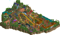
so this is my first design I ever released. This was originally a part of my new park, but I had some major hacking issues with the park and the different themed areas did not fit together so nicely, so I decided to cancel the park, but liked this coaster so much, that it would be a shame not to release it. I put a lot of effort into it, and I hope you like it.
Keep up the good work guys, and dont let the fantasy style die... I sure wont!
Thirteen -
2 fans
 Fans of this park
-
 Full-Size Map
-
 Download Park
786
-
 Objects
163
-
 Tags
Tags
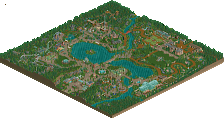
![park_6132 [NEDC6] Ramses](https://www.nedesigns.com/uploads/parks/6132/aerialt6366.png)
I was really torn on this...
Let me preface the following comments by saying that kudos for finishing this, I'm glad that you took a portion of the park that you liked and released it anyway.
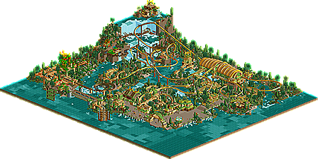
There were definitely some nice things here; the bridge coming out of that waterfall was incredible and (perhaps unfortunately) was by far my favourite thing in the entire entry. I would assume that the design is the flying coaster, and the mine train is just a supporting ride.
The layout itself was...not my favourite. I think that the element around the station was interesting but the execution was lacking in my opinion. As you stated, this was fantasy, but I still think that some more traditional elements would have helped this. I would have loved to see a real unique/iconic element to really set the ride apart as a 'design.' The current 'pretzel loop' was nice, but hidden so far away from the guests that it was a lot less impressive than I would suggest it probably should be.
A comment about the guests; really wish you had fixed this, I think that even something as simple as an invisible path from the entrance just so the peeps actually populated the area would have given it a lot more life.
Overall, I'm going to give it 65% but I feel as if you could have made this a lot more interesting. Great job finishing this, it was a little nostalgic seeing this sort of building style and I certainly hope you continue releasing stuff.
This was just short of design to me. The layout was a bit all over the place and the peep problem brought this down a bit.
I had a chance to look at this last night and I really enjoyed it.
I love the environment you created and there's no shortage of interesting things to look at. The Mine Train coaster really added a lot to this and the area up by the waterfall was very cool.
As far as the flyer goes it looks great but it seems way too fast to me, especially for a flyer which are generally on the slower side. It had some great moments and cool crossovers though and I enjoyed the signature dive over the station.
I also thought it was strange that this had multiple trains with no transfer track and was completely disregarding block sections. Sure it can be classified as fantasy but I didn't think it was too far beyond the realm of reality that these things should be overlooked... maybe that's just me though.
Overall this was very nice. I'm looking forward to your next project and hopefully you can earn a Design with this one (though it's going to be really close based on the public vote).
I loved this man. It showed a lot of creativity and skill. Especially in the waterfall section with the minetrain.
I didn't like your pathing and the fact that the colour scheme was a bit too repititive. It's also a shame about the peeps but overall I think this just deserves a design accolade.
Guys, thank you very much for your words. I completely agree with all the negative things you said. Those were also the reasons I cancelled the park. But I am glad there are some things in there you can enjoy!
Nice to see you release this. I'm a stickler for the old PT2 style so this really appeals to me, but again I'll echo some of the points mentioned above.
This was not a spectator ride at all, being that to enjoy the ride you had to be on it, or on the smaller mine train coaster in the back. Almost every viewpoint was blocked by a building or some other obstacle, and being that the ride is almost entirely over water, it doesn't give much in terms of interaction. The queue helped for sure, and while I'd suggest you to move the buildings to the other side of the path, being that this was a portion of a larger park I'm assuming that would mean placing the buildings in some sort of lagoon. Maybe this all could have been avoided by not restricting yourself with the corner boundaries? Who knows.
(tl;dr, more interaction! more spectator appeal!)
Id also suggest using an actual path texture as opposed to TT blocks. They look good when used in archy and scenery, but they lack the texture needed for large expanses, something that path textures do great at. That's an easy fix for next time.
Overall it's good work though, and knowing you I can't wait to see what you come up with next.
The building style is really cool in parts. The color scheme is a bit repetitive and the foliage feels relatively haphazard. Having a ton of unhappy peeps that can't leave the park or even use the restroom only hurts the park's image, so I really don't know what was going on there.
Tropic Thunder was undersupported in several places and overall Vines of Venom looked like it had more attention paid to what it did and interacted with. Overall the white water detail was good, but the water is all you can really see from the path. As nin noted, the rides are hidden in the distance or behind foliage or behind structures. Cool from a riding perspective but it doesn't feel integrated. It feels like old-school fantasy but without the polish or imagination.
Some of the rides' elements were good but overall Tropic Thunder's pace was too fast and I didn't like the high-speed drop-to-in-line-twist-to-drop. The element over the station was a nice idea that could have been pulled off better, perhaps on a larger scale with 4D track and a merge.
Good from the overview, nostalgic architecture and style, but just not enough high-level content. The mine train proves you can do great little details, though. 55% from me.
...quick question.
If this was on the same map as the space shuttle, what'd you do with it? Is it going to be in another park, release separately, or..? I'd just really like to see it.