Park / Capricorn Coast
-
 04-August 14
-
 Project Antarctica
- Views 6,939
- Downloads 925
- Fans 1
- Comments 22
-
 66.25%(required: 60%)
 Silver

][ntamin22 85% inthemanual 70% Jonny93 70% Ling 70% 5dave 65% Liampie 65% MCI 65% Roomie 65% geewhzz 60% pierrot 50% 66.25% -
 Description
My first full-size LL solo, formerly known as Project Antarctica.
Please check out the readme. Thank you! -
1 fan
 Fans of this park
-
 Full-Size Map
-
 Download Park
925
-
 Tags
Tags
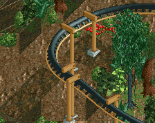
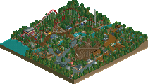
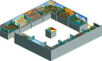
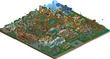
I really love this old school LL!
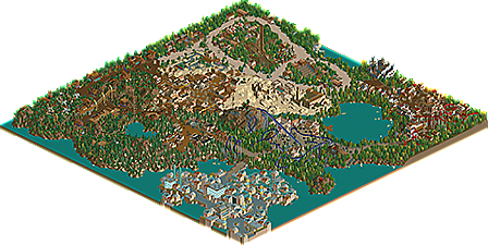
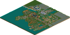
Props to whoever made the map, I'm glad you caught the volcano mid-explosion
Let me know what you think! Don't have huge expectations but I'm glad it's out regardless.
I can't view it in game, but from the overview parts of this are seriously Spotlight material. The Jungle area is one of the best I've seen since the days of Fatha/Twisted
Whoa, seriously nice stuff. Might have to get LL working to see this in action.
Needless to say, this park is pretty cool. I love that a new member has created a proper full scale LL park - in a classic style even. I'll review the areas one by one quickly:
Entrance area: one of my favourites in this park. VERY classic, but a tad simplistic and the 2x2ism is extreme here. Good colours and texture combinations, regardless. With more variation, function and composition you're heading for spotlight quality. I know you can do that in the future.
Italian area: I don't like this area too much, there's way too much filler landscaping, the theme isn't clear and a lot of the textures clash. The volcanoes look like an afterthought.
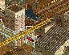
Castle area: despite being slightly generic and cliche, this area is better again! I like the coaster interaction a lot, and the awkward shaped castle works very well in my opinion.
Tropical area: the colour/texture combos here are outstanding. Blue flowers, yellow trees, lush green trees, bright paths, dark architecture with black details - perfect. Wish you would've done more with this, because the area is very empty. Also I hate how it borders the desert. Really awkward and ruins both this area and the desert area.
Desert area: not bad, but too generic for my liking. And see the comment above.
Jungle area: another good area, but it has its flaws. There is filler stuff again, but nowhere as bad as in the Italian or tropical area. I don't think the red flowers looked very good with the dark blue/purple awnings. The other colours remind me of diarrhea but it's no disaster (my MM entry pointed this out already). The architecture is good though, enough variation and to keep it interesting. I think the glass looks good because it contrasts well with all the brown and dark greens, shame you didn't use this in the station area. That makes it a bit confusing. Is this a modern Jurassic Park type area or of a jungle-tribal theme?
Western area: insanely small, but shows a lot of promise. The foliage is terribly random, in a positive classic LL way. The rocks could've been more jagged though. I refer to Fatha. Coaster layout was bad. Architecture was the best in the park. Love it, perfect colours. Very soft.
It's obvious that you rushed certain parts just to finish this park. It didn't quite enhance the park, but it's better than letting it sit unfinished on your HD until the end of time. Thanks for sharing this, I enjoyed it. Should make a fine silver - that's what it deserves in my opinion. It's on par with Cocoa's Pearl Bay for example, but definitely a league below Brighton Glen or Escapist Experience. In other words, a good effort that shows a lot of promise. Can't wait to see what the future holds for you. My most important advice: 1) strive for a consistent density of details and features; 2) fight 2x2 habits; 3) if you don't have ideas for a certain theme, don't do the theme at all. It drags down the inspired areas.
Congratulations on [insert accolade type here]!
edit: I just realised this is a lot of text.
Thank you all for your comments. Especially the review, Liam, that was really helpful and your advice is much appreciated.
Now, the rest of you. Although (probably) not spotlight quality, this is only the third full-size LL park in a year and a half, and only 4 comments? 10 downloads? I know a lot of you don't own an LL disk but it would be nice to hear some more thoughts, seeing as I did spend a lot of time on the park. Apologies if I sound like an ass and/or didn't give you enough time to look at it.
It'll get more attention in time, especially when it hits the front page. It's a matter of time!
You could draw some more attention to this by posting some full screenshots, perhaps. Can't hurt.
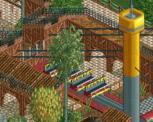
I'm working on getting Loopy Landscapes working and when I do I'll post a full review. Based off of the overview I think the suspended coaster is genius... I love the trackitecture on the lift and the queue line is very immersive. The arrow ands the floorless are very nice as well and the mine train with 1 car trains is adorable. I loved doing that in Loopy Landscapes.
Hopefully I'll get LL working soon so I can see this in-game.
This looks awesome, i'll be sure to check it!
I hope people with LL can open this up and vote so this can get nominated for an accolade. I can only view the overview map and it looks like it could win.
Sorry csw, I'm out of town and haven't been around much. You know my thoughts on this but I'll download and give it another look-over before casting my vote.
PBJ Offline
Love the old skool feeling of LL in this one...
Congrats on the accolade!
congreats csw! i still haven't checked this out in game but i will do as soon as possible
Sweet! Thanks to everyone who downloaded and gave it a look, glad I could share this with y'all.
On to the next project...
If this was released like in the time of NE2 it would be Spotlight probably. Good solid release and well deserved silver. Love the atmosphere and nostalgic feeling this park has.
I didn't know what to think of this. It reminded me of Coaster Ed's "seen it all before" comments way back in the day. It's nice that you've finished a full scale park. Few members can claim they have. Still, for me there was nothing actually special about it. It lacked a clear sign of your character, of something unique in your style that only you could have brought to the table. It was more like recycling old parks. Sorry for the bluntness, but only honest comments will help you I think.
very well planned and cleanly done, but sadly that's all it is.
posix - I think you hit the nail on the head. I started this park in a semi-realism style, but after a while I realized I prefer fantasy. Hence the entrance area being completely different than all the others. A lot of the areas were very heavily inspired by past spotlights, like Through the Ages, Disney's Movie Magic, and Raindrop Riviera...just my own take on already established themes.
pierrot - I'll admit this park's not for everyone. It's interesting how you say it was well-planned because I really didn't plan anything at all