Park / Kepler Science Education Center
-
 11-July 14
- Views 7,369
- Downloads 823
- Fans 8
- Comments 24
-

-
 71.25%(required: 70%)
 Gold
Gold

AvanineCommuter 85% Louis! 80% Poke 80% Faas 70% inthemanual 70% Maverix 70% posix 70% Corkscrewy 65% csw 65% Jonny93 60% 71.25% -
 Description
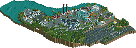
Nestled between a highway and a steep lakeshore, the Kepler Science Education Center is a family-oriented park designed to educate and entertain all ages, from gentle rides, museum-like exhibits, an observatory, and planetarium (hosting several different shows daily). The lecture hall occasionally plays host to celebrity speakers from the science community.
-
8 fans
 Fans of this park
-
 Full-Size Map
-
 Download Park
823
-
 Objects
382
-
 Tags
Tags


![park_3410 [H2H7 Finals] Asteroid Fields](https://www.nedesigns.com/uploads/parks/3410/aerialt3040.png)
I had some time to review this in-game yesterday and I have to say I really love it. The concept was pulled off so well that I felt like I could picture an elementary school version of myself going there on a field trip for school.
The architecture was very good and screamed "modern science center" but the great setting and the clever introduction of color gave it a fun atmosphere.
The only weak point for me was the orange and blue building that housed the theater. The colors were great as the composition would have been very white without it but the building itself was a bit of a clusterfuck.
I think the strongest part of the park was the blast tower area (I love the use of a single queue and the pad you build them on) and the restaurant on the water. That little area was great.
Congrats on the well deserved accolade. This was a very unique concept and you pulled it off really well.
Thanks nin; I agree.
And thank you Coasterbill.
Funny you should say that about the lecture hall - I actually made it to break up the quarter-tile chaos of the lake side of the science center, the planetarium, and the Chemistry Building. It's loosely based on a real structure on my university campus, Gaines Hall (it's the orange brick + grey corrugated steel one in the middle).
I'm a bit skeptic about this one.
It doesn't look half bad, but gold? It's just a bunch of buildings and one (!) coaster. I haven't checked it ingame, but there's better parks that have gotten silver and bronze.
Well maybe you should before saying that it was rated too highly. Nice to see your getting back to your old ways, I was starting to like you for a minute during Micro Madness since you actually submitted a nice entry and had positive and constructive comments for everyone.
It is just a bunch of buildings and one coaster. But he gave all those buildings specific purposes, and designed them really well. The theme is strong and executed well.
Wouter, you seem to have minimal understanding of what makes a park good or not. You also seem to have no understanding of how to provide constructive criticism. Highlight the strengths AND weaknesses of the park, make suggestions, or just be positive for a change instead of just throwing up some verbal abuse.