Park / Kepler Science Education Center
-
 11-July 14
- Views 6,995
- Downloads 728
- Fans 8
- Comments 24
-

-
 71.25%(required: 70%)
 Gold
Gold

AvanineCommuter 85% Louis! 80% Poke 80% Faas 70% inthemanual 70% Maverix 70% posix 70% Corkscrewy 65% csw 65% Jonny93 60% 71.25% -
 Description
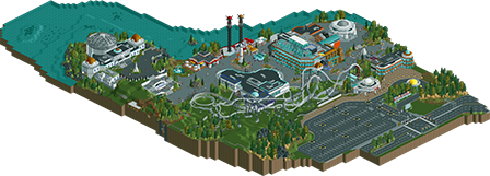
Nestled between a highway and a steep lakeshore, the Kepler Science Education Center is a family-oriented park designed to educate and entertain all ages, from gentle rides, museum-like exhibits, an observatory, and planetarium (hosting several different shows daily). The lecture hall occasionally plays host to celebrity speakers from the science community.
-
8 fans
 Fans of this park
-
 Full-Size Map
-
 Download Park
728
-
 Objects
382
-
 Tags
Tags


![park_3410 [H2H7 Finals] Asteroid Fields](https://www.nedesigns.com/uploads/parks/3410/aerialt3040.png)
glad i was one of the testers for this. you really stepped up your game.
coaster design was solid, with good pacing. the fact that you had 3/4 coaster tracks in 1 coaster didn't bother me as much as it seemed to bother others, you made it work.
architecture was cool but at certain points a lot better than at other places. the observatory, station and entrance buildings were very cool, but for instance the big blue and orange building you have in the middle just isn't my taste, also keep the roof colours one colour on a building, so it would've been better if instead of white you would've made it grey like the rest.
surroundings wre cool with a decent parkinglot, the water could've used a bit more underwaterfoliage but that's not a huge issue.
i'm debating wether to give this 60% or 65% right now, would've voted 65% or 70% if this was a design and not a park
Very cool park and cool ideas. The coaster could be better, but overall this is awesome. Is it sent in as design or as spotlight submission?
Spotlight. As it is a full and complete park (albeit a small one), spotlight felt more appropriate.
Here are some maps to show the layout. Thank you Louis! for approving it.<3
EDIT: These were made before a lot of minor tweaks and bug-fixing, so are not the final version of the park. Have to go in-game for that.
I loved this. I didn't think much of the screens you posted but I was delightfully surprised by it. That coaster was great despite all the different track types (somehow it worked). And the coast on the lake was great.
I think the simple answer to the three track types would be that it gives the ride character for an otherwise generic layout style and not-really-themeable-theme (entropy). The observatory is missing some details in the full overview (it was stitched from the penultimate final save file, not the actual final). I could have added more underwater foliage and rocks, but I was using a palette of only two grass types and the rocks, and absolutely covering the underwater layers looked a bit silly and too distracting to me.
i can see this getting high silver/low gold
I absolutely ADORE this! I love the integration of curvature in the architecture and signage. The trackitecture is flawless and the whole park is really well designed. I absolutely love the way you made the huge dome, I might be borrowing that idea! Great work here, I want to see more from you!
I loved this! Really top notch parkmaking. I think Louis said this in another topic but it shouldn't really effect your vote if this is a spotlight or design entry; if the work is quality [as this is] then the vote should reflect that.
Few nitpicky things from me:
1) Entropy's queue line. Really? For the park's main attraction the queue line really didn't reflect this at all. I understand that because it was housed in a building it didn't really matter too much but I think that you should have definitely extended it outside the building.
2) Graveyard texture. Didn't really fit for me, you went for the kind of space/modern look on everything yet you seemingly unnecessarily used the graveyard texture for some parts of a building. Really detracted from the building I thought as it was completely different from everything else and therefore stuck out. Similarly I personally didn't really agree with the use of brown brick, but that was more understandable given that the space-theme is limited to grey, black, and white.
3) Geology Exhibit. Felt redundant to me. The entrance building was nice but the cutaways made no sense to me. The lava rockwork was kind of interesting but that odd flat metal roof with the arch walls was frankly terrible in comparison to the rest of the park. I think it would have been nicer if you'd simply had the land extend over the top and use better supports with some small rocks underneath.
Those were the only pressing things that stuck out to me [although I personally would have made the observatory telescope one tile longer] and as such didn't take away too much from just how much I loved this. Gorgeous curves, brilliant touches [underwater plants, the NASA(?) sign, the entrance sign was a particular favourite], and a solid coaster layout.
75% from me; build more please!
Thanks Avanine; I never expected people to like this that much. Glad you liked it.

To Stoksy - I have to agree on the queue. I probably could have handled that better. Maybe wrap it underneath and out into the footprint of the coaster. The structure was almost completely done before I worried about what was inside. This was originally just a "Hey this monorail thing is kinda fun let's build a structure" and somehow... kept going for 49 years. The graveyard texture was just for contrast, as was the brown. The little 2x2 thing on top of the structure was supposed to be for offices or administration since it's not visible from the path.
The Geology Exhibit was actually intentionally done that way. There's a scrolling sign indicating the exhibit is on supervolcanoes so the various rooms are supposed to be lava flow and slowly regrowing ecosystems. Not really my best execution. I never planned to have a section of foliage there so I didn't want a bunch of the quarter tile land objects sticking out - at least the metal would look deliberate and tell that something was constructed into part of the hill that wasn't originally tall enough to contain a completely submerged structure.
On the telescope in the observatory though, the doors work that way to block extraneous light, so having the telescope outside of the dome would completely defeat the purpose. It might even be more correct to have it further inside but I did want it to be slightly visible to more distinctively show what the structure was supposed to be.
Thank you for your extensive feedback - I'm glad people are looking closely at the park. Makes me pretty happy.
Very good. A lot of thought and effort behind this made it convincing. Overall a bit dull colour choices. Lack of warmth or atmosphere, and a bit small in scale and content.
I thought this was superb. In every single way.
The architecture was top notch, and the coaster layout was exceptional. The general feel of the place was perfect, it felt educational and it felt fun, it was exactly how you set it out to be. The way you used track was very natural, none of the buildings felt forced, and for the first time outside of LL, it felt right.
You rarely find a park these days that is totally different to anything we've seen before and is still of incredibly high quality. This is one of those parks.
Congratulations on a fabulous creation. I hope it scores well for you.
Really nice park overall. I take back what I said about disliking all the random track types on Entropy; I think it really pulled together quite well. Architecture was overall quite strong, especially from you, though a few areas got a little bland and borderline looked like some early NSCO work from someone. In particular, the science activity center just felt like it lacked a lot of needed detail, and the adjacent buildings like the chemistry building really didn't blend in well.
Overall, very nice and very original, and you definitely captured that science park feel.
I love how you always think out your projects. Including a full labeled map of the park, custom music, everything. That said I've always been a fan of your style. Keep building please!
71,25% seems a bit high and i really expected this to grab middle silver. the fact that my 65% would be one of the lower votes suprises me, it seems like just about any park that we're exited for/impressed by gets gold these days.
good park nevertheless
^I disagree. It screamed Gold quality.
Congratulations. I loved this so much. So happy for you.
Scott.S Fan Offline
Eh. S'alright.
Anywho this is something that I totally dig. Haven't seen it in game just yet but can already tell that I'm going to love it. Will return with more in depth thoughts.
The world needs more space themes.