- Views 9,345
- Downloads 774
- Fans 1
- Comments 26
-

-
 70.00%(required: 65%)
 Design

Faas 75% FredD 75% Liampie 75% CedarPoint6 70% disneylandian192 70% geewhzz 70% nin 70% Corkscrewy 65% csw 65% Poke 65% 70.00% -
 Description
That rougarou gonna git' you! Beware the beast that lives in the marsh, he'll kill a feller dead.
Originally made for June 2014 Reddit contest. -
1 fan
 Fans of this park
-
 Full-Size Map
-
 Download Park
774
-
 Objects
129
-
 Tags
Tags
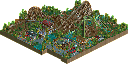
This was nice. The architecture was very very good, and the atmosphere throughout was top notch. I personally didn't see too much glitchyness and I've said it before - if people think this is glitchy, they obviously weren't too active 7 or 8 years ago when the detailed builds started taking off.
My issue with this was that you literally showed everything of interest off in the screens you showed. Of course, I got to see the coaster layout, but apart from that I'd already had a chance to see it all. If this had come out of the blue without any advertising I guarantee this would have gotten a higher score than it did, simply because NCSO of this caliber is best when it comes from nowhere and surprises you, hence why your screenshots got a higher score than the final release, even though people are saying that the coaster is the best part of the design and that was previously the only unseen bit really.
Thanks everyone
Trav, i suppose a lot of the voting is hype-based. This isn't me being butthurt bitching at the panelists, but i suppose seeing half of something before it's completed can sway voting.
I'm cool with a 70, though. It had its flaws and shit so it's justified
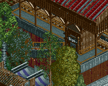
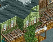
I think 70~72 is pretty fair. The trackitecture is a tad out of control, and the log flume is a hot mess. The supports at the end look particularly clusterfucky, but the way that little section looks with the monorail track is overall quite pleasant. That huge canvas overhang for the log flume queue needs another support somewhere - that's like 30ft of canvas and metal that's supported by a single pole that's only connected on one end. Rougarou's entrance hut isn't really hidden at all and the "Sign" at the exit wasn't changed (not sure what it was supposed to say anyway...).
As for the actual layout, I loved the first drop and following hill, but everything after that felt a bit slow. Particularly the ending should have had more flourish. And of course -10% for the station flyby.
Really liked this. The layout looked really cool IMO. A tad more speed would've added more intensity for sure, but whether or not that's a good thing depends on what you were going for. I thought it carried just the right amount of speed to cater to as wide of an audience as possible.
I'm a fucking psychic, I swear
File a lawsuit. lol
http://tsdr.uspto.go...cIndex=0&page=1
nice logo liam