- Views 9,345
- Downloads 780
- Fans 1
- Comments 26
-

-
 70.00%(required: 65%)
 Design

Faas 75% FredD 75% Liampie 75% CedarPoint6 70% disneylandian192 70% geewhzz 70% nin 70% Corkscrewy 65% csw 65% Poke 65% 70.00% -
 Description
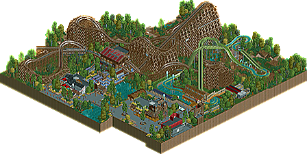
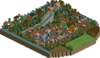
That rougarou gonna git' you! Beware the beast that lives in the marsh, he'll kill a feller dead.
Originally made for June 2014 Reddit contest. -
1 fan
 Fans of this park
-
 Full-Size Map
-
 Download Park
780
-
 Objects
129
-
 Tags
Tags
This is really cool.
I loved the layout of the coaster and I also like most of the architecture. In some of your NCSO work I have the feeling you lose yourself in technical details, but not here. Well done!
However, I would have liked to see the log flume with more actual log flume track. I know it's personal preference but I always think log flumes like this look really messy.
I agree about the log flume, it's a total disaster with all those glitches and textures. The trackitecture in the station area also got out of hand in my opinion. Everything else looked really nice.
75%
I hate the new name of the restaurant. The old name was clearly better.
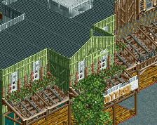
I agree with everyone about the log flume but the coaster layout is great. It has some really cool moments (especially with the turnarounds). The cottage building is great as well.
This was pretty decent I thought.
Turnarounds of the coaster were really well done, although I think it lacked a little airtime. Same thoughts about the flume as Liam and Faas. Diagonal lift, although unique, was way too messy for an NCSO park in my opinion [there's no nice way to adequately support it]. Also seems a little odd for the majority of the track not to be flume track. Transfer track seemed a little odd to me; is that actually how they can be made?
There's definitely a level of innovation in your NCSO work that I certainly haven't seen before. It's very refreshing and unique to look at, so although some of it's not really to my tastes I hope this isn't the last finished NCSO park that you make.
75% from me also.
I think you rushed this a bit at the end. There were a few spots that could've used a bit more polishing. I also wish you didn't show all the good stuff in screens beforehand! As a result I was expecting a bit more.
Nonetheless, still good quality and worthy of design.
I enjoyed the coaster and the landscaping around it and some of your architecture.. The log flume was a giant mess though.
seeing how it's probably the way i merged which makes this so messy, how could i have fixed it?
I think I agree with csw here. I think everything needed some more refinement (of course you only had a month) and the screens gave away most of the map. That said, the layout was phenomenal and was easily what I loved most about it.
65%
that feel when 9 votes but only 8 downloads
Honestly, water coaster was the best choice. Only thing i could've done a bit better was to make the lifts log flume as well rather than dinghies
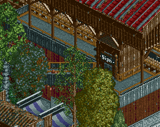
Sorry but sometime I just hate the amount of trackitecture you use.
I took some off the flume station (the very top portion) and a few path covers and it helped quite a bit in my opinion. At times it really works (like the coaster station), but other times it's just unnecessary.
Like what most are saying, the coaster was the highlight of the map with the flume being the weak link here, but with quite a bit of refinement the entire design could've been top notch.
some of us got it from someplace else
anyways i loved this submission, the trackitecture looked good but it would be nice seeing some more of the actual roofs every once in a while from you. the flume was actually my favorite part of the park, though not many people seem to agree with me. but you could've fixed some of the glitches by lowering some stuff a little more, although it didn't ruin it for me.
coasterlayout was cool, but not really what i'm used too. at points it felt too sprawling but the way you did the supports did a good job at fixing that.
i gave this a 75%
Only took 2 and a half years, but i did it. Sixth time's the charm, they say.
Congrats shogo. I knew you'd get there one day.
I haven't had a chance to take a look at it yet, but from the overview it looks like a solid design and a contender for Best Woodie 2014. Great stuff.
Congrats!
Wow. Look at that voting. Perfectly even.