Park / Attractiepark 't Drouwenerland
-
 23-June 14
- Views 5,092
- Downloads 1,003
- Fans 4
- Comments 11
-
 78.75%(required: 70%)
 Gold
Gold

Xeccah 90% Dimi 85% FredD 85% Liampie 80% MCI 80% disneylandian192 75% Faas 75% inthemanual 75% Maverix 75% csw 70% 78.75% -
 Description
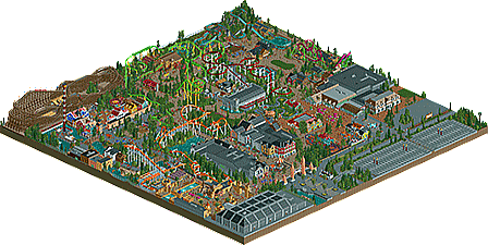
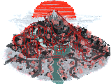
Attractiepark 't Drouwenerland is located in the Netherlands and started as a small playground. It grew out to a large themepark with multiple rides based on real existing rides.
-
4 fans
 Fans of this park
-
 Full-Size Map
-
 Download Park
1,003
-
 Objects
445
-
 Tags
Tags
![park_4713 [NEDC5 - 03/10] Nøkken](https://www.nedesigns.com/uploads/parks/4713/aerialt4585.png)
![park_4229 [H2H8/8] Valle Del Amanecer](https://www.nedesigns.com/uploads/parks/4229/aerialt3993.png)
This is one beautiful park. The level of detail is out of this world. I need more time to comment further.
holy fuck. whatever you do, dont go off of the aerial, this has to be seen in game to truly appreciate
Hmm; I have many of the same feelings with this park as I got from Seb's park. The map was just so small that everything felt really cramped in; I mean there were several queue lines right on the edge. Obviously that's not to say that I didn't enjoy the park [real shame that Firehawk wasn't open due to the black hole], but it would have been nice to have everything a little more spread out.
Although the invert was nice, I thought it was way too slow for most of the layout. Cheetah Hunt was probably my favourite coaster, except for the twisty underground section. Although having two log flumes seems a little odd to me, I thought both were really well done.
Overall; very impressive on a micro-level but on the whole everything was just too cramped for my liking. I sort of get that it would make sense given that it began as a small playground and being in the Netherlands there wouldn't be that much space, but I still think that this would be better if you had used a larger map size so that the park could 'breathe' a little.
Firehawk being closed kinda sucked. Could have asked someone to fix the black hole. I would have done it.
This also looks a lot more modern than the bench would suggest. High level of detail, and a great park overall.
I'll echo stoksy about the cramped-ness though. Some things surprised me by where they were, because they didn't seem to mesh with the surroundings, and I believe a big part of that was due to it being a bit tight.
nah, i really didn't felt it had the same trouble as seb's park.
i felt the areas were left to breathe and it being small made the composition a bit tight and nice
This was really awesome. I didn't really get some of the themes though. There was one really cool Scandinavian area with the wooden coaster, but it had some Western buildings. And then there was another corner (with the two log flumes) that also was semi Scandinavian but also Western. That was pretty confusing.
This was a very nice park. I think the Valhalla area was my favorite followed closely by the main entrance area.
I think the invert may have been a bit slow and could have benefitted from being a little taller but the coaster looked absolutely great. The moment of the turn into the mid course over that path was excellent as I really felt like I could picture myself actually visiting this park and standing on the path watching the coaster fly overhead. The loop and swooping dive after the brake run were really nice too.
Overall I loved this park. I did feel like some areas looked vastly superior to others (I felt like some of the paths were just huge) but I'm nit picking. You'll get a great accolade for this and you absolutely deserve it.
Congratulations with your first accolade! You have made a big improvement. It was a very nice and beautiful park to look at. You have to watch it in game indeed, the aerial doesn't have the atmosphere you feel when looking in-game.
Only thing I did not like was the lay out of the orange B&M inverted. It doesn't look impressive at all (the way a B&M should look like) and it has a speed problem. It looked like it would stall in his corkscrews... Also, the ground beneath is could be done more interesting. Other lay outs were good, especially Cheetah Hunt.
Congrats on the accolade!
Nice stuff, sir. I had the same problem as Stoksy: it was too small. It felt cramped in some places. Also, personally I wouldn't name a coaster with identical colors and elements the same as it's real life component; even something as simple as Cheetah would have been better to me. But whatever, phenomenal park and congrats.
some parts where good, some parts weren't...
the layouts were decent, but nothing spectacular, the invert had some serious pacing issues though, the blackhole on the arrow suspended was an eyesore and could've been fixed for release.
The part at revenge of the mummy with the dark brown wallwork was sub-par with the rest of the park, the foliage also felt out of place at times...
overall a 65% for me...