Park / Seaside
-
 03-June 14
- Views 2,116
- Downloads 426
- Fans 0
- Comments 12
-
 52.50%(required: 65%)
 Design Submission

disneylandian192 65% FredD 65% tyandor 60% MCI 55% csw 50% Faas 50% inthemanual 50% Louis! 50% posix 40% 5dave 20% 52.50% -
 Description
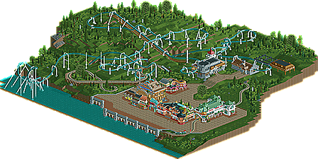
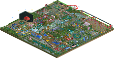
Here it is, finally. I showed screens of this already a long time ago and got around it for quite a while. Some days ago I finished what was left to finish.
The buildings are based on a historical compilation of a castle, which is the station building itself. It's not the only "old" structure around, though. Everything is evocative of dignified style, such as leavings and ruins of pre-war highlife.
Hope you enjoy it like I do. -
 No fans of this park
-
 Full-Size Map
-
 Download Park
426
-
 Objects
307
-
 Tags
Tags


You almost nailed this. 65%
Dislikes:
-Pacing of the corkscrews
-station and coaster buildings
-awkward interaction of trolley and coaster
Likes:
-other architecture- simply beautiful
-landscape
-cobra inversion
-coaster layout and supports
Overall I liked this design but I think you could have done a lot more with the coaster station. It had a lot of potential and the buildings you created are gorgeous.
I find the composition rather horrid and the coaster left a lot to be desired. Foliage was very meh as well and though it's your signature style i felt the structures to be superficial and over-the-top in a way that isn't believable. 40%
I didn't like this really.
What I liked was the architecture (obviously).
The coaster had a strange layout, no interaction with almost anything, the tram was unorthodox (besides that dive underneath the boardwalk), there was no life at all
No peeps, no details, no benches, no queue at the ride(?)
Where's the entrance to that area?
Sorry, I wish I could say something positive besides the archy, which really is your strong point. If you either focus on that even more (who needs rides?) or work on the other parts more it'd be nice.
Nice to see you're being active again!
"MFG"
Your buildings were really rich and interesting, the rest (coaster, landscaping, foliage) was the complete opposite. Bland and boring.
I agree with 5dave except I didn't like the architecure though. Far too detailed and it didn't work together as a whole for me.
How do people get there? There's literally no access to anything.
The main concern I have with my submission is the coaster. To be honest, it was the first coaster I finished, which makes me quite proud.
On the other side, it was quite hard to pull off the realistic part of it all. I failed hard with combining both sections, establishing a relationship between architecture and coaster. I tried using peeps, and it looked horrible. So I removed them again, leaving it behind a bit too plane, but I couldn't think of anything better and sent it in.
I still like it.
I know there's a lack of atmosphere all over it, and the layout isn't very creative either, but for now it was the best I could come up with.
Wow the building is so nice I love it. Other part except the rollercoaster looks a bit unfinished. I can't stand a map full of grass lol.
I really enjoyed the layout until the corks. The positioning and fast turn into the brakes just seemed poorly planned. Another thing about the map that felt last minute was the interaction between the tram and invert. Perhaps having it run straight through would have been better with minimal squiggly-ness?
Ultimately I voted 65% because the layout surely wasn't bad, the archy was fantastic (though a little messy/over detailed at spots) and the foliage was tastefully done. This map is the minimum i'd expect from a design, but surely has room for improvement. In the end nice job!
Archy was awesome, the level of your archy is from a very high level. I really liked the idea ot the tram riding under the path near the sea (but it would look better if you placed it on the ground so there would be no supports visible). The layout of the tram also looked weird on some places. More straight lines would've been better.
Lay-out of the coaster looked fun, but it's not a top lay-out for me. I disliked the long straight part after the cobra roll and the long going up right before the interlocking corkscrews. Also, the paths were kinda wide. Try to fill them a bit up with some stalls, statues, banks, trash bins, banks, lamps, flowers, trees...
As Disneylandian said, this is the minimum for a design but I do think it is design worthy. Focus on lay-out making, foliage and fill up your paths! And if you can do that, I'm sure we have another top builder among us...
Oh yeah, I didn't mind the coaster not having much interaction. I don't think its unrealistic to place a coaster on a mountain or between the woods (just like the Beast at KI). But a better and longer queue line would have helped I guess.