Park / Woodland Lake
-
 07-May 14
- Views 5,556
- Downloads 792
- Fans 1
- Comments 24
-
 46.25%(required: 50%)
 Spotlight Submission

Sulakke 60% csw 55% Louis! 50% 5dave 45% Faas 45% inthemanual 45% Poke 45% robbie92 45% FredD 40% Liampie 40% 46.25% -
 Description
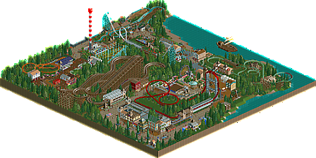
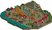
this started out as a reddit contest park for april, sadly i could not finish in time. it's been a while since i've made NCSO, with my last finished project being in september. but anyways, i hope you guys like it!
-
1 fan
 Fans of this park
-
 Full-Size Map
-
 Download Park
792
-
 Objects
222
-
 Tags
Tags
![park_3118 [MM2014 R1] Vertigo](https://www.nedesigns.com/uploads/parks/3118/aerialt2765.png)
Good to see you've incorporated some of my tips. .
.
Sad to see you ignored some of my tips
You know what I think of this. Not enough quality wise and quatity wise for an accolade.
My main issue was the entrance that was just cramped in a corner. with forest on the right.
Gave this 45%.
I enjoyed this. It was cute and happy and fun.
The peeps and music helped created a friendly atmosphere.
My main problem was the architecture. Basically, every building had a wooden post fence incorporated in some way and it just bothered me. Furthermore, you just added a fence or a texture to every single window and I don't understand why. Some of them could have been left bare and, in my opinion, it would've look a lot better.
Additionally, I don't feel the trackitecture needed to be there. I feel you put it there for the sake of it. Paths make good roofs you know. I didn't really see the point of the pirate ship either.
Overall, a nice park but these little things brought it down for me. 45%.
I'm in the 45% crowd. The skills you've shown here might warrant bronze or even silver but it didn't come together for me. But it felt superficial; the buildings felt hollow and purposeless, and the inconsistent detailing doesn't suggest a theme. The coasters were alright, and I've seen even silvers have worse rides than in here, but still there's room for improvement. Quantity was enough as well, but all together it just fell short for me.
I voted 50%. Certain aspects aren't of 50% quality IMO, but I think it's deserving of an accolade.
This was my first ever map btw. I'm quite proud of myself.
Come on... A quarter of the path stuff is vandalised. Really? I also didn't enjoy some of the naming on the rides. Just leaving them unnamed isn't really a good sign. I enjoyed the buildings though, and what's so bad about using post fences? I mean, can you do NCSO without them? And besides that, they didn't look THAT bad on the buildings. I really loved the accelerator (or whatever it's called) though, it has a nice fitting colour scheme and it looks like a good ride. That's really the best ride in the park. And right next to it is a gigantic wooden coaster without a lot of steep drops. I really think it's an eyesore. It needs more track variation. Still i really quite liked the park itself.
I actually commented on the vandalism before the release. It would have been easy to fix....
@ faas, the entrance was a problem, i should've made it more clear. hopefully i'll do that better in my next few parks, the ones i'm currently working on do have that i think.
@poke, i guess i'm just scared that the buildings are gonna lack detailing, but i guess i'm not helping myself with that. i'll try to use less in the future. i actually liked the ship myself, i saw it more as a sailing boat, but i guess i didn't make that clear enough. it kinda makes sense if you're doing a beach thing and there's a ship. then again it does seems kinda awkward.
@ shotguns, how could i make it come together more next time? i feel like this is still a pretty big issue for me. should i try to maybe make 1 park next time and let it have the same theme throughout the park?
@ louis, thanks! good job on the map! there doesn't seem to be any bad stitching here.
@ wouter, when i looked it didn't seem to be that much of an issue, i guess i didn't look hard enough. also i glad you liked the accellerator. as for the woodie, it's supposed to be a GCI coaster, they usually don't have that many steep drops except for the first one.
I neither liked or disliked this park... Overall it's not that bad, but there were a few turn-offs for me:
- it seemed like there was no entrance... it's hidden in a corner, that was weird. Also the fact that the entrance was in a corner gave you no opportunity to build a main street/main square. It's not a requirement, but those buildings just facing some plants looks weird to me.
- The lay-out of the powered is bad. It's good you hacked out the lift hill and made it like a real powered coaster, but it still didn't look like a fun ride.
- The place where you've put the Schwarzkopf shuttle launch feels like it is crammed in.
- Also not a big fan of the lay-out of the flume and the way you've supported it.
But keep the building up, because you're making progress.
this way for a contest over at reddit. sadly the old contest bench that was provided has the entrance in the corner.
That doesn't mean that it has to look utterly boring, right? Some more turns and longer flat track would make it that much better.
I thought the technical aspects of this park were fine enough, but I just didn't feel a good atmosphere from it. However, although not by much, I do think this is good enough for an accolade. I gave 55%.
46.26%? well that's better than i ever got so i can't complain. ofcourse it's sad i missed it by only 3.76, but there's always a next time!
Close but no cigar. Keep building. You'll get it next time.
Looks like I missed the panelist cutoff, but my vote was 60%. I thought Falco was a very nice coaster, also a nice station.
The architecture was solid for the most part, and I think you'll quickly refine that aspect and be putting out some good parks. Maybe the half-timbered look worked more for me than others. The top hat supports were fantastic, though I wish Maple Crunch were a little longer. I felt like the foliage was handled well on the whole, which is a great parkmaking skill to have. There was some lovely atmosphere in places; the whole entrance aesthetic was handled well, even if there wasn't much of an entry plaza to speak of.
Sadly the way some bits were un-themed basic RCT weren't so appealing; plain shops and stalls scattered around, Top Spin and Spiral Slide just kind of plopped down. The flats that have some queue covers and foliage feel much more like a part of a place I would want to visit and less like a scenario. In addition to the vandalism thing, another small touch that can help sell a park is naming your trackitecture and scenery rides. For example- the ship off the coast is a nice sculpture, but I don't really see an obvious reason for it being there. Mousing over it could tell me something like "Harbor Pirates" or "Fireworks Barge," but instead it tells me "Wooden Rollercoaster 1." Missed opportunity.
Damn...
Every time i see a park that was submitted for voting but didn't get an accolade, it's usually sucky. I mean, they're usually made by people that think their stuff is amazing and it's not and they don't get the accolade. Thing is, this definitely deserved Bronze, even if it had a few problems because it was a nice park.
on the one hand it's a good thing wouter, standards are staying high. i do recognize that this park had some major flaws, so i understand why people would vote 40 or 45%. gues i'll have to improve my NCSO a little further then
Wouter, you thought this deserved bronze, an opinion to which you are entitled. 70% of the panel didn't.
But that's not a reason to indirectly call everyone that didn't get an accolade in the past 'sucky' and to say they 'think they are amazing but they are not'.
For the millionth thime, choose your words carefully.
gdb, better luck next time, you'll get there. Start getting a bit more creative in what you build, it will pay off I'm sure.
thanks faas, i'm not sure if i want to continue my NCSO or CSO now though, maybe i'll even start with LL.
Technically, 13% of the panel - 43 of us didn't get a chance to vote.