Park / Avonturenpark Montferland
-
 03-May 14
-
 Avonturenpark Montferland
- Views 12,901
- Downloads 1,322
- Fans 7
- Comments 41
-
 77.50%(required: 70%)
 Gold
Gold

CedarPoint6 85% Liampie 80% Louis! 80% posix 80% Xeccah 80% 5dave 75% geewhzz 75% Jonny93 75% Phatage 75% Sulakke 75% 77.50% -
 Description
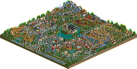
A dutch park located close to the border with Germany, Avonturenpark Montferland has 6 themed areas to offer. Fairytales, local myths, knights & damsels in distress, Oriental adventures or seven sea journeys, it is all possible in Avonturenpark Montferland. Enjoy your stay!
-
7 fans
 Fans of this park
-
 Full-Size Map
-
 Download Park
1,322
-
 Objects
543
-
 Tags
Tags
I'm surprised I had the high vote. This was all very pleasant and was a well deserved gold. A lot of this reminded me of stuff 5dave used to do which I really liked. The architecture was certainly the strong suit for the park-- really nice stuff all around for the most part. I enjoyed a lot of the coasters too-- the invert was my favorite, though the Intamin across the map had a nice flow to it as well. All in all I really enjoyed spending a lot of time digging through this park and I hope to see some more from you in the future.
That was quick. Will view this in game soon, although from reading the comments so far I must admit I'm a little surprised (and a tad disappointed) that this is only 100x100, honestly thought it was bigger.
From the overview I think that the Arabian area will be my favourite, but I will (hopefully) provide a more comprehensive review after seeing it in-game.
much like canthose valley that boat could of bean better but overall i really liked it, good themes
agreed with the 5dave statement. i was thinking of canthose a lot when viewing this
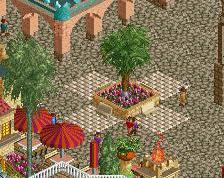
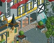
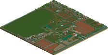
Can't help but feel a little underwhelmed by this park. Kudos for the execution of a lot of the detailing as what was there was really quite impressive. I was accurately most impressed by the Arabian area, but (as with all the areas) everything was just so small; there seemed to be so little content in each of the areas (at least looking at the park from an overall perspective). One of my biggest critiques of the park was how close to the edge of the map everything was; particularly the train.
Taking nothing away from what was there however; the level of detail and the composition of the areas was top notch and definitely deserving of gold (the cut-aways were brilliantly executed). I personally look at a park as a whole first and then when I come back to it will explore a little further into all the details that have been put in place; unfortunately, my first impression is that with a lot of the detailing that has become almost 'required' in parks it's the overall content that has been hurt as a result, and therefore the appeal of this park is lower than perhaps it would have been if it was larger.
Nonetheless, I look forward to seeing more from you and congratulations on the gold!
No logo for the park? or has that become optional/people not having the time to make one?
^Parks are now only released with a download and maps. Logos can be requested, and upon completion, will appear on the park page.
I loved this park. The architecture was great in the Arabian area and over by Yeti and the park was full of life. It had a very fun atmosphere throughout.
This may sound crazy but I think one of my favorite things about this park was the entrance huts on the ride. Since you didn't hack them away, you had to find really creative ways to hide them and that was a lot of fun to look at. The exit building on Toby's Magic Lamp for example is a great little piece of architecture that probably wouldn't exist if you would have hacked the exit away.
As far as coasters go, VOC was my favorite. The ride is well themed, has great flow in my opinion (though Louis is the final authority on flow) and that first "cheetah hunt" element looks great. I must have watched this coaster run 10 times and it may be my favorite steel coaster in RCT2 ever (my favorite wood coaster is Thunderhawk at Hudson Crossings if anyone cares). The station for VOC was really clever too.
I really enjoyed Yeti also though I'd go with 8 car trains as I don't think B&M has ever built a coaster with 9 car trains if you don't count Alpengeist's 0 car. We were discussing that in a stream just the other day actually... still this couldn't be more minor of a critique. The theming on the coaster was great and the pacing was too. Those little flags everywhere really brought this area to life, as did the entrance banners which I think I mentioned in the screenshots.
Callaghan's Curse was a great wood coaster. The dive over the lift hill by the station is the ride's signature moment in my opinion and would be a great element when on the ride.
Rapunzel was a lot of fun too. It's nothing earth shattering but it's really quick and fun. It takes one or two hills a little fast but that's really not a big deal. Great job on this ride, the interaction with The Old Mill flume was nice as well.
I guess if I had to pick out things I didn't care for I thought the main entrance and the castle in the middle of the lake were underwhelming and not really worthy of the awesome park they were in. This is especially true of the castle as it would most likely be the focal point of the park that would probably show up on logos, t shirts and other marketing pieces. The front of it is okay but the back of it is pretty bland.
As you can see I have very few critiques because this park was awesome and I had a lot of fun (and spent a lot of time) looking at it. It was a great blend of old and new styles and you weren't afraid to break the mold a little bit (Hexentanz is a perfect example... 99.9% of people would have put a Carousel there but you did something a little different).
Congrats on the gold (and borderline spotlight), this park is great and I can't wait to see what you do next!
My main problem with this is that some things were very obviously of a higher quality than others - and not in the improvement-as-time-goes-on kinda way.
It seemed like you had your specific ideas and built them, and then everything else in between was just filler. For example in the 'Once Upon A Time' area, the whole of the coaster/log flume look really really nice, and the hot dog and fries building in the middle is really good as well, but then the facades on the dark ride opposite it look like a completely different style of building. They seem to lack inspiration and seem very tired as a result. It's as if you just built one part of the facade and copy/pasted it with slightly different colours the rest of the way around, which is a real shame because that area would have been amazing otherwise.
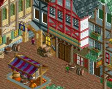
It happens all around the park as well. In the entrance street, I felt like one side (The side you can't see in the overview) was a lot better than the other side because it seemed a lot more colourful and the buildings actually looked different and inspired. Then you look at the other side and the buildings are very grey and again seem to copy the same formula.
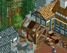
Even on the building in the middle, the front of it, the side you can see in the overview looks nice. It looks thought out and detailed. Then you turn the view and you see a completely flat wall with a 'window' (ie an object that doesn't even look much like a window) every square. It really seemed as though it was a bit rushed to me, which is a shame because you showed your ability to use levels and detailing on big buildings with the wooden coaster station.
Your rides were stellar for the most part though, no complaints there. And of course there were some very very nice parts, such as the log flume/Mack bobsled coaster as I've already said. Some other personal highlights are the Asian chairlift station, the rapids ride and the architecture around the wooden coaster. The foliage and landscape was also very nice throughout.
Overall I'd say 75%, but this could have been a 85% - 90% for me if everything was up to the top quality seen here.
This park kinda takes me back to the 'old days' here at NE.
Great fun themepark you have there, lots of atmosphere and just a general fun place that could give a ton of inspiration!
Great job seb and congrats on the accolade!
congrats on the Gold, well deserved.
This probably would've gotten spotlight a few years ago.
I love this, and I look up to your work a lot, and find it very inspirational! I really like the very hyper-detailed scenery in the park, and I really loved the atmosphere. I think it is a WELL deserved gold, and I am very inspired by everything here! MAKE MOAR!!!!
absolutely lovely. very fun, full of atmosphere and charm and movement. I especially loved the area with the blue intamin, just so well put together. I think it suffers a little from being a bit unfinished in small parts and a bit samey and crowded (although I'm hardly one to complain about that). But overall a fantastic work and a well deserved accolade
its just not possible that there is this much adventure in the netherlands. or is it a requirement that all parks must be adventure parks?
nice for the bumps, cocoa, i'll try to contribute myself
seriously, if this park was broken up with big chunks of water and land and stuff it would probably get spotlight. thats my problem atm too