Park / Avonturenpark Montferland
-
 03-May 14
-
 Avonturenpark Montferland
- Views 12,410
- Downloads 1,215
- Fans 7
- Comments 41
-
 77.50%(required: 70%)
 Gold
Gold

CedarPoint6 85% Liampie 80% Louis! 80% posix 80% Xeccah 80% 5dave 75% geewhzz 75% Jonny93 75% Phatage 75% Sulakke 75% 77.50% -
 Description
A dutch park located close to the border with Germany, Avonturenpark Montferland has 6 themed areas to offer. Fairytales, local myths, knights & damsels in distress, Oriental adventures or seven sea journeys, it is all possible in Avonturenpark Montferland. Enjoy your stay!
-
7 fans
 Fans of this park
-
 Full-Size Map
-
 Download Park
1,215
-
 Objects
543
-
 Tags
Tags
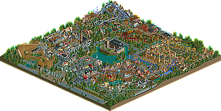
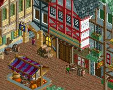
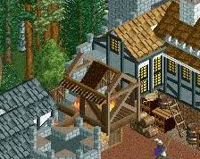
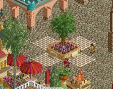
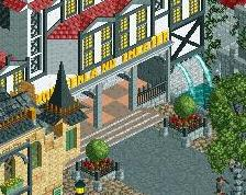
real cool park. the architecture was good, but wasn't perfect, for instance the tower in the medieval area felt a bit random with the objects used. the entrance was nice too, but would look one hell of a lot better without those ugly circular tower objects though.
layouts were good i'd say. but the coasters just felt like they were shoved away around the edges. different ride placement or some extra thrill rides might've helped that.
edit: voted 75% on this one.
I really liked this, everything was top quality and the layouts were all really nice too.
I haven't had a proper look yet, only looked over it whilst approving, but just a tip for the future - allow your areas and coasters to breathe. Everything is crammed in and on top of each other, there isn't enough space for the themes to breathe and it harmed the atmosphere slightly.
But, still, a great park, a great debut release and looks like it could be a spotlight contender for some people.
First of all: This park is awesome!
It had everything I want to see in a park. Good architecture, great amtosphere, great layouts and a good park layout. The themes were well chosen and well executed.
The theming was really good in the whole park, and I wouldn't say that there is a weak area. They are all just awesome and atmospheric. I would say, that the "pirate" area is probably my favourite.
The Layouts were really good. I especially like the combination of Gerstlauer Bobseld and Log Flume, which reminded me a lot of Tripsdrill (the biggest compliment I could give you). VOC is also fantastic. I think the capacity wasn't perfect, though. It's kinda strange, that the woody had a 60 second waiting time, because it wasn't quite perfect this way. The Mack Youngstar Coaster (?) could have used 2 trains.
The park itself looks excactly like a european park looks in terms of space usage. You used as much space as possible and it was worth it.
Overall, I voted 90%
I don't think this should win Spotlight, for the same reasons Paradise Island didn't get one; too much stuff that has been done before. I don't have a problem with copying atmospheres, tricks or whatever, but it does cancel any spotlight prospects in my opinion. Also, it would be very small for a spotlight.
Nonetheless, this is clearly a very well crafted park. Tons of content, great atmosphere, great rides (much better than I anticipated!) and overall very consistent. This park is exactly why the gold accolade was installed. I hope to dedicate another reply to this park soon, as it sure deserves a proper review.
Congrats on the [insert accolade type]!
edit: We were talking about the classic centre lake + four corners format a while ago, in I think it was Robbie's stream. This might be the first major park using this format in ages?
Fantastic work all around. Architecture was definitely the strong point, but I thought it was a bit too overwhelming in the medieval area. Everywhere else it was immaculate. I especially enjoyed the fairytale area and the Asian area. Really the only thing bringing it down at all was the large building in the center lake. Overall a really nice job. My favorite parts were the rapids ride in the asian area and all the store fronts in the fairytale part. I would vote 80% but no on spotlight. No spotlight because while the work is magnificent, the map is a bit smaller and there were a few parts that weren't worthy.
It's like viewing my own park in a parallel universe where I am dutch.
"MFG"
I do agree with Liampie pretty much. Very well crafted and there were some things that extended outside that center lake four corners (call it CLFC?) but it was overall too conservative to get a spotlight rating/vote out of me.
My favorite part of the park was the launched coaster and how it was in a land between 'kingdoms'. The tiers of path elevations in that area were really cool situated between the two fortresses, and the coaster itself commanded the area without overly dominating it.
I think a park like this could've benefited heavily from having more space between the castles, making for more of an impression of traversing an entire continent with different ruling empires. It would make sense with the ride choice and placement too. These days, where good finished parks are few and far between given the level of detail we've come to expect, I think too many people are opting to start with a smaller map in order to make filling it up easier. I prefer the solution of letting the park breath more and having more quieter stretches of space that give contrast to the excitement.
The thing that makes me not vote spotlight, though very close to it, is that it doesn't captivate me like a spotlight should. Legacies captivated me with its architecture, Starpointe and Thorpe captivated me with its senses of realism that are second to none. I think what hurt this the most, even though the quality as a whole weren't spotlight (though some parts were) is the lack of space. It had enough content to garner such an award, but at the expense of the composition and flow lacking.
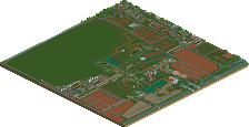
It's finally released, yes! All the comments so far hit the nail on the head: the park does lack breathing space mostly because I used a way too small sized map. 100x100 isn't enough when you want to implement all the ideas that I had. Guess I was afraid of risking to hit the object data limit at one point haha. Furthermore I can't deny that I was very influenced by the works of 5Dave, Liampie, Fisch and later on by some H2H6 parks. For heavens sake this project started on Canthose Valley's PT5 bench!
Luckily I didn't build this with a Spotlight goal in my mind. When I read the comments on my posted screens I was afraid that this park would never lived up to the high expectations it had created. I wanted to create a park that could exist in real life and would be nice to visit. I hope you all have as much fun exploring the park as I had building it!
(P.S. I didn't knew that I had my gridlines on when I uploaded the park?)
it was real fun. and there's no reason for us not to be disappointed because we've got a really good park here. and i can definitely see how you were inspired by those guys. when i looked at this one building in the mainstreet, i immediately thought of fish's work. so you did a good job at that.
Definitely a good park, yeah. But it's too small like the rest said. I like how you put some of the coasters in there, like in the corners and everything, but there's some bits where there's too much coasters together and it's nearly ugly. And most of the paths and buildings feel crammed, the buildings are definitely not bad though. The entire park has a messy feel to it, i don't really know but some stuff looks too messy. Especially the asian bit. Ew. There's so much going on there! And the foliage is weird, it feels different everywhere and i like it to be more the same. It kind of reminds me of flowdiskords stuff, nicely built but very messy looking. Also, the VOC ship looks kind of odd, i don't really get it. It looks as if it isn't even on the water, and then there's random coaster shit happening in the front and the back, i just don't understand that.
Don't get me wrong, i liked it, but there's a weird crammy feel to it that just makes me not enjoy it fully.
What do you mean by random coaster shit? The way you comment on it sounds like you don't like it and thats fine. My way of building can't be everyone's cup of tea.
I think it just looks weird with the coaster going through the ship, like, why is it open like that? I've never seen a ship like that. The way that the coaster drops (i can't even tell because at the coaster pieces there there's so much going on and it feels like it blocks the view) in the corner there at the front of it just feels weird, it looks as if a gigantic portion of the ship has been cut off for the coaster, plus the paths going through it, the bit of the ship with the corner not being in the water at all and with the random support there, in total it just looks awkward. If you made a seperate station and kept the ship as decoration, i would've enjoyed it a lot more.
By the way, congrats!
Seriously Wouter. You are being far too picky for someone that hasn't ever really done any decent work themselves.
Now I'm not saying you aren't entitled to an opinion, and i'm not saying that you have to be good at RCT to know what good RCT looks like, but seriously, all you seem to do at this site is be negative towards other people and never comment on what's good about something.
Sometimes I think it may be a language thing, but all other people with English as a second or third language don't come across like you do. You really need to cheer up a bit and actually contribute something to the site that isn't entirely negative, because I know I'm not the only one you are pissing off.
This was great. Lovely themes but yeah it was a bit too concentrated in some places. Congrats on the gold.
Tight voting. I woulda been right in there with the 75/80 crowd too, but I was streaming and didn't cast my vote in time. Reviewed on stream: I liked a lot of things, especially towards the back of the park. The interection on Rapunzel is amazing. Definitely worthy of Gold.
Really good park, well deserved gold.
It has the flaws everyone already mentioned but still I really enjoyed going through the park.
Hope to see more from you and I hope you'll develop your own style a bit more in the future.
Big RCT2 releases always get accolades before I can even look at them, much less take the time to decide on a voting score.