Park / Six Flags New London
-
 29-April 14
- Views 3,988
- Downloads 563
- Fans 3
- Comments 19
-
 Description
Just started playing the game again and decided to do the 'Create Your Own Six Flags Park' scenario.
-
3 fans
 Fans of this park
-
 Full-Size Map
-
 Download Park
563
-
 Objects
289
-
 Tags
Tags
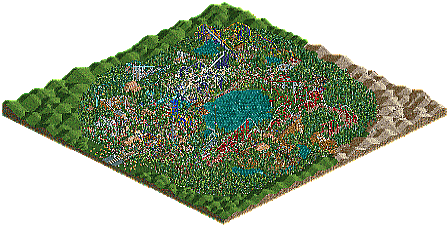
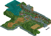

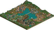
This was fun to look at.
how long did it take you?
About a month. Wasn't playing for long, Enjoyed building it though.
While it's not amazing from a technical standpoint, this sure looks like a lot of fun. Coasters were believable enough; I especially liked Nolan and the big white beemer in the center. Good stuff.
Looks amazing. Obviously not up to it's full potential on the lack of custom scenery, but wow. Nice builds, realistic land, and even realistic Six Flag lines lol. Good job. I would love to see what you could do full throttle.
This park is just plain fun. Very promising stuff. You captured the feel of a six flags park, but still kept that vintage, overblown RCT2 style. Playing it like the game was meant to be played.
Now time to to do something out of the ordinary and creative!
This was a lot of fun to look at. The fact that you had fun building it really came through and translated into a fun atmosphere for the park itself. I'm looking forward to seeing more from you.
First of all: Guys seriously, 50%?
About the Park: I think it's pretty obvious, that you are fairly new to the "professional" way of building RCT2, as you didn't use trainer or a custom bench for this. There are some "noob" mistakes in this, like coaster track placed directly on the ground or not working brake systems. The architecture is a little bit too simple for my taste, and you focused it on wird parts (like building a huge building for the start of the queue and no building for the station itself). You should also try to use the ground textures a little bit better, as you only used it very rarely.
The park had some nice atmosphere, but it was a little bit crowded in terms of paths, attractions and the few theming elements. It gave the park a "busy" feeling, for example at the entrance. You could have tried to use more 2 field wide paths. That being said, the park layout was pretty decent and Six Flags like.
Your coaster layouts were really special, and I liked most of them, except Spiderman. I would have loved to see a few smaller coaster for kids, as you only have 1 small coaster, which doesn't really look eligable for kids.
Quality wise, I would say this is a 30-35, as there is a lot to improve. I gave it a 40% in the end to reflect the work you clearly put into this.
What's wrong with this having 50% Version1? You're saying it like it's the most ridiculous thing you've ever heard, while giving it only 10% lower yourself?
It looks pretty fun from the overview Chillsons, will check this out when I have more time.
Cheers for some of the feedback guys, it was only a small draft of what i could do. Only started playing the game again so that's why it was a little rushed.
Because normally, the NE vote is at least 10% lower than what I would give. And for me it feels really bad, that this gets 51%, when all of my stuff normally is between 30 and 40%. I guess I have to rethink how I should play this game
As J K once told me... "
version 1, that's your opinion. it's very well possible that you sometimes don't agree with a rating. i agree on it not really being 50% but there's no reason to bitch about it.
I agree, still I didn't bitch about it, I just stated my opinion. Plus, this almost got into panelist voting and that would have been a waste of time (if NE still wants to have the same high standards that it had)
The only reason that people vote this higher than your work is because people (including me) think this is better than your work. That's how voting works version1.
Exactly, and that's why I question the way I build, because if you percieve my work worse than this, then something is definitely wrong with me.
honestly i think this is better than any of your work version1. he had custom supports, some nice station buildings and the layouts were decent too.
Version1, I think you're really underestimating Chillsons work. There are a lot of really nice things in the park, and I think just short of accolade voting is where this belonged. Remember that accolade voting does not equal an accolade.
I actually think Chillsons is right on the brink of earning an accolade if he spends a little more time on his next park and refines his style a little bit more. Some things in this park (like the B&M sit down looper) were really, really nice from an aesthetic standpoint.
Your work is slowly but surely improving also Version1. There's no need to put down other people's work because they get higher ratings than you do... just keep building and pay attention to detail and I'm sure you'll get an accolade eventually.
It's a shame it isn't up for the vote. It's a worthy bronze.
I enjoyed this chillsons, it brought a smile to my face when approving.
The layouts were pretty good, not amazing, but solid enough. Whilst surroundings were basic, you seemed to still put a lot of effort into placement and it came across as a strong park, even though it was a scenario submission.
Good stuff.
really version1 go screw yourself