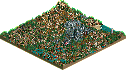
Park / Forest of Nautica
-
 15-February 03
- Views 10,206
- Downloads 568
- Fans 1
- Comments 25
-
 68.75%(required: none)
 Silver

Liampie 80% Cocoa 75% G Force 75% Jaguar 70% RWE 70% 5dave 65% Ling 65% posix 65% Scoop 65% saxman1089 60% 68.75% -
1 fan
 Fans of this park
-
 Download Park
568
-
 Tags
Tags
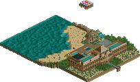
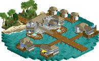
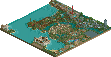
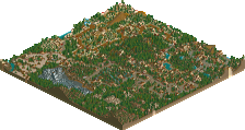
Forest of Nautica by OZONE
EverQuest Mystic Realms by Prince Ashitaka
-Only three Runner Ups this time (the fourth became RCT Station's Pinnacle Park).
-Marks the first time every single runner-up made The List (Atlas at 30/Nautica at 36/EQMR in the late 40's).
-Great job you 3!
Fatha' Offline
Twisted Offline
My personal favourite was Atlas Infinitium, It was swell as a bean!
Wonderful parks all of you.
Edit
OZONE: Isn't "Anteayer" the day before yesterday?
BiO
Everquest, you made a nice park, man. I liked the flyer, and even though I still dont agree with the Mirage coaster, I still thought that the park was great. Kudos. Now go to hell.
And OZONE, even though I found more misspellings in the park than any I've seen from Dark Pitt, I liked what you did. Nice and well-rounded, and didn't make me focus on one section more than the others, which is a turn-on for Kirii. Call me sometime.
Forest of Nautica- Well, I dont know about you, but if I was Iris, right here would be your newest spotlight. This park tops HIOA in so many ways. Yes, it does have its faults like the slow coasters and the way the space section stuck out badly, yet, the sheer craftsmanship that went in this park overrides those factors. One of the nicer western sections I have seen in a while, as well as the complimentary luge woodie to go along with it. Now its not every day you see one of those eh? My favorite ride in the park however (no, actually it is NOT a coaster) is the go kart track (the name escapes me at the moment). I cant get enough of how it goes through the streets and such. I dont know, but that just really caught my eye. Lots of creativeness went into this park that HIOA cant come close to.
Everquest- Mystic Realms- I must say, I was rather dissapionted with this park. I actually liked the pre works in this chain better. The jagged rocks were just so bare and boring, and I really disliked a lot of the sections. Some of the architecture just clashed horribly with itself (for instance the palace, every tile of different colored building was the same hight, making it contrast badly and look rather unattractive). Nothing really struck me as new or creative like we have seen in some of the previous Everquest parks, and everything just seemed as if it was thrown together without any real thought. I dont know, but this park just didnt hit off with me. Hence why I am not or never will pick spotlights, due to my pickyness in certain aspects of a park.
Congrats to the runner-ups though. So close to Spotlight............. yet so far.......................
Geez, what a cheezy line that is
EDIT- Just wondering, why wasnt Sanctuary given credit for AI? Didnt he help make it?
~Prince Ashitaka~
And sorry, Harikiri, if I offended you by misspelling things. It wasn't my intention(although it probably would have been if I had known it bothered you).
About the other two parks:
I was glad to see Posix release somthing, in fact, i still am glad he did. It was a very nice park, the egyption section was best followed closely by the Western section. I didn't care for Sactuary's section though.
EQMR was ok, not quite what I like (i'm refering to those bare rocks mostly). but still pretty good, better than the last everquest park.
Anteayer is cooler then Ayer anyway.
Butterfinger: Four corner parks are the coolest! Watch as I foolishly defend The Happy Place out of desperation!
Jötunnheim- mmm, an interesting area by itself, looking half decent imo.. the problem starts with Utgardloki.. the coaster is just plain ugly and horrible to look at
Mount Buffalo- surprisingly nice. Boulder Rush wasnt spectacular, the flowers overused, but i luv everything else of this area, the architecture, landscaping, and specially the theatre (Tropico has one of those.. kinda..
Sludge City- tho the coaster was nice i really didnt enjoy this area... that little something wasnt there for me...
Arabiyah as-Sa'udiyah- Phaistos.. if u hadnt but it in brackets that it was made by x, i wouldve said it looked a hella lot like an xsector coaster
mmm.. i was in a critical mood today.. ill leave those otehr two for anoter time period..
congrats u guys
Posix ans sanctuary park was wicked I loved Mountian Buffalo.
Thanks for letting me build a coaster in the park.
Ozones park really amazed me aswell. Great themed areas and architecture.
PA park was also good. I seen this from the beginning. I loved Mansion Majestic. great area.
Anyway, I think people are taking their time with RCT2, and i'm sure there'll be a boom in parks from the sequel when the time is right. Until then, us original-players will have to try and keep you all entertained, right?
Posix - yay! I'm probably going to walk the walk and talk the talk on this one.
(other park comments edited in when I actually look at them....ie, once i've finished d/ling them...ie now....)
edit
Ozone - I thought this park was excellent in places and slightly disappointing in others. The flow of Illusions Isle wasn't present, replaced by a strange mixture of unusual themes smashed together to make the park. For that reason, I think it isn't as good as II. However, the theming in Spain and Canterville was indeed astonishing, and I thought the red vs green idea was wonderful. interesting space area, and quite well done, but I think it could have done with more red rocks. All round awesome architecture (so many coaster pieces), but you didn't use all 255 ride slots
Prince - 127 years is a long time, and I think a lot of that time was well spent. Mirage was very cool, as was the Siege coaster (cool loop and weird round and round ending). Bald Mountan, unfortunately, sucked. The theme was boring and monotonous, the architecture uninspiring. The Mansion very nearly sucked, but was saved by the colours. I liked most of it, but would have liked more 'vertical invert' quality and less 'bored rocks' trash. Well Done
Wasn't too keen on some things but i loved the mine ride
Forest of nautica - Great work !! Although (as butterfinger said) the space area stood out it was a nice park...I think their was a bit too much grey on rooves and as paths..
I thought the entrance to two towers was great and i liked the idea of the go karts on the road !!
everquest one - Not amazing but i thought mansion majestic was lovely. Some of the bare rocks weren't too great but over treeing them would have been worse !!
Overall i think IOAH desreved spotlight just as Forest of Nautica was very close for me !
Now the fact than some have uninstalled RCT is quite stupid IMO. Certainly there will be RCT parks that you will want to d/l in the future? Right? No? Wow................
This is rather off topic though..........