Park / Valken
-
 18-April 14
-
 Valken: Lightrider
- Views 6,681
- Downloads 960
- Fans 7
- Comments 18
-
 77.50%(required: 65%)
 Design

5dave 85% Cocoa 85% csw 80% geewhzz 80% Louis! 80% inthemanual 75% Jonny93 75% Poke 75% MCI 70% posix 60% 77.50% -
 Description
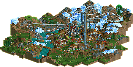
Summon the Valkyries. Ride the Aurora. Pick your own berries!
-
7 fans
 Fans of this park
-
 Full-Size Map
-
 Download Park
960
-
 Tags
Tags
I loved this. The layout was something special, as was the landscaping and it was just so cohesive.
Well done!
i know i can only look at the aerial, but how in the fuck this isn't at least getting an 80%? this shit's fantastic
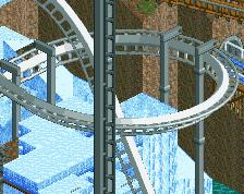
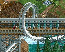
I really need to get Loopy Landscapes working. This is remarkable and that last loop around the brake run is a work of art. Well done.
Magnificent work. The mountain area of the ride is fantastic, and the lower grassland is even better. Buildings were solid. And the peeps added so much life. I give this a solid 80%. Well done
While I can't look at it in-game at the moment, it looks incredible from the overview. You're very much today's Coaster Ed, using LL as a way to convey a story and carve out your own aesthetic niche for yourself from the typical NE LL work. The landscaping looks awe-inspiring as well, and the layout looks delightfully unconventional. My one qualm, looking again from the overview, would be that the ending seems to come very quickly. Regardless, absolutely beautiful!
This is some of your best work. It's a little messy but the open feel with the landscaping and the clumped foliage is really nice. There's a lot of space to breathe and the atmosphere is great.
The coaster is very nice, there was obviously a lot of effort put into the interaction with the surroundings. The custom supports are well done without being too over the top. The pick your own berries was very creative and fit well into the surroundings. I would have liked to see one other ride, maybe even a custom flat, just to round out the area and make it feel a little less sparse.
The landscaping around the area is fleshed out nicely. The volcano trick is almost overused but it looks good and breaks up the blockiness that usually is a problem with rct landscapes. In that sense it does more good than bad so even though I don't care for that particular hack much, I appreciate it's use here. The maze idea is one I've always wanted to do with an ice park.
I'd say this more open and natural style is a step up to your game and I'd love to see another project like this. The peeps are the cherry on top and add to the fun factor.
Thanks for all the feedback, folks. I have to say this is getting much better reviews than I anticipated- I'm not particularly happy with how the station area turned into a busy mess. Glad everyone is enjoying the landscape!
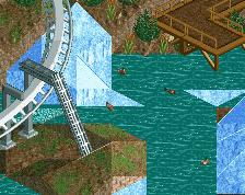
really great design, layout was solid and had plenty of interaction. however i think the part before the lifthill would've looked better if you used grass instead of dirt. also i feel like the direction the water goes in doesn't make a lot of sense, you'd think it'd go away from the gletsjer, but instead the water goes towards it, while that's where all the water is coming from it seems.
did you submit this competatively?
The water flow is modeled on the same principle that formed the Great Lakes here in the US. : http://web2.geo.msu....ch/glacial.html
I'm no expert here, but my idea was that the stream originally flowed the other direction and reversed flow when the retreating glacier (moving from bottom to top of the overview) began pooling between the two bedrock outcroppings (the cliffs and the rock supporting the station buildings).
^That's really cool. I enjoyed reading that
that makes sense, since there's grass there it seems like a place in the mountains, where glaciers melt and grow back each year, i love it when parks/designs are thought out like that
Amazing. Re-installed LL on my Win8 machine just for this and wasn't dissapointed at all. Great atmosphere, great hacks and great layout!
I agree that a supporting ride would have been nice, as well as hacking double-wide paths to it (I don't know how tricky it is, but it looks much better IMO).
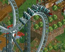
Also I'm not sure if the dive loop twist and the zero-g are turning in the right direction or not, it always seems wrong to me, either way
Keep up that top LL work!
"MFG"
PS: Why is the overview image so distorted?
absolutely adored this. amazing layout and terrain interaction. beautiful scenery too. and I loved the cottages and village atmosphere. great work
woooo
congrats, this was much deserved. though i agree with the accolade panel that it's not exactly parkmaker material, it's still the best LL design we've seen in a long time
Congrats!
that coaster layout <3
Sorry for the bump, but I've given this another look and it's just so baller. Good job, ][22.