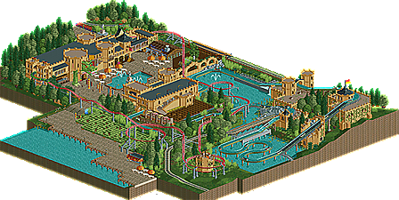
Park / Castle of King Patrick
-
 18-April 14
- Views 7,263
- Downloads 804
- Fans 0
- Comments 23
-
 56.88%(required: 50%)
 Bronze

Faas 65% Sulakke 65% 5dave 60% Louis! 60% posix 60% Corkscrewy 55% MCI 55% geewhzz 50% Jonny93 50% Xeccah 50% 56.88% -
 Description
Edit 20th december 2015: I tribute this to my colleague and dear friend Patrick who left us this sad day. We had such a good time together, you meant a lot to me. I wouldn't be the person I am today without you. You are de Boomstammetjes, I will never forget our time which ended way too soon...
-Not all pieces of land are black tiled, because I got error trappers when trying to place black tiles on it...
-I want to thank FK+Coastermind for his great work on the dragon's head! He did a great job on that and I want to thank you for helping me out with it! -
 No fans of this park
-
 Full-Size Map
-
 Download Park
804
-
 Objects
254
-
 Tags
Tags

really sad to see this unfinished, but it stilll looks great
Could you possibly release the whole thing unfinished too? This project was really promising.
I really enjoyed this submission though. It took me back to my trip at Plopsa, and whilst I didn't enjoy Plopsa that much (stupid weather) it was still nice to have that feeling, something that is rare in RCT.
There's a POV of the real log flume, for those who want to compare. It was the biggest log flume of Europe when it opened in 1989.
Louis, I will upload the whole unfinished map.
Yeah, sad to see this go unfinished, but happy that even this little bit got released, it's such a wonderful area. I was more than happy to supply a sculpture for this.
Hopefully you will get some inspiration in the future, would love to see more of this kind of work. well done
FK
Sad to see this go unfinished indeed.
 It was al so lifeless without them. They would have made this maybe twice as good.
About this part that you released, you earn some feedback.
Things I liked +:
Architecture - Cool castles, I like the flags everywhere, it gives it a bit of life.
Square - I liked the square in front of the castle with the fountain and the dragon.
Rides - The rides looked fun, perfect for a family park like Plopsaland.
Furthermore I liked that you made me a knight to battle against Liampie.
Things I didn't like - :
- Where were the peeps?
- I didn't like the table objects you used on the square.
- I didn't like the maze area, it was way too bland.
I voted this 65%. Please keep building.
I never let the peeps enter the park, it's more fun to me to just build stuff. Don't care about the peeps, if I let them in it would mean a shitload of extra work I'm not motivated to do...
This park was just too big, I should focus on smaller projects in order to get stuff finished.
Well for me that takes away a lot of the atmosphere. What exactly is extra work about it?
The paths and shops especially, also the banks and trash bins etc. I don't build that stuff when I'm busy building, I plan to do it afterwards but afterwards I'm like meh not important.
Well, for me it's the most important thing to be honest.
I liked this - I basically agree with what Faas said. I do agree peeps would've added a lot though, they always do. I always try and add peeps because it's always satisfying to watch the little guys ride my rides and have fun.
Congratulations on winning Bronze.
I personally thought it was Silver quality, but congratulations on an accolade nonetheless.
Congratulations man. Some more content and some happy peeps running around would have made this silver I'm sure.
Congrats!
How is this not a design submission?
my thoughts exactly, it only has 1 real coaster and 1 untracked ride. and it's not a big themed untracked ride like piraña was. also it was pretty small.
Yeah I voted on it like it was a design submission to be honest.
Surely it doesn't matter whether you voted on it as a design submission or not?
You thought it was design quality, so voted it as 65%. The quality of a submission doesn't all of a sudden drop 10% because it's no longer a design submission.
Designs are given at 65% because designs should be of at least high silver quality, so the whole scale should be seen as one. If you vote something as design quality, you are essentially saying it is of high silver quality, and that should translate across to a normal park submission.
Maybe that's just me though.
No because a design is still a good design with only two rides and a park is not a good park with only two rides. Why send something in for spotlight when there's only two rides?