Park / Thorpe Park
-
 16-March 14
-
 Thorpe Park
- Views 25,391
- Downloads 2,161
- Fans 31
- Comments 54
-
-
 90.00%(required: 80%)
 Spotlight

Louis! 100% yes Liampie 95% yes Xeccah 95% yes FredD 90% yes geewhzz 90% yes inthemanual 90% yes pierrot 90% yes Coupon 85% yes Jonny93 85% yes Pacificoaster 85% yes 90.00% 100.00% -
 Description
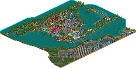
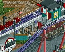
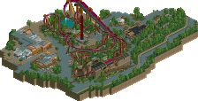
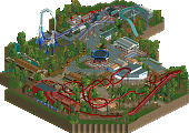
Thorpe Park is a very heavily inspired park based on the real life theme park in England. The park was once an open quarry but is now surrounded by water on it's very own "island". The thrill capital of the UK packs a punch with a great selection of flat rides, water attractions and three world class roller coasters.
-
31 fans
 Fans of this park
-
 Full-Size Map
-
 Download Park
2,161
-
 Objects
518
-
 Tags
Tags
![park_2813 [PT4 R1] Alton Towers Entrance](https://www.nedesigns.com/uploads/parks/2813/aerialt2477.png)
Will write a more comprehensive review once I see this in-game.
From the overview I tend to agree with SF in regards to the content; however, given it's a rec I can understand, especially given that there's so few good full-scale park recreations I am still very excited for this.
Congratulations on the accolade and legendary parkmaker status.
WOW! much better than the old thorpe park i have. This is perfect!! great work indeed:)
Oh my, this is absolutely wonderful. Congrats on completing this buddy, this is a fantastic creation of a park. Wow.
See that's one of the reasons why I love this park. It's not afraid to do something like that. I think it's ugliness is rather beautiful. I love it.
That's an interesting approach there Louis
I'm also of the school that ugliness is rather beautiful, but that X hall was not "beautiful ugly" to me. Had it used some smaller details to help break down the scale a bit, it could've worked better for me as something meant to be purposefully ugly. The back half was more successful in playing with extrusions and other pieces to give it more visual interest.
Overall, Oliver, I really enjoyed this. The consistency in your foliage and application of the right level of detail (except for the X hall) was quite commendable, and I think that that's what pulled everything together. I also really enjoyed the actual parkmaking elements, like the transitions between areas, the relationships between path and object, and the general flow of the park. Everything had a good sense of polish that, as evidenced by the lack thereof in my completed works, I find incredibly admirable. Plus, over 400 RCT years? Good on you...
The one thing that held me back from seeing this as a 90% or above was the content. What's there is amazing, but I would've loved to see a little more, whether it be Saw, Swarm, or any other addition you may have wanted to add. I feel like another major ride or two would've helped make this feel like a more substantial park and therefore would've garnered a higher vote from me (had I been able to vote).
Overall, though, fantastic job, and I can't wait to see what's next from you! Let's hope this isn't NE's only spotlight for 2014, though...
I wonder if the lack of Saw and Swarm was due to the fact that he's completely at the scenery limit. If they were left out so that details elsewhere weren't compromised I'm completely on board with that.
I've been watching this one develop over the last few months and now looking at the finished park- well, it's a masterpiece.
Inspiring stuff- well done!
-X-
Wow Airtime...
Like others said, a very crafty park.
Also the insane amount of hacking and make everything look so clean... impressive.
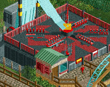
Well one complaint is that i didn't like the rotating platform in Rumba Rapids. It looked messy.
That said, i love this one for sure and i'm going to view this the coming days just to enjoy it, while i'm drinking and relaxing with a coffee.
Your new status is well earned.
Congratulations Airtime.
Amazing park, everything was so cleanly executed and the detail level was perfect; not over detailed, not under detailed. I think this is my favorite realistic park. Absolutely incredible. Here's a few of my favorite areas/things! Congrats!
Although there's lack of 'design' work that needs to happen in recreations, there a ton of other challenges one has to face when making one. Foremost of these is how to take something that exists in the real world and translate it into RCT.
I haven't been to Thorpe park yet. The closest I've been is Google Maps' (which goes inside the park in street view too). From this though, I can start to see how well you translated this into the square world of RCT. The scale is spot on with the peeps which really enhances the experience. It's first a recreation and then a great RCT park and from having not gone there yet at least, there's not much that seems like it could be better.
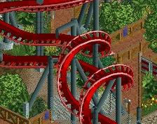
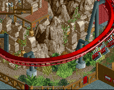
I know that there are things that need to be sacrificed to make it all 'fit' in RCT, and it's up to the creator to pick and choose what has to be done to make things work best. Your decision on the things to change around (a lot of details on Colossos' layout, the boat building facing the wrong way, the corkscrews being the wrong order on Nemesis Inferno) doesn't agree with my tastes but didn't detract too much from what was a great park. I'll surely be looking at this one again.
Great job!
Though i would finally give a few comments on this.
First off, congrats Airtime, this is a brilliant release. I've seen you work on a bunch of this, so to see it done was amazing.
I think what really makes this park are 2 elements.
1. the foliage and landscaping are superb. Captures what Thorpe Park is, which making it RCT-able. The sourrouninds of the park aren't necessary, but you put so much care into them it really makes this feel like a "complete" park. Only sad thing is that giant stretch of land you didn't black tile. ILLUSION RUINED! lol
2. For a great deal of this park, you are mixing really neat tricks with very simple choices. For example, the frontier section with the log flume (i forget it's name...) includes a lot of buildings that are perfect in size and design, but are just very simple and elegant. Then you have brilliant bits like the rides which are complex and detailed. The simplicity of certain parts is just really refreshing. Then you had all the little hacks and tricks like on Vortex or the water slides. They really added alot of interaction.
One thing that did annoy me was some of the trees, particularly around the rapids. It became hard to see the actual ride or content between those trees. I found the diagonal paths a bit annoying at times, when peeps would be walking through walls and fences, but that's more of a personal preference. And those cars on Colossus, so glitchy, lol
I think you did a brilliant job of choosing where to be true to the park and where to alter things a bit for rct's sake. So often i see people refusing to deviate from reality, and it can be costly when dealing with things.
Overall, really amazing work man. Inferno was as perfect as it can be, actually really loved the flume, even though it's pretty lame in real life, lol. Also, that station for Tidal wave, gorgeous.
Congrats again Airtime!
Oh yes please. *Must reinstall rct2*
As is evident by my 95%+yes vote, I absolutely loved this park. It may be the smallest spotlight we've ever had, it's the best looking park in the hyperrealism genre. This park looks like a mix of Pacificoaster's cleanness and colour, and RRP's talent to create credible environments.
It's mostly the park outskirts that make me compare you to RRP. For example, the backlot with the decayed dock thing on the right of the entrance, as well as the commuications tower on the parking look like things RRP would do. The non-park areas aren't filler, they're 'places' in their own right. If you took out the park I'd still love this map.
But of course it's mostly the park. And parking. One of my favourite things on the map is the octagonal building directly after the entrance. It's so boring, and you made it interesting and good looking. To the left are some flawless custom flats. To the right there's a great water functional water park and a great playground. The kiddy area makes me want to have kids myself and X is again an incredibly boring building that managed to make look good. Maybe this is the solution to have big buildings in your park without ruining the looks: just give it colour.
Anyway, my point is that everywhere you look, there's something interesting and new. Everything is executed perfectly. Also I'm glad you took the semi-recreation approach, otherwise everything wouldn't flow as well as it does.
I could review the whole park area by area, but there's no point in that because I love everything almost equally. I'll just make a list of a few things that stood out to me: the indoor skate park. the tan-peach-blue building next to Stealth. The whole Colossos area even though I think the coaster needs more inversions. The Colossos queue. The Top Scan looking like a Top Scan. The Tidal Wave theming. The infrastructure around the parking. Anything.
Lastly, I'm really glad someone made a European park in this hyper realism style. Especially a Tussaud's park from a time before they went nuts with Saw/Swarm/Smiler style bullshit. I've never been to Thorpe, but my love for 2005-Alton Towers spills over to this park.
You might ask yourself why I didn't vote 100%. Well, there's one thing I don't understand. What's going on with the shoreline at the back of the park? It looks like they're preparing for a German land invasion.
Congratulations on the well deserved spotlight, and I look forward to seeing your work in H2H7!
A big bump, but here's a fresh video review of the park. Still holds up incredibly well this many years on.
https://youtu.be/k9qGbSaW44A