Park / Indigo Hills
-
 22-January 09
- Views 11,574
- Downloads 3,038
- Fans 2
- Comments 21
-

-
 75.77%(required: 70%)
 Gold
Gold

CedarPoint6 85% FullMetal 85% RCTFAN 85% RRP 85% Steve 80% Turtle 80% Xcoaster 80% eyeamthu1 75% nin 75% posix 75% chapelz 70% geewhzz 70% Magnus 65% Evil WME 60% Highball 60% 75.77% -
2 fans
 Fans of this park
-
 Full-Size Map
-
 Download Park
3,038
-
 Tags
Tags
![park_4114 [H2H8 R3] Forum Caeleste](https://www.nedesigns.com/uploads/parks/4114/aerialt3853.png)
heyyyy.... that isnt right....
Things i Like: the castle themed bit, the woody, the invert,
Things i Adore: the dueling coaster, the riverrapids/toboggan thing (genius)
erm, those are then only two catagories. i loved it all tbh.
Edited by SSSammy, 17 January 2009 - 05:18 PM.
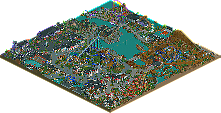
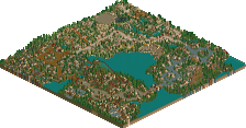
From what I see in the aerial, I like it. I think it was a very bold move to make the back coaster bright purple and yellow, and I thought better colors could be chosen. I really like Indigo, the invert, as it looked very cool and certainly fun. The vertical drop coaster looked fun as well, with the two vertical drops it had. I didn't like the rapids ride, mainly because for me it looked too spread out, and kinda boring. Personally, I didn't like the blue coaster near the woodie (which looks really sweet, although I thought the turnaround could have been executed better) because I really don't know what it is. The Crab/Octopus(?) object looked sweet as did the show in the bottom left.
All in all, I think it's deserving of a gold.
Makes me wish I had rct2.
Loved the architecture too for the most part. especially the area with the lighthouse and the water coaster.
a well deserved Gold. Congrats
Oh and i love that logo.
Great work, go on!
The blank areas in the land REALLY added to the atmosphere, as did the wide pathing. Sure it meant there was a lot of wasted space, but on the flip side it also meant that you could really take in all the truly important details in all the richness; often from several different angles.
I'll try to give a more in-depth review when I give it another look. I feel like this one really deserves me looking into the specifics of what I did and didn't like about it because it's easily one of the best (and most anticipated) releases of the last year or two.
Ride6
Let's see some more comments, hm? This is bordering on being mildly pathetic.
My main gripe with the park will be the back half minus the Norse (?) area. It had a lot of cool stuff... like the octopus and the rides were pretty nice but it just felt bland and not as fully thought out as the rest. The colors really didn't help either. Another issue was that the park jumped around from almost themeless areas to highly conceptual sections and then right back to more lightly themed sections. It almost felt like some of the areas were from a different park. It's kind of hard to explain though... or really even put your finger on what is "wrong". It just feels like the space and castle areas have a much different, and more realistic approach to them than say... the Mob area or the back sections.
Still though, most of the theming and architecture is superb, some of the best I've seen in any park. The rides are all nice, most seem a little cookie cutter but I think that it's something that helps the park rather than hinders it. The types of rides chosen are very good for the sort of realistic grassy sections rather than a highly themed coaster. I don't really see those areas as wasted but as ways to add balance and harmony to the park and I think it worked wonders. The eye really transitions easily from the attractive, detailed architecture to the calmer emptier areas around rides. The park flow and path layouts worked really well too.
All in all I loved this park, egg and also well done to the fellow members of Majesty for completing this.
It was a very hard park to vote on, i remember opening it up and not knowing what to vote. I was torn between some of its quality, and the feeling it gave me to be looking at the park in its entirety. Really, finished parks should be finished, not be noticed for their potential that could have been. Thus my low(er) vote.
What I loved were the stunt(boat) show and the ghost train ride, and what was terrible was the whole purple coaster area (what was a significant part of the map)..
The other stuff was so-so, not bad but not brilliant either...
The coasters were ok-ish, too bad about the support work.. Now I know why I love Toon's supports so much..
Oh btw, the woodie was the best of all, my favorite part of the map.. Major kudo's for that!
I think if you were somehow able to finish this by yourself egg, this could easily have been spotlight..
Now it lingers between silver and gold imo..
SF
Some stuff was great, don't get me wrong. The octopus, the live action stunt show, the wooden coaster fit well in the area and looked very natural and flush. The B&M's didn't do much for me, they felt too forced, and reminded me of how old B&M coasters always looked back in 06-07 of NE. The mafia duelers were a great idea and executed fairly well, although the architecture and the area as a whole was sort of a let down for me.
Seeing some of your most recent work, it is obvious you're such a better player now than when this park was started, so I really hope you're not giving up the game and find some inspiration to start something else. I remember seeing I think an Aqua Trax from you that looked fairly brilliant, so I'd love to see that finished someday.
Love your style Egg, just hope you continue to work on more projects like this.
Back to BoT now... =/
-X-
This was such a hard park to review. I gave it 15/20, but in all honesty, I could have given it 12/20 or 18/20. The reason is that there's a lot of really great stuff in there - it seems like it SHOULD be a spotlight-quality park - but then there's a lot of stuff which let's it down a bit, or the idea doesn't get executed well enough. I still can't really decide if it is spotlight-quality or not, but it is definitely worth a front page NE release, and all in all, it did hold my attention for a long time, which is an achievement in itself, and is generally a sign of a good park.
Part of the reason why it did hold my attention is there's a lot of nice little details, and some really cool unique ideas and well-executed rides... Reeling them off, we have: The Space Rockets ride, the rafting ride, the octopus, the stunt show by the entrance, the shipwreck, the animatronic aliens... etc. But then there were ideas which didn't quite work. I did not get the 'Tears of Thor' ride one bit. Is it a rollersoaker ride? If so, it looks like none I've ever seen. It just seems really really random and odd. Then there's the Rapids. I liked the idea of having the boats be able to go whichever way the current took them, but this resulted in some really short ride-durations and boat-clashes etc. This was a cool idea, but one which didn't get pulled off that well, and should have been expanded on. I imagine that peeps riding the ride would have been disappointed.
Similarly, the racing Mafia-themed coaster. Again, a great idea in theory, and for the most part, was pulled off well... but then there's this lack of care at the end, when the racing element of the ride just ends, and one of the trains runs out as a clear 'winner'. Ok, it's only a minor detail, but from a peep's point of view, riding the coaster, it'd suck if one train always 'won', especially by such a margin. The whole point of a racing coaster is that it is a race, and to remove that element of the ride right at the end shows a lack of care and maybe that you're not thinking about it from a peep's point of view? Perhaps.
That whole area was a little disappointing overall; again a good idea, but like the description/write-up of the park reads, it's 'drab'. It needed a bit of colour to liven it up, it was a little dark. The alien section too could have done with a bit of sprucing up. I did really like the use of trackitecture in that section though; the tunnels on the rides, the structures. Really good. My favourite section in terms of theme was the 'haunted' section, particularly the Spooky Manor ride; that was really really sweet. But I'd agree with a previous comment - the park seemed to jump between areas of 'theme park' and 'amusement park'. The flow sometimes didn't work. This is also evident at the entrance - there's no real entrance plaza or anything - the park just sort of begins. Archy for the most part was pretty damn good and just how I like it - realistic and not over-detailed - and the foliage was good too. Liked the use of 'negative space' on a couple of the B&Ms - ie. they travel over 'blank' areas of land.
Just to go back to the coasters, as I haven't mentioned them all yet. The write-up reads: "Indigo Hills is essentially, a park all about coasters" - and thus for me, it's a bit disappointing that the coasters seemed to lack uniqueness or punch. I mean, they were good, but not great. The dive machine falls into this category. The woodie - looks great and imposing, but man, the first half of that ride was way too aggressive. The invert too looks impressive - I really like its dominant centrepiece lakeside setting - but like the dive machine, it seemed to lack punch. And again with this 'lack of care' - or maybe 'unfinishedness' - the random missing supports and (I'm going to be the one to say it) 9 cars per train! I never got a sense that if I was a rider on these rides, that they'd surprise me that much or really excite me - sure, they'd be fun coasters, but none of 'em would have that extra special element to make it into one of my Top 10 lists!
One coaster which I thought would have had punch or uniqueness was the little coaster 'Dragon's Cave'. This was a really sweet nice idea, and I thought what you did there was really good. BUT it seems too short and too squeezed in at the side of the map, more like an after-thought. See, if you had made a big version of this ride, and built it instead of the red B&M Dragon, I think you would have a unique special major coaster, with punch. As it is, your good idea seems more of an after-thought, pushed to the side of the map, whilst you have a good - but fairly standard - coaster as the main ride of the area.
So yeh, I think that's the main theme I'm trying to pick up on here. It's a good park, but it lacks that extra special something, that 'punch'. It could be because, like geewhzz says, it took ages to complete and so is 'outdated'. It could be because of the unfinishedness of it and the multiple builders. Hand in hand with that are the few little 'careless' things I've already mentioned (another 'mistake' is that there are two top spins in the park) - I guess the execution wasn't always spot on. I'm really trying to press home that there was a lot of good stuff going on here - hence my 15/20 rating - and whilst it is deserving of a big release, I felt that it lacked that extra 'punch' necessary to make it a great park rather than just a good park.
Congrats on such a good park egg. I really hope we see more work from you, I know your skills are far beyond this now.
Also can someone explain the score you need for spotlight? Also what is that spotlight % thing above the park map?