Park / Miasma
-
 19-April 14
- Views 4,634
- Downloads 732
- Fans 0
- Comments 15
-
 62.50%(required: 65%)
 Design Submission

5dave 70% geewhzz 65% Louis! 65% Poke 65% ][ntamin22 65% inthemanual 60% Jonny93 60% Maverix 60% posix 60% Cocoa 50% 62.50% -
 Description
A futuristic design inspired by the music of Broken Bells and The Jungle by Upton Sinclair.
-
 No fans of this park
-
 Full-Size Map
-
 Download Park
732
-
 Tags
Tags
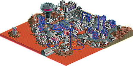
![park_3152 [MM2014 R1] New Society](https://www.nedesigns.com/uploads/parks/3152/aerialt2774.png)
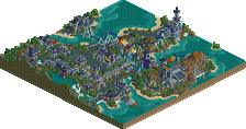
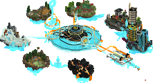
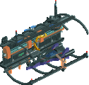
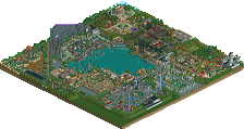
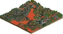
I thought this was really cool. The layout was nice and smooth, the theming was great, there were some nice colour choices and great structures, such as the huge tower at the top and the lighthouse. However I think the 2x2 grey buildings could have been larger and expanded upon but other than that this was good.
why doesn't this have anymore comments or downloads? i thought it was really neat and original. i do agree with xtreme that the grey buildings got a bit boring, i think you should've done more with them.
also, next time post some screenshots! i think that's the main reason this has got so little attention right now since this actually is the first time i heard of this design
I love everything about this. On multiple occasions I had to do a double take because I would have sworn it was RCT2.
I really wish I had LL so I could see the coaster run in-game.
This reminded me of Milo's Martian Waterworks. Albeit slightly more primative.
You have imagination which is always nice to see. I think LL brings the best out in you. I look forward to seeing more from you.
Thanks for the comments everyone. This was my first project in which I used Codex fairly heavily, and it was an enjoyable experience.
Also, gdb - I didn't show screens because it was a secret project
yum there isn't anything like a dirty meatpacking facility on mars
I love that tower. Wish the support blockers were a little more discreet, maybe underground?
A lot of cool ideas here, but a lot of repetition, which i think makes it suffer a little.
I'm agreed; a little more variation in landscape and building textures would have been nice. Love the last big drop and turn over the water, the top-hat supports are cool, the launch tubes and the production line are great ideas. Nice twist on the ubiquitous lighthouse with the "beacon," and interesting trackitecture for the arcology.
This really could use a few more votes. I can't believe it only has 8 after a week.
I would like to vote, but I don't want to vote based on only the overview, since I don't have LL.
do I think this should get design? I'm not sure. Its a bit plain and unoriginal in theme. I can certainly appreciate the sculptures that are there though. There's not quite enough to hold my attention, and it doesn't really build much of an atmosphere. Decent though.
The score cluster is definitely interesting here; with just minor improvements the forecast looks good for your next attempt CSW!
This was really cool. Shame it missed out.
Close but no cigar. Thanks to everyone who took the time to look at this, especially the panelists. It was a lot of fun to make and I think it's a neat idea.
I know its not literally mars themed but futuristic red stuff is pretty much thr same