Park / Indiana Jones et le Temple du Péril
-
 10-February 14
-
 Indiana Jones et le Temple du Péril
- Views 11,067
- Downloads 1,299
- Fans 14
- Comments 26
-

-
 84.62%(required: 65%)
 Design

BelgianGuy 95% geewhzz 95% Louis! 95% Kumba 90% Pacificoaster 90% Arjan v l 85% robbie92 85% Sulakke 85% Xeccah 85% ][ntamin22 85% MCI 80% 5dave 75% Jonny93 75% posix 75% disneylandian192 70% 84.62% -
 Description
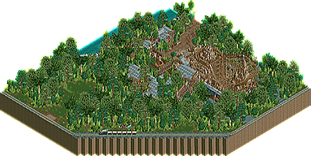
A heavily inspired, semi-recreation of Indiana Jones et le Temple du Péril at Disneyland Paris.
-
14 fans
 Fans of this park
-
 Full-Size Map
-
 Download Park
1,299
-
 Objects
245
-
 Tags
Tags
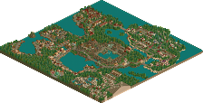
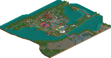
![park_3340 [H2H7 R2] Indiana Jones and the Temple of the Damned](https://www.nedesigns.com/uploads/parks/3340/aerialt2942.png)
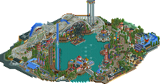
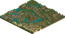
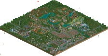
Shame the map was taken at this angle as it doesn't show the best side of the park.
There was so much here that was just exceptional.
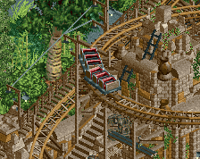
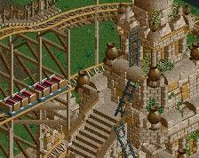
Certain people may think that this is 'lazy theming' but I actually think it is some of the best theming this site has seen. It is an incredible representation of the ride, and even though it is not meant to be a 100% recreation, I do think it is the best recreation of anything in RCT.
I know how hard you've worked on this, as I've sat here and watched you build it and given you constant feedback, and I honestly think that this deserves a massive amount of praise.
Congrats Oliver <3
So, so beautiful. I wish there was more though.
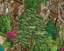
Foliage is spot-on. Seeing as it's more than half of the land...this should do well.
Really great ride! It was sometimes hard to see the track though due to the massive amount of foliage. What brought this down to me was the lazy BBS. I don't know how good you are at hacking, but at least timing the trains correctly would have been an improvement.
All in all great theming and great ride, although you can't see that much of it!
"MFG"
Very good! Although I think 90% is a bit too high.
I liked the ride and the theming (especially the trucks and stuff) but there was not much in terms of architecture and supporting rides. 80% for me. Well done!
^Didn't realize he made this. Nice one! Pity there's no credit for the logo visible on the site!
"MFG"
Airtime, this was just great man, loved every bit, nice job!
I didn't make the logo, it's Disney's logo lol
But thanks all the same
^ Be careful, they might sew you.
Very crafty and unique design Airtime.
It's not much as a whole, but very nice nonetheless.
I was blown away by this. I must have watched it for at least 30 minutes from all different angles.
The only downside for me was how glitchy everything was, but that's a minor issue. This is flat out amazing overall.
I was a bit surprised to see this as I thought it was part of a massive and glorious upcoming solo. Cut out like this it was tiny. I see the quality, but like in real life, fine dining amuse-gueules don't excite me.
It was nice, but it looked like what you most enjoyed about it was creating the foliage. Which looks great, but is way too overpowering. It drowns the actual ride. I was tempted to just remove parts of it so that I could see. I think you should have taken care of this issue.
Finally the attraction of extreme detail level has never been accessible to me, so I couldn't appreciate this as much as others seem to.
I would have really liked to have seen more park surroundings associated with this, the surrounding foliage despite being beautiful did indeed overpower the ride. The support work was very detailed, but tended to blend together do to the brown (obviously there was nothing that could have been done about this other than thin out the supports and add more rich brown). All in all a great quasi-recreation, but I was looking forward to more content. What is there, however, is immersive to say the least.
^That is the key to a good realistic release, but also there is a need to address the overall composition so that the view from above also looks good.
I believe this does just that.
And luckily we've scored exactly the same on our designs so we can't have arguments at home
Congrats on the green nametag