Park / Mystic Mountain
-
 02-February 14
- Views 8,622
- Downloads 883
- Fans 5
- Comments 42
-
 61.11%(required: 60%)
 Silver

MCI 80% 5dave 75% Faas 75% Louis! 65% ][ntamin22 60% Airtime 55% Arjan v l 55% inthemanual 55% JJayMForce 55% Jonny93 55% Xeccah 55% 61.11% -
 Description
What will you discover?
-
5 fans
 Fans of this park
-
 Download Park
883
-
 Objects
300
-
 Tags
Tags
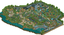
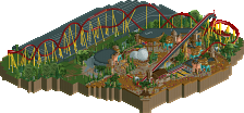
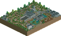
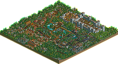
Very good effort. A proper full blown solo park showcasing how much you're developing your style. I think you're quite talented.
All the themes are executed appropriately, and you are able to create nice visuals using only native objects.
What lacks for me is clarity in composition. Some areas are a bit too playful, dense and conflicting with one another. As a result the park's flow is coming short for me. I really look forward to what you'll do next though. Thanks for this park and for being a new promising player to watch out for.
This is awesome man. You can clearly see that you had a lot of fun. I'm nearing completion on my own NCSO park so it's interesting to see how you tackled some issues I'm also experiencing.
One thing that was missing in my opinion was a major coaster. You know the one skyline dominating rollercoaster people come to the park for.
Of course that doesn't mean that this park isn't awesome! I loved Ronin Warrior and the little medieval town. The kiddy coaster in the Asian area confuses me however. The name is grasshopper but the sign at the beginning of the queue says 'Samurai'.
I had fun looking through this park and I look forward to seeing more from you!
75% for me.
Thanks guys. Yeah Faas, I just realised that! The name was originally Samurai but I changed it to Grasshopper. I guess I just forgot about that little sign!
some outstanding NCSO, you had some really original ideas to make up for the lack of some objects, such as the brown brick walls at the big castle that you made grey using windows, and with that also added texture to an otherwise boring tower. really great park. everything just went into so much detail.
i think i was a bit less convinced by the asian part though, it's probably just not my thing. but the castle part more than made up for that.
Good work. Makes me want to get back into RCT2.
meznator Offline
This park shows how much fun you can have playing RCT2!
There is much interaction and atmoshphere. Your unique building style show through really well. I love it!
Can't wait for your next park to come out!
I enjoyed this park, there are a few dead ends and lost guests but for the most part peep flow is pretty good. The park is very lively and fun.
PS: I love Raptor's layout. One thing though, if the riders are on their backs when the photo is taken, wouldn't it be a picture of the back of their heads? This is really the game's fault and not yours but I just realized it when I was watching the ride.
Really great NCSO park you've made there. Congrats on this effort! I liked all of it. Nothing really new, but solid themes with great execution! My favourite parts were the castle (although missing a signature ride) and the mine area. I agree with Posix that the park is missing is flow (path layouts, cluttered theming - especially that jungle area). If you get this right plus a few more unique rides, I will look forward to a new park from you even more!
Keep it up!
"MFG"
Wow, absolutely amazing NCSO, great technique and architecture, also the layout made sense and all of the features looked to be really-well thought out.
I really appreciate the comments. Thanks.
Why does this only have eight votes? Come on guys.
Thanks Faas. It would be nice if more people voted - I would love an accolade!
Or at least let it go up for accolade voting.
really hope that one person gives it a vote, this really deserves atleast bronze or maybe silver. this park was just so creative
Really cool park, PCE. That castle and the buildings inside it look awesome, and I loved all the themes. I thought the foliage looked really good too.
Oh, and the way you designed the roller coaster in the Asian section of park was really neat, with the way it smoothly flowed, tranquil almost.
you got 10 votes! that means panelist voting! enjoy the accolade you'll most likely get!
Wow, where did this come from?
I really love it. You need to improve on the coasters I think, but the theming was just too good. Not sure about the ronin queue, did you forgot to theme this one?
Thanks MCI. The queue was meant to be a walk through a peaceful Japanese garden. Wow, this is getting views really quickly.
You deserve it. It takes dedication to complete a park. I sincerely hope you get an accolade with this.