Park / Baker Lake Amusement Park
-
 25-December 13
-
 Baker Lake Amusement Park
- Views 10,001
- Downloads 1,195
- Fans 12
- Comments 22
-

-
12 fans
 Fans of this park
-
 Full-Size Map
-
 Download Park
1,195
-
 Objects
423
-
 Tags
Tags
![park_4118 [H2H8 R4] Mount Haystack Ski Resort](https://www.nedesigns.com/uploads/parks/4118/aerialt3883.png)
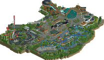
that entrance is a work of art
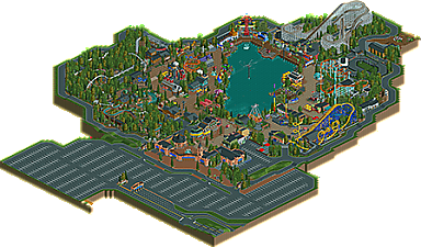
This is a fantastic park. Very well detailed great work.
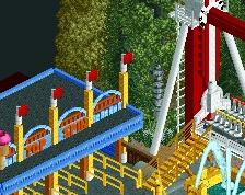
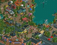
Love the atmosphere, the boardwalk, kiddie land, and mine town areas were very good. I loved the Coal Blaster and the Golden Zephyr. The entrance area was one of the best I've seen. Overall great park!
Cool park.
Great architecture and solid layouts.
But I felt something was missing and I think that's because there are no peeps.
Well, this is 'finished'
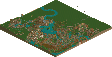
it's just not got the surroundings it should have.
Don't hold of on it, it's fantastic
another very solid realistic park at new element. very high quality of detail, etc, and very enjoyable. great work!
but... why couldn't you just finish it up around the edges? add peeps? just a couple more hours would have made it even better- you can't help but notice a bit of lifelessness in it without these finishing touches. seems like such a shame to give up now!
that said, still an excellent park. should make a solid gold (I think its clearly too small for spotlight)
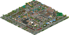
The park makes has an unfinished feel to it. It's bare in parts, misses benches and pathing details, some rides crash (Buzzsaw), ghost glitches and some lazy spots (missing naming, floating sign texts, missing custom flat details, bare park surroundings,...) are an eyesore and the peeps are missing badly. I feel like giving the park a few hours more thought and time and it would be much better. The coasters were nice (although what was with the Mack mouse not getting over that first hill?) and the theming too, but the overall laziness of the park kept it down for me. Hope you could work on that and reupload it sometime.
"MFG"
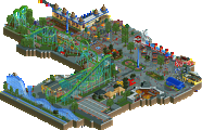
I did get a sense of that 5dave said but there were just so many good things about this park that made this one of my favorite releases in a while. First and foremost was that the park was believable - there weren't too many big rides packed into a small space yet it felt like a place that never lost it's family-oriented identity and kept building rides at a moderate pace throughout it's fairly long history. The path layout was simple and straightforward but at the same time contained surprises around many corners; it was exciting while still basic enough to let the park breath and ensure that guests wouldn't get lost easily.
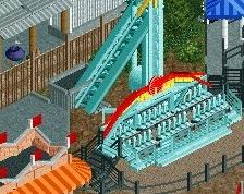
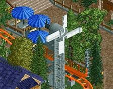
Really good ratio of ride types and the custom flats looked great, wish a few more of them were working though. Coaster execution was pretty good - the woodie was a nice twist off of the standard double/triple out&back but still fit in it's genre and time period. Would've been better had you used less cars (or 3 rows per car train) so that the pacing around the turns wasn't quite as fast. I did cringe a little when seeing the corkscrew coaster's corkscrews going the wrong way - yes RCT doesn't let you orient them diagonally but I think you could've made it work the correct way. The launched coaster through the woods was a great family ride as well as a great/realistic option for a park like this to build to have that 'new' ride to keep attracting visitors. I really liked it's interaction with the flume too.
I thought there was a great and consistent level in the buildings. Also, each building knew it's place in that it was in an amusement park, not the actual place you were trying to them it to. Their scale and variation was really well done too, helping the park feel really believable as a whole.
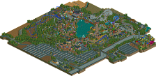
One thing that could've helped this park was the tree density. I felt that most of the park was built using very advanced methods yet the tree spacing looked like it was from a park made in 2005. With multi-tile tree scenery and other creative foliage methods, I felt this was the only major category of parkmaking that left a lot to be desired here.
^Why not finish this?
It might only take 2-3 hours more and you have a great park under your belt!
"MFG"
maybe just let someone else finish it up for you if you're completely dead?
I prefer to wait for a more finished version.
I'm gonna finish it up. Coups knows that
Didn't this start out as a TPR group park?
^or wasn't it some sort of park that contained lots of tpr references? I didn't check to see if that was still there