Park / Mercury City
-
 17-November 13
- Views 4,631
- Downloads 774
- Fans 2
- Comments 13
-
 58.13%(required: 50%)
 Bronze

5dave 75% inthemanual 75% Louis! 65% MCI 65% Liampie 60% Airtime 55% geewhzz 50% Jonny93 50% posix 45% ][ntamin22 40% 58.13% -
 Description
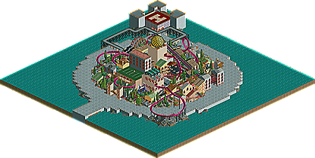
A small side project, completed in less than a week. Inspired by City of Dreams and surrealism. Enjoy.
-
2 fans
 Fans of this park
-
 Full-Size Map
-
 Download Park
774
-
 Tags
Tags

![park_3350 [H2H7 R3] Meizhou Rising](https://www.nedesigns.com/uploads/parks/3350/aerialt3056.png)


![park_2089 [NEDC] Shock 2 - #4/9](https://www.nedesigns.com/uploads/parks/2089/aerialt1883.png)
![park_3334 [H2H7 R2] Bermuda: The Lost Colony](https://www.nedesigns.com/uploads/parks/3334/aerialt2938.png)

This looks really fun from the overview. Will check it out and vote later.
I'm in Japan but I'll be sure to check it out once I get back- doesn't have many votes so far :/
maybe the standard number of votes needs to be way lowered for LL, or maybe it should just pass a quick check by an admin for it to go into accolade voting?
^You bring up a good point.
Just downloaded.
It was alright. The bits in the center were mostly well done, in a very city of dreams style. The coaster was a little bland but fit into the surroundings pretty well. But my main disappointment is that you took an interesting, well designed center and surrounded it with grey path in a perfect circle and water. Super boring, and it totally brings down the overall quality! I would have put red mesa cliffs with your sci-fi architecture worked into them around and through the city and made it feel organic and real instead of just giving up after the center was finished.
For me, its not quite design quality, but it could be close- if you fixed up some stuff and resubmitted (is that a thing you can do? ) it could be great
I surrounded it with water because it was meant to be a small island in the middle of an ocean...the only transport on and off the island is the bullet train. I think it feels more isolated when surrounded by water.
I don't know. I put a perfect circle around because the theme made me think of crop circles, and I knew I wouldn't get bored with a small area to build in.
Just gotten round to looking at this. This was really nice. The pacing was perhaps a bit too quick, but the layout was nice.
Surroundings were pretty good too. I think it would have been nicer not in the middle of water, but still, good work
Finally took a look at this... It's much better in game than on the overview, I really liked the chaotic look. I expected the random colours and textures to be ugly, but it worked well somehow. I also enjoyed the details like the tennis court and the bullet train, among others. Sadly, I didn't like the coaster as much... It was way too fast, and almost impossible to follow. The go karts should've been left out, it looked weird how the perfect circle was broken in one corner, especially in such an unelegant manner. Looks like your 3 year old annoying cousin raped your park when you left him alone for a few minutes. Lastly, I think you should've done more with the ring around the city. The bare path didn't look very good. Either a less wide ring or a wall around the path ring or something would've made it better, in my opinion.
Overall, I'd say it's worthy of bronze and very promising regarding your LL skills!
Finally...
Congratulation on the accolade!
this took a while! but congrats on the accolade csw, it's always nice to see one of the people that originate from /r/rct get an accolade.
Didn't realise this was up as a park haha I thought it was a design submission.
Congrats on the bronze though. I did enjoy it.
Ditto. I voted higher than I would have because of that.
Deserved bronze all the same
Wow! I'm quite surprised that this scored a 58%. Thanks to everyone who downloaded and gave it a look, and the panel for being so awesome (two 75% votes? What?!). You won't have to wait long for the next one
Edit: Also, I think I originally intended this to not be up for an accolade but I had to choose between spotlight submission or design when I submitted it. I chose park because there are numerous flat rides around the park, and felt that design wasn't the right category.