Park / RAPIK
-
 02-November 13
- Views 1,818
- Downloads 566
- Fans 1
- Comments 4

-
 Description
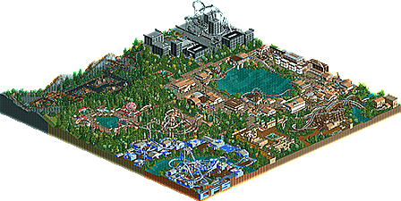
ramona's first park in New Elements.
Use just Base Objects. -
1 fan
 Fans of this park
-
 Download Park
566
-
 Objects
239
-
 Tags
Tags
![park_2830 [PT4 R3] Transport Tycoon](https://www.nedesigns.com/uploads/parks/2830/aerialt2488.png)


wow the guy who gave this a 10% is a dick. Sure its not the best park in the world but 10%? C'mon. Anyways about the park: it's a good start. Some of your coaster layouts are a bit weird. The brakerun of the mine train was way to short for example, the freefall coaster didn't even have a brakerun which it clearly needed and the woodencoaster didn't clear the track don't know what went wrong there. The architecture is a bit simple and overall there is just a lot of stuff that seems a bit unpolished. But keep trying. It's a good start
Well, it may not be a 10% but I fear it does not get much better either. I´ll edit this comment tomorrow after university to give some feedback, need to catch some sleep now.
____________________________________________
Finally, here you go:
Your buildings miss detailing, they look all very empty and boring. I know my detailing isn´t nearly ace, but just to leave detailing all out isn´t the right way either. Also the use of zero-clearencess is a bit messy. You´ve got some pretty cool ideas (the station of the monorail standing on pipes) but other buildings miss roofs where you could easily put them with zc :/
The Layouts are pretty awefull, to be honest. Very unrealistic and for fantasy aspect they doesn´t look fun at all. Even if you´re building fantasy rides, try to imitate some real coasters first, so you get a feeling on what is fun (and looks good) and what not. The holding brake (for the vertical drop coaster) is meant to hold the train at the top of it´s very ferst drop, not to kill the guest used as a brake at the end of a ride (60km/h->0km/h in 0.5seconds is a very fast death, but not fun). The underground hills on 4Twist are a pretty killing feature, too.
If you put a curve between to lifthills (the minetrain) dont bank it, that looks shitty and if you´ve got a fat guy left of you... outch.
Putting a Inversion at the very end of an coaster can be cool, but if the train crouches trough it the effect is turned to bad, too.
Also you need real brakeruns on your coasters. Brake your guest slow and smooth at the end of each coaster, not apruptly to death or while half the train is facedown on a drop.
The Map layout is a bit messy, but it´s okay I think. But please dont build on the very edges of a map, you just cant build there on a high standard.
The foliage is okay for the beginning but try to mix it more. Not every 4th of a tile needs a bush on it, leave places open and really mix it up. Also changing the land texture under your trees helps to break it up and create better looking foliage.
Last but not least, do the same thing under your pavement, it looks better if the land texture under your pavement is different to the land right and left.
I hope I could help you with some of the feedback, keep trying!
Gruß
MCI
Have you seen it in game? A 2 is a pretty damn accurate score, if you ask me.
Don't you think 10% is a little bit discouraging? I mean, it's not that good but you can see there was effort put into this. Atleast give some feedback.