Park / Whirlwind
-
 04-November 13
- Views 4,569
- Downloads 651
- Fans 2
- Comments 30
-
 64.23%(required: 65%)
 Design Submission

Maverix 75% Pacificoaster 75% Arjan v l 70% inthemanual 70% Louis! 70% MCI 70% Xeccah 70% AvanineCommuter 65% JJayMForce 65% geewhzz 60% Jonny93 60% Airtime 55% posix 55% 5dave 50% pierrot 40% 64.23% -
2 fans
 Fans of this park
-
 Full-Size Map
-
 Download Park
651
-
 Objects
240
-
 Tags
Tags
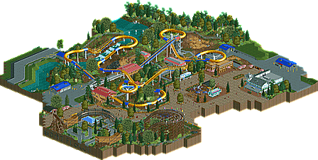

![park_3607 [NEOlympics] Abu Al Sheikh Amusement Park](https://www.nedesigns.com/uploads/parks/3607/aerialt3220.png)
I really liked this design. Well done!
When I saw the overview and noticed that you added part of another coaster I was really hesitant, but you actually made it work. Really clever!
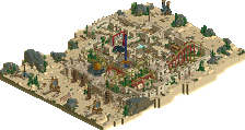
The design itself looked really cool as well. I loved the dinghy slide when I played scenarios in RCT1 and you made me feel the love again. The architecture was a bit blend but it did the job.
for some reason i am unable to get a download started (probably something wrong with my internet), but it looks great from the overview. I'm sure it will make it to design submission without my vote for now :/
From a aesthetic point of view it was nice. But I don't understand the concept at all.
I've never seen a water slide that works this way (I know Master blaster slides, sure) - have you some reference slides? Also it's strange that this ride is in a park rather than a water park...
"MFG"
5Dave, it's based off Wildebeest at Holiday World in Santa Cruz Indiana.
^It´s not Santa Cruz, it´s Santa Claus
I really liked it, the only big "bad" thing is the thick Lift parts. They´re glitching like shit (at least on my pc´s) and are really destroying the atmosphere because of that :/
Yeah they do that. Until you just move the screen off of them. Hana
I like the layout, but I am a big fan of the wooden coaster track you put in.. will you finish that ride and make a larger park out of this? The detaling on woodie was great.
Whether or not the dinghy slide is hyperrealistic or not, I think it is a different and cool design normally not done on NE.
I mainly just wanted to get it finished as I absolutely love it. It was so much fun to build. As ottersalad (killer name btw) said, I really wanted to do something different that I haven't seen on NE before.
-Josh
Ah OK now I get this.
Still strange. lol!
"MFG"
Really interesting concept, nicely executed, love the cutaway area with the woodie. Architecture isn't amazing, but the dippin dots stand is nicely done.
I think next time, work on your architecture, it's what will take this to the next level.
Oh, and not sure the slide actually has #datflow, but nicely placed on the map
Aww man... close!
I really liked this design.
Definitely something else than the usual stuff.
The cut out woody is a great touch!
Unique design.
expand this to a park and make the woodie completed...
this has potential to be more,so go get it
Mad props for trying out a new design type, water slides are never built/submitted!
It looks pretty impressive from the overview, but I haven't check it out in-game yet so my comments are a bit minimal for now.
the water slides itself was fascinating and works well with landscaping, but the surroundings were quite boring honestly.
also, why do some people tend to add cut-out rides on their park? it looks absolutely hilarious and adds unfinishedness. maybe just for me though.
I loved building it. I'd love to hear what I can improv in from the panel. And also if someone could do me a huge favor and like screen shot the panel and how each person voted? I only look at this site in my ipad and it won't let me see that. (I go to the library to submit stuff) that would be incredible.
I really spent a lot of time trying to get all of the details on the coaster itslf right I probably didn't spend as much time in the surroundings as I should've. Like I said. The more feedback I can get the better I can make my next release.
Thanks to everyone who's checked this out!!
-Josh
There you go.
I think the score is pretty accurate. While I enjoyed it very much, it might miss the extra little something to be design worthy. While the ride was really awesome, the buildings lacked a bit in comparison. The area with the wodden coaster (if someone likes it or not) was well executed and felt very atmospheric (to me). Ont he other side of the map, the river could have been better. Try to theme the bottom of the river/stream as well, since I first saw a themed riverbed (is that a common word in english?) every other (unthemed) one felt empty and way to clean. Like a brand new canal or something like that.
Gruß
MCI
awww man, I missed the voting :/ I would have given it a better score
It seems to me that getting a design is becoming downright impossible these days.