Park / Faastopia - World Showcase
-
 16-October 13
-
 Faastopia - World Showcase
- Views 8,608
- Downloads 1,122
- Fans 1
- Comments 27
-

-
 65.38%(required: 60%)
 Silver

disneylandian192 75% Cocoa 70% Dimi 70% geewhzz 70% posix 70% 5dave 65% Airtime 65% Arjan v l 65% Coupon 65% Jonny93 65% Maverix 65% robbie92 65% Pacificoaster 60% pierrot 55% BelgianGuy 45% 65.38% -
 Description
Started three years ago with some playing around on a random bench. Learned to make the bench my own and was able to create this. My biggest solo project yet and something I'm pretty proud of. Enjoy and don't forget to vote and comment!
-
1 fan
 Fans of this park
-
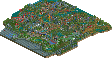
 Full-Size Map
-
 Download Park
1,122
-
 Objects
456
-
 Tags
Tags
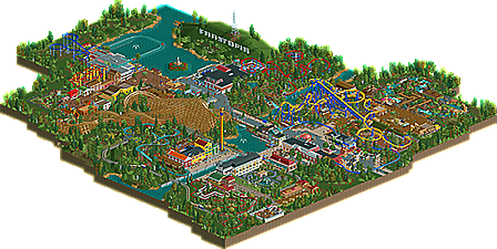
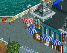

A very charming and quaint park. I like the little inlet with the overlooking hill. There's something about it that reminds me of retro RCT style combined with newer techniques.
Thanks guys. The retro style is probably becuase it's an old bench. I'm very interested in what other people thought as well. Don't hesitate to reply and vote!
Gotta find some time to view it decently in-game, but from the overview it looks interesting. I'm not a big fan of all those dead ends the park seems to have though. For general flow of the peeps I prefer an "O" or similar type path systems that have no dead ends.
While I usually like themed areas, these seem a bit underwhelmed though, could've been done a bit more thorough and with more thought behind the choices you made. Now it almost seems like you just wanted to get the park done asap. This is all from the screen overview though, so maybe in-game it will be different..
Good job getting it done though, that seems to be quite an accomplishment nowadays!
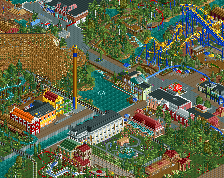
Nice park. I really love the Margherita Madness ride in the mexican part of the park. It's so different. I also love the architecture of the buildings near the water coaster and the station for the patriot missile. One question tough. Why is arjan walking in the middle of nothing haha ?
?
He escaped his cave.
Neat park Faas!
Your work always puts a smile on my face.
The warm atmosphere, The fine use of colors and the fun it always oozes.
I do think the entrance could've been more impressive, it's quite small and unnoticeable.
That entrance might be more fitting for a fare or very small park.
Unfortunately, i'm not a fan of the path setup.
It might be effective, but i couldn't be happy about it when visiting
as a peep, having to take detours to reach the next ride.
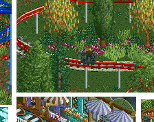
I liked the custom supporting on Los Pollos Loco and Mambo, although on Mambo there's some room for improvement, since a lot of the supports sticked through the track. A tad higher would definitely make it look better.
AND I HATE YOU FOR SHUTTING ME OUT AS A SECURITY GUARD.......asshole.
Okay...back to the review.
I love to see (no offense) csw working to keep the grass neat, so FAASTOPIA is clearly visible.
Liam the elephant and Marino the tiger... lol.
At least they got a spot IN the park...
I liked the ride Apache and Margherita madness and all the other rides, except the log flume Trastammer.
Honestly, i think that one is shit, could've been much better.
I did like the antique cars combined with the maze there, don't know, but there's something about it, just like Margherita madness.
The park's atmosphere is good though, you never fail at that.
Very enjoyable release.
I do hope that you're going to challenge yourself to create more ride interaction.
Keep those releases coming Faas!
@ Recurious : He hates me.
this is wonderful, it's like you took the charm that everyone loved and made a more coherent park out of it.
It was a litle inconconsistent though- for example, some of the Europe area was sort of patchy and awkward, especially in the park layout- walking through the scandinavian buildings to get to the viking area behind is sort of weird (btw, I liked the backside more than the front!), while the africa area didn't really feel like Africa, especially in the inconsistent architecture and foliage
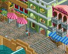
But some areas were really really well done, especially the Cuba area (seriously, perfect) and the Mexico area. I also liked a good old spiral lift coaster, that was nice. I was really looking for an Asian area though!
All in all, a fun park. good job. maybe get a little bigger next time, you seem to finish them quickly enough
This park was difficult for me. For everything that i liked, i was generally bland on most of it. I wasn't unimpressed, but i wasn't impressed either.
I think the biggest issue is the scale. The buildings are tiny, but the paths are huge. For such small buildings it looked like there was tons of space between everything cause nothing was imposing except the coasters. A larger scale would have made your layout seem more coherent.
There were areas very atmospheric like around the maze, but other parts just looked sloppy. For example, all your bathrooms were impossibly small two square buildings. It's just a matter of inconsistency. Some areas had wonderful architecture, while other places had bland buildings with crazy textures. And don't forget your details, things like naming all your stalls and such. Just helps make a more presentable final image.
All in all, enjoyable, but in my opinion nothing ground breaking. For your next park try to play with a larger scale and altering your architectural forms.
FK
Six Frags: Thanks for your reply. I can partly see the problems you mention. Enjoy the in-game experience!

Recurious: Thanks.
Arjan: You were right about the entrance, I made it to be an entrance to a much smaller park and then started to expand the park. After that it was impossible to enlarge the entrance and I kind of like it this way, although it is small. I kind of like the log flume. What did you think was 'shit' about it? You are right about the ride interaction. I love seeing that.
Cocoa: Thanks man. You're right about the inconsistency. It is mainly because I did not build all the areas right after each other. The entrance area is more than two years old while Europe is only a few months old, for example. There are gaps of several months of not touching this park.
FK: You're right about the scale (I guess) but when I build in a bigger scale I lose my interest in the park in one day. This keeps me motivated. It was not my plan for this park to be ground breaking, so you're right about that part.
You could've done so much more with that logflume imo.
The design is very simple, barely interaction with paths and other things.
It's just whirling around some trees.
In some regards, this wasn't that great of a park, to be honest. I feel you totally destroyed any sense of path flow, composition, and planning. That being said, it isn't all bad. Little bits here and there were nice, and the coasters are definite quality.
I think taking some more time to get some basic hacks in your parkmaking would really make you able to go the extra mile, like the invisible hack, some MOM to get more detailed rides and such, due to your lack of hacking you used here it sometimes tends to look unrefined and even a little too basic for my taste.
As has been mentioned some themes weren't thorough enough to carry it all the way but what was there is promising.
overall a good park but for me it has a few too many flaws in terms of technicality and aesthetics to really shine
I was a bit disappointed by the small size of the park, but the content was pretty good. The Americas area was my favorite, but other than that, it seemed a bit plain. good architecture in spots.
Arjan: I kinda liked the log flume. I like whirling around trees.
Shotguns: Ok, thanks for your reply.
Belgianguy: I was expecting this reaction from you. But like I said before I don't care about technicalities, I don't enjoy them and I don't like doing things that I don't enjoy.
csw: Thanks, I see where you're coming from.
"I don't like doing things that I don't enjoy"
very true
Yay! Silver!
Thanks guys!
Shame I never got a chance to vote, I was looking forward to taking a look, just haven't had the chance to look properly yet.
You can still do that now. Enjoy!