Park / Silver Shores
-
 10-October 13
- Views 1,849
- Downloads 597
- Fans 1
- Comments 2
-
 Description
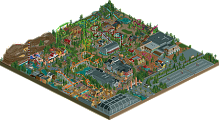
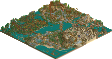
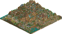
This was for a Reddit contest back in February. Probably my best attempt at realism to date, and I wanted to get some thoughts before I start another realistic project. (which needs to happen soon, because this isn't that great.)
-
1 fan
 Fans of this park
-
 Full-Size Map
-
 Download Park
597
-
 Objects
237
-
 Tags
Tags
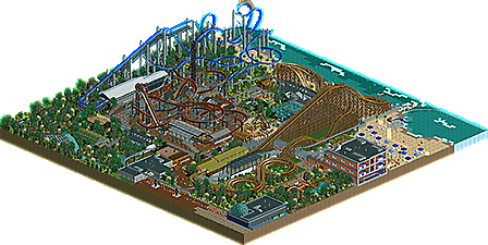
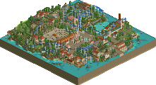
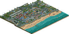
for a realistic park ,it's not very realistic. colors and layouts are especially strange, and not fitting for a park of this size. the park layout is also confusing, and the foliage really needs work. the hotel and beach area is pretty nice thogh
I definitely agree about the foliage. One of the first things I noticed when I re-opened this was that the foliage was terrible. The layout was basically just a large circle with two entrances (one from the hotel and the other from the "street") so I don't really understand how that qualifies as confusing. I was going to try and make a larger version of this initially, but then decided to try to use the idea for the reddit contest instead, which made the park smaller than it should have been. Thanks for the comment