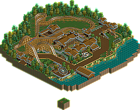
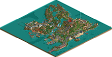
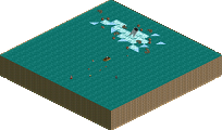
Because I've worked so fast on this build I wasn't really able to rework it, otherwise it would've take a lot longer so I decided to release this as it is and take the feedback onto my next build
I think it's a nice first release. Yeah, it needs color, but it's good to see a fairly complete build. However, the layout leaves a lot to be desired. It's very short and uninteresting apart from the Hurler-esque turn after the first drop (from what I can tell from the overview at least). In the future, if you plan to submit something as a design, at least make sure you have a solid layout.
Don't be so mean! The choice to take advice is what seperates an advice from a command... I think this was promising, especially considering it's your first release. If you want to get accolades and stuff (it's okay if you don't get fun out of that!), I suggest you spend more time building a flowing coaster layout and refined architecture. Quality requires time and patience.
I hate some of the sentiment that advice must in most cases be taken... You lose your character per se whenever you take everybody's "suggestions", like what happened to me.
Okay... sorry... i'm probably over reacting, but like you said... it has potential, so to me, it's a shame he didn't improve the layout and colors, because it could've been way better than it's current state.
You lose your character per se whenever you take everybody's "suggestions", like what happened to me.
We're trying to make you lose your character because your character isn't your character, it's robbies
With that being said, your most recent work (which I love) has improved because of other peoples comments and suggestions. I think most people owe their progression to comments, criticism and suggestions.
You just need to know what to take on board and what not to.
That is what I am referring to, Louis, of my apparent lack of character. Advice if used correctly can make you great, otherwise it can harm your innate style and you become 'like everyone else'.
8 Comments
Comment System Offline
Arjan v l Offline
Where's the colour?
Design is STILL boring.
Why ask for advice on the new block?
You obviously didn't take the advices.
xRBz Offline
gir Offline
I think it's a nice first release. Yeah, it needs color, but it's good to see a fairly complete build. However, the layout leaves a lot to be desired. It's very short and uninteresting apart from the Hurler-esque turn after the first drop (from what I can tell from the overview at least). In the future, if you plan to submit something as a design, at least make sure you have a solid layout.
Liampie Online
Xeccah Offline
Liam has some nice points in general, however.
Arjan v l Offline
Louis! Offline
We're trying to make you lose your character because your character isn't your character, it's robbies
With that being said, your most recent work (which I love) has improved because of other peoples comments and suggestions.
I think most people owe their progression to comments, criticism and suggestions.
You just need to know what to take on board and what not to.
Xeccah Offline