Park / The Blighted Lands
-
 14-August 13
- Views 5,340
- Downloads 719
- Fans 2
- Comments 14
-

-
 55.38%(required: 50%)
 Bronze

Louis! 70% 5dave 65% Kumba 65% Loopy 65% tyandor 60% Airtime 55% geewhzz 55% Liampie 55% Maverix 55% Wanted 55% Jonny93 50% posix 50% RMM 50% Six Frags 40% pierrot 25% 55.38% -
2 fans
 Fans of this park
-
 Full-Size Map
-
 Download Park
719
-
 Tags
Tags
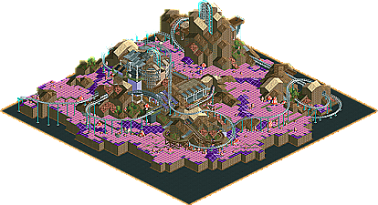
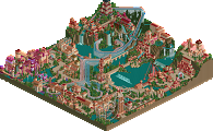
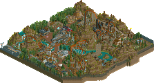

Although, I think it should be a design. Also, shame you didn't do the black tile maze thing (although that seems like a massive bitch)
Great stuff though, I've never seen purple land tile used so effectively before!
That screen screams originality.
I agree with Cocoa though, it's kinda small for a park and there are to few rides.
But hey ho, was fantastic anyway. The contrast of the pink flowers and purple grid land, combined alongside the beauty of the architecture, the rawness of the landscape and the flow of the coaster was incredible.
I'm so glad you won something with this, you've been robbed recently.
The coaster was fun too.
Your quality of build impresses me, but your depth of thought amazes me.
Some surprisingly positive feedback so far! I was honestly expecting a few more "I don't get it" responses, considering this is relatively unconventional. I'm glad the storytelling came across strongly.
Although I can't see this in game, I absolutely adore the overview!! It's unique and beautiful, the ideas are wonderful and I would love to see a full scale park with this much imagination. This is right up my alley, as you can tell Fantastic work, I hope you can keep up the unconventional work.