Park / Inselfieber
-
 23-July 13
- Views 18,689
- Downloads 1,181
- Fans 4
- Comments 61
-

-
 67.69%(required: 60%)
 Silver

Louis! 95% Airtime 80% Maverix 80% zburns999 80% nin 75% Liampie 70% prodigy 70% tyandor 70% Arjan v l 65% Pacificoaster 65% Wanted 60% CedarPoint6 55% geewhzz 55% wheres_walto 55% posix 50% 67.69% -
4 fans
 Fans of this park
-
 Full-Size Map
-
 Download Park
1,181
-
 Objects
1
-
 Tags
Tags
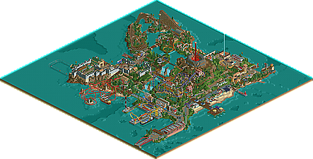
![park_2095 [NEDC] Archimedes - #1/9 (Winner)](https://www.nedesigns.com/uploads/parks/2095/aerialt1885.png)
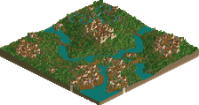

I love every single bit of this park. Maybe because it was my "baby" but you did simply wonders with the map. Thank you so much for letting me be part of it As soon as my PC is up and running again we'll complete our task of doing the video for the channel. Thhose guys will shit bricks the moment they see what you did with their old and crapy Inselfieber
________________________________
Holy shit, seven month later I realise how drunk I was writing this comment...
No where in the park did I feel it was held back by NCSO objects, everywhere oozed atmosphere and creativity and I was truly immersed in the park. I haven't felt this way about a park in a long time. I loved the layout, all the bridges. OMG the bridges <3
I know some of the coaster layouts weren't amazing, but I didn't think this held the park back too much, but this was why it was 95% and not 100%.
I honestly thought that others would feel the same way and so was surprised to see everyone else down the other end of the scale. But, well done on Silver. It's a very impressive park, and I now crown you King of NCSO. (nin I need that crown back from you)
This is Jonny's NCSO strength I think.
My main point of criticism is that áll the layouts had an inversion. I know that there are a lot of people that really enjoy coasters but get sick in inversions. Guests would probably be able to enjoy it more if there was at least one coaster without an inversion.
But seriously, I think even for gold, you need more consistency in terms of quality. The Santa Monica section seems out of place theme-wise and quality-wise.
Another huge thanks goes to BigB and Version1 for their feedback during the whole building process.
Before i built on Inselfieber i was never up for NCSO but i realized it make so much fun to build with the original game objects. I followed always my rule not to use any custom scenery inclusive rides and paths.
@Maverix: Thanks man, i am glad you enjoyed my park
@SuicideCarz: Thanks, don't worry about the write up, its just a small spelling mistake and the rest is pretty good
@dawidox: I am glad you like the park
@fizzix: Wow, thanks for these kind of words
@zburns: Thanks for your long comment and your explanation how you voted on this submission. Its always nice to hear the background of a voter. I know i am not really talented in layouting coasters but i tried as always to focus my work on atmosphere and architecture.
@Intamin: lol
@Luketh: Thanks a lot
@Fisch: Thanks for these friendly words, yeah i a really proud on this park
@Wanted: Sometimes during the building process i had the same feeling like you on the park but whatever, thanks for your comment
@Xcars: This won't be my last NCSO
@cocoa: Not every building can be loaded with tons of the details. I used less details in Pompeji because the roman architecture is not always like the big temples or the big stadiums. Here is one of my inspiration sources:
@chorkiel: I don't think this is a huge problem
@Turtle: Thanks man, your work like Isole Calabria was a huge inspiration for me
@SSSammy: Thanks a lot
@Louis: I was really wowed that you enjoyed this park so much, thanks for the crown anf for the release prep work you made
All in all i am really satisfied with the park and the score, thanks for the huge amount of comments!
MCI made the RMC? Wow, is all I can say. That was a lovely layout, my only issue with it was the vertical loop, but it was definately one of the stronger layouts in the park, especially in it's setting. Kudos to MCI.
^ thank you. I built this layout a while ago. today I would not put the Loop in anymore. But when i realised it Jonny already did all the theming and i thought the Loop would fit in there.
Congrats on your first NCSO accolade, Johnny!
RMM Offline
hahaa really, you guys are nuts. a 95 is saying, "it doesn't get much better than this".. and that is absurd. sure, you like it, but from a an overall view of every aspect, compared to what we've seen in rct2, this is a 40 at best. for ncso it's a 80 at best. opinions differ, i get that, but we're 'accolade panelists' and i think giving this anything higher than an 80 (for NCSO) is almost a mockery of the system.
If your post was serious, then you are the one who needs to get the fuck outta here.
It's absurd to think you're putting a limit on NCSO work just because you can't appreciate the work for what it is. Fuck off.
While you may think this is a 40 at best, I think that this park does a lot of things better than many recent releases and deserves gold even. It had really creative use of scenery, well integrated trackitecture, interesting rides and great atmosphere. Oh, and NCSO isn't a crutch for lower quality work... it makes the park all the more amazing considering he had a limited palette yet he was still able to create an immersive and well composed park that kept me interested longer than some recent releases.
As for the park, I loved it! This is the kind of NCSO I wanted to see, where trackitecture is used to its fullest potential to help make the architecture pop when you have a limited amount of scenery to work with. It kind of beckons LL work in that way imo. Amazing job.
RMM Offline
NCSO is a limit... no?
this whole 'thing' is a result of our constant nagging and how our suggestions are actually strict guidelines on how to create art in rct. how can one tell somebody what is and what is not art? spotlights are essentially non-existent and unless there is a contest, we rarely see a submission from the elites here at NE. everybody's work looks like everybody else's. and because of this, we have a few who stick with LL, we have this NCSO craze, we have 'the dump place', and a lack of full topics on projects. remember when you could just go into the AD, and just know that your favorite parkmaker would have an active topic with his distinct work?
it's like that new guy posted in his 'hi i'm new' topic... it's baffling that we don't have crazy, mind boggling, rollercoster/park creations submitted more here at NE. we crush creativity here and throw it in a corner, therefore we get NCSO. we like it because it's new, because it not robbie1, or Robbie2, or Robbie3. which is fine by me if you want to play it, but to give this a 95? nuts. not salted, just plain nuts.
i rambled on there but my p... you know what, i don't care. i don't know why i'm typing this. this park is nice, continue to enjoy the game and release things.
remember when Gila was released? Toon change the game; the single most important release in rct2 history. did you ever think that in the future, we would use custom scenery not to differentiate our work, but to finesse it to the point where it all looks nearly identical? to the point where not using custom scenery becomes trendy? again, it's fine to play, but don't rank these parks up there with the best of the best. it ain't right.
i'm nagging about nagging.
i just think NCSO is a silly branching result due to our own nagging.