Park / ZoomZoom
-
 20-July 13
- Views 2,116
- Downloads 580
- Fans 0
- Comments 11
-
 52.31%(required: 65%)
 Design Submission

posix 65% Arjan v l 60% Jonny93 60% Pacificoaster 60% tyandor 60% zburns999 60% Liampie 55% Maverix 55% CedarPoint6 50% Coupon 50% Wanted 50% wheres_walto 45% prodigy 40% Airtime 35% nin 25% 52.31% -
 No fans of this park
-
 Download Park
580
-
 Objects
1
-
 Tags
Tags
![park_2829 [PT4 R3] Grand Central Station](https://www.nedesigns.com/uploads/parks/2829/aerialt2485.png)
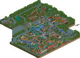
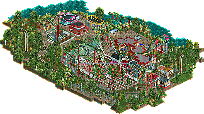
Otherwise I'm having a hard time to reason why I think this is about the same quality. It's good and nice to look at, but somewhere at 65% for me, so just barely a design.
Again, I get the sense it needs more clarity. The path layout doesn't really guide my eyes well. The theme is a bit too ambiguous. Perhaps the greens are also a little too overpowering as they have to compensate for lack of content.
I really like the entrances of your queue lines though. Especially this one here is fantastic.
I always have a problem with conceptional building. Mostly I start with the coaster. I have an idea for the Layout (which I really like in this one). My theming creativity isn't really a match to the many of you, though. I build this huge recreation structure second and wanted the coaster to interact with this (which I also think worked well). BUT: the theming itself is a mess, I really know that, which is because I'm still experimenting and trying to get a feeling for architecture. The buildings in the street aren't bad I think, yet I know they are pretty redundant. The buildings around the carusel don't fit in the design at all, but due to lack of inspiration I left them in, which was not my smartest move;) overall I'm not discontent with this, since it is an improvement of more than 10% regarding my first submission. And since I just using CSO since this years April I do consider myself on a good way towards an accolade.
Thanks to you admins, to you panelist and everybody who's commenting this! I'd love to hear as many opinions about this as possible.
What do you guys think foliage wise, flow wise, ..., overall wise?
Thanks and Auf Wiedersehen
All this stuff is pretty easy to fix, and if you do this in your next project I'm sure you'll get an accolade!
-S.C.
It would've looked better if the brake acted a little later.
You've build a floor less B&M coaster, so you've also missed points there, since those coasters have double catwalks.
Also the supports were unfinished at places and the two supports at the turn around half loop by the queue, were incorrectly constructed, i was wondering how that could support that half loop correctly.
You have some nice interaction going on though.
There's some nice interaction at the cobra roll, but that could've been so much better, if it didn't looked forced, like it does now.
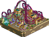
I'll show you what i mean:
The path in the black crossed area shouldn't have been there, so peeps are forced to cross the bridge, wich would've been a better way.
Now you have two choices... go around or cross the bridge, wich gives me the feeling that the bridge is forced interaction.
I hope you know what i mean.
The architecture was nice, but that light blue building stuck out too much.
I liked the use of a train, it always adds to the design.
Please add peeps also, they contribute to the atmosphere.
You wanted comments?
Well here you are, i hope it helps.
As for the bridge: The bridge was first. I've always wanted to make a cobra roll-bridge combination. I build the path behind the cobra roll afterwards because I had no better use for the place behind the roll, which I won't do again after your advice! (By the way I really appreciate you going the extra mile with the screenshot! Thanks)
I was also too lazy too support every bit of the last section of the coaster and I don't know why, but I always (which means since this years April, since I started CSO then) trouble with supporting loops... Is there something like a support tutorial in the forums?
Well for the blue building... I cramp it in, for the heck of it. Though I knew no one would like it there I left it in. Since I'm still experimenting with the game I just tried some few things out in this design, not thinking about their harmony. Also one could consider it a homage to pac and Mav because I saw something like it in pacs starpointe and Mavs Hudson Crossing park.
As for the peeps, I simple forgot to open the park before submission, and I instantly knew that this would be another let down to this...
I'm very grateful for your comment and advice and especially that you kept your word! Have a good one and take care bro'!
Auf Wiedersehn
-S.C.
^ ZoomZomm was the slogan in Mazda commercials for quite a long time. (I'm not a Mazda fan but I though that'd funny to use here as I could think of a good name I decided to give it a ridiculous name;)