Park / [PT4 R7] Villain
-
 27-June 13
- Views 30,146
- Downloads 627
- Fans 0
- Comments 36
![Park_2857 [PT4 R7] Villain](https://www.nedesigns.com/uploads/parks/2857/aerialm2507.png)
-
 No fans of this park
-
 Download Park
627
-
 Objects
1
-
 Tags
Tags
![park_2848 [PT4 R5] #DATCREEKYBRIDGE](https://www.nedesigns.com/uploads/parks/2848/aerialt2501.png)
![park_2849 [PT4 R5] Fox Glacier National Park](https://www.nedesigns.com/uploads/parks/2849/aerialt2502.png)


![park_2814 [PT4 R1] Unnamed Entry](https://www.nedesigns.com/uploads/parks/2814/aerialt2476.png)

Pro Tour 4. When the elite battle, who will come out on top?
Prelim #7 - Best Wooden Coaster
COUNTDOWN CLOCK WIDGET
SSSammy - Unnamed Entry
5dave: 80% | Kumba: 80% | Liampie: 75%
Posix: 70% | SixFrags: 75% | Louis: 90%
What the Judges Say:
"Nice little, twisted woody. I really liked the atmosphere and colours of it. What I didn't like was the boring queue line, the missing peeps and there wasn't many details throughout the map. The station and the other structures looked strange and unfinished. Also I didn't like the track parts being on ground level. Nice work, leaves a bit to be desired, though."
-5dave
"Love the coaster name. I liked the feel of the area and details here and there. Nice try asking for 100%"
-Kumba
"Good layout, good landscape, good architecture. And within the genericness lies some creativity. I love it!"
-Liampie
"Nice and enjoyable but somewhat not competitive enough. Loved the interaction of the monorail. Some of the landscaping felt unnecessarily busy to me. Overall good but missing that wow factor that makes ProTour what it is."
-Posix
"Nice beginning of the ride, the pacing is good and it has a nice GCI-flow with the diagonal bits and dips. Then when it should be about halfway through the coaster loses its pacing, there's a few slow turns and hills and the ride stops. Almost looks like you ran out of time and decided to end it there suddenly. Theming of the coaster also is a bit minimalistic, especially with all the codex possibilities. Could've been a winner when finetuned."
-SixFrags
------------------------------------------------------ Does not achieve Qualification
Average: 78.33% < 80%;
__________________________________________________________________________________________________________________________
][ntamin22 - Hashtag Flyby Flowlercoaster 1
5dave: 70% | Kumba: 70% | Liampie: 75%
Posix: 75% | SixFrags: 60% | Louis: 80%
What the Judges Say:
"It was similar to the first one, but here the foliage was unfinished and that made it look very bare and dead in places. The layout was great, maybe a bit over the top in places but still a fun ride. The station was cool with the tower and the fly-through. The queue was too short too and I didn't understand the usage of the snowy fences on the lifthill. Also a strong but 'not quite there yet' entry."
-5dave
"Great station and station area. Just the layout was kinda ugly and the mine train supports did not fit well. Nice try."
-Kumba
"This might be one of the best looking things you've ever done! I love the station area a lot, the textures and colours work really well. The coaster looks really good too, and the station fly-through is incredible. At firt I thought it was trackitecture and even then I already thought it was amazing. The comet-sign is well done too. The surroundings obviously weren't finished, but voting on potential a 80% is justified. Lovely work!"
-Liampie
"Certainly a weird flyby. Nice colours, nice subtle little hacks, also pretty fun layout. Haven't seen an open station in LL since I don't know when. The mini golf stations made it nicely spacious. Liked that. Overall not feeling very "complete" yet. I'm aware it's just a prelim, not a design, but still, something was missing for me. "
-Posix
"The beginning was promising, and I like the roundabouts, but the flyby is weird, awkward and unrealistic (while the piece is presented as realistic) and the coaster loses its pacing towards the end of the ride. The theming of the coaster also is bit weak.
The icy fence works as fairground-style running lights though, I like that idea."
-SixFrags
------------------------------------------------------ Does not achieve Qualification
Average: 71.67% < 80%;
__________________________________________________________________________________________________________________________
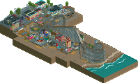
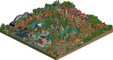
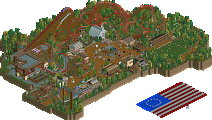
Ottersalad - Villain
5dave: 65% | Kumba: 65% | Turtle: 65% | Liampie: 50% | Steve: 70%
Pacificoaster: 65% | Cedarpoint6: 60% | SixFrags: 60% | Louis: 70%
What the Judges Say:
"At first I thought this was a hybrid judging by the grey colour, but then I thought maybe it's just painted wood. Either way - the layout was modern yet classic with some nice parts through the structure. I didn't like that there wasn't a working BBS, also you could work on your hacking and foliage. The queue was too short again. Landscape and archy was nice though."
-5dave
"Nice layout, but the surrounding area did not help."
-Kumba
"Coaster itself doesn't hold my interest for more than a single run through, and the surroundings, while showing promise, aren't very cohesive or atmospheric. "
-Turtle
"Surprising overall quality for a first submission. I didn't like the coaster much though."
-Liampie
"Surroundings were decent but left something to be desired. I actually admired the coaster quite a bit, but it lacked a certain something to make me truly fall in love. An interesting layout though, and held my attention for some time."
-Steve
"I didn't like some of the awkward transitions and the choice of trains for what seemed like a CCI coaster more than anything. "
-CedarPoint6
"The amount of diagonal bits is a bit overwhelming and kills the flow it could have. The pacing also is a bit off halfway through. I like the Wild West style buildings though, but since this isn't the architecture round it doesn't really count.."
-SixFrags
------------------------------------------------------ Does not achieve Qualification
Average: 63.33% < 80%;
__________________________________________________________________________________________________________________________
Maverix - Vesuvius
5dave: 70% | Kumba: 65% | Turtle: 70% | Liampie: 65% | Steve: 75%
Pacificoaster: 75% | Cedarpoint6: 90% | SixFrags: 80% | Louis: 80%
What the Judges Say:
"Solid layout, nice queue, great themeing and archy. The only thing I didn't like was the unfinishedness. Leaving out the buildings in the foreground and concentrating on the ride sorroundings themselves would have helped a lot IMO. The layout felt slightly awkward in some places, I can't put my finger on why, though. Maybe it was the fact that the first drop was hidden from the people's view. Solid entry overall."
-5dave
"Good layout, but why make so much on the other side of the coaster? It was very nice, but not what we are judging you for. The lack of a large volcano, or at least Pompeii themeing was a real disappointment. This needed more planning and it could have been amazing."
-Kumba
"More interesting than the last one, while not being finished enough to warrant a place. "
-Turtle
"Really nice. I thought the coaster was nothing new but still relatively exciting. Definitely not something you see for the theme you chose, which I liked. The surrounding architecture was nice although the station seemed a bit bulky. Good work, just not quite there for me yet."
-Steve
"Awesome layout. A great design for a GCI and I loved the dip under the exit into the fly-through. This all felt very natural. "
-CedarPoint6
"Very weird bit after the first drop; almost made me not give it an 80%. The rest made up for it though, as it has nice pacing and flow throughout the rest of the layout (although some parts were leaning towards awkward-but you get the benefit of the doubt). Also love the theming and the attention to detail on the buildings."
-SixFrags
------------------------------------------------------ Does not achieve Qualification
Average: 74.44% < 80%;
__________________________________________________________________________________________________________________________
Dimi - Medieval Climate Optimum
5dave: 85% | Kumba: 90% | Turtle: 75% | Liampie: 90% | Steve: 75%
Pacificoaster: 85% | Cedarpoint6: 80% | SixFrags: 90% | Louis: 95%
What the Judges Say:
"Awesome stuff! That what I was hoping for. Loved the layout with the drop facing the lake and the dive through the bridge. The fly-through was cool too. Not a fan of the trim-brakes, though! The landscape, foliage and architecture was great and the colour of the buildings were a fresh touch! Some parts I didn't like where the grey tarmac and the naming of the ride. My fave of this round!"
-5dave
"Great coaster all around. Misses a higher score because it did not seem very original, I did not get the name and the landscaping was used as themeing a little too much. Still one of the best entries in the contest. "
-Kumba
"Obvious skill here, but not enough imagination for my liking. The architecture is the same all over, and the coaster is all left turns. With a bit more thought, could easily get a spot. "
-Turtle
"One of my favourite woodie layouts ever. The theming and landscaping are minimal, but they got that 'special' touch and the coaster is framed nicely. So much fun and warmth again!"
-Liampie
"Like entry four, just not enough for me. Wasn't particularly thrilled by the coaster, but the surroundings were definitely very good. Just not quite there but I can see you making your way in this if you push yourself even more."
-Steve
"I don't really understand the name, but it was a pretty good take on Wodan, though it lacked some of the GCI feel and I didn't like the brakes in the fly-through. The station was very pretty."
-CedarPoint6
"Love the flow and pacing throughout the ride, although I'm not so sure about the final helix, just feels a bit like a filler. Obviously borrows elements from Wodan at Europa Park in Germany, although it has its own original bits here and there, which I think are an improvement to the real life Wodan, so good job! Also love the theming of the coaster; The supports, foliage, architecture and interaction with the paths and queue are great. Best coaster so far!"
-SixFrags
------------------------------------------------------ Achieves Qualification
Average: 85.00% > 80%;
__________________________________________________________________________________________________________________________
Mr.Brightside711 - Landslide Wooden Prelim
5dave: 50% | Kumba: 75% | Turtle: 70% | Liampie: 45% | Steve: 65%
Pacificoaster: 65% | Cedarpoint6: 65% | SixFrags: 75% | Louis: 50%
What the Judges Say:
"Not too keen on this one. I liked the elevation changes, but IMO it was all to spread out to make sense to me. A more compact terrain-hugging woody would've been better. The station was a bit too huge and the queue was a bit strange with parts being unpaved. You're not quite there yet but the entry was different to all the others, which is always a good thing, so keep it up!"
-5dave
"Very nice terrain coaster. Great layout till the end. Thing was, the rest of the map did not have great supporting elements. "
-Kumba
"Probably my favourite actual coaster of the competition, but surroundings were far too samey for me. "
-Turtle
"This doesn't look like much at first, but upon closer look it's a pretty enjoyable entry! The coaster is surprisingly good, the landscaping is subtly varied, and the architecture is not half bad. I also liked the dirt queue because it was different. If you take the time to develop your ideas further, I can see you making wonderful things. "
-Liampie
"I actually enjoyed the coaster. Used the terrain nicely. However the station, landscape itself, and just about much everything else needs to be improved upon. "
-Steve
"I used to build these kind all the time just for fun-- the fully terrained coasters are neat to build. Unfortunately it didn't hold the flow between elements to add to the aesthetics of the ride as a whole."
-CedarPoint6
"Love the pacing and flow of the coaster! Would be a blast to ride this in real life I reckon. There was no real 'wow-factor' though, which kept it from scoring higher for me. It's mainly the theming (or lack of it) that makes it appear bland and uninteresting. It was an interesting ride though!"
-SixFrags
------------------------------------------------------ Does not achieve Qualification
Average: 62.22% < 80%;
Airtime Offline
Sammy how the hell you didn't get through with that I don't know. I think anyone would struggle entering in LL simply because the elite, that are able to judge, have mixed opinions of what LL should be and you'd have to create something ridiculous for it to get through. This is one of my all time favorite pieces of LL. The layout is great. The surroundings are over the 80% mark easily.
Congrats Dimi on qualifying. This woodie did not have the best layout to be honest. I felt like there was 3 points (low turn before the tunnel dive, the high turn around helix and the last helix) that weren't 80% quality. The surroundings were stunning though. Everything else was perfect, gorgeous. I don't think this should of qualified but I'm glad it did as you were robbed in the previous round. That landscaping for your (Dimi's) last prelim was the best of the round, easily and you should of qualified. I have no idea what people were judging.
Edit: Also to show some ][ love. The bulk of the layout was nice I just didn't like the series of turns underneath the station/brake run as well as the ending few turns with the station fly-trough which seemed forced. The station building, surroundings and little details were great.
These two LL entries make me wanna play LL. A feeling I never get now.
Editing again to be clear to who I'm talking to.
Thank you for your kind words. I know I'm not the best with architecture/scenery, but I took my time building it and trying to make it looks clean unlike my usual work. I'm pretty bummed and surprised that I didn't even get close to 80% mark with this layout. I know coaster design is my strongest attribute and after seeing all the prelims, I feel mine has the best layout and yet I scored the lowest. :[
What kind of pisses me off though is half of the comments are about the surrounding. The focus of this was the coaster, see "Best Wooden Coaster".
The only thing I seen unfinished was the surroundings area, not the coasters themselves and thats what I thought was being judged?
I personally judged the entries first and foremost on the layout;
+Pacing
+Flow
+Interesting elements
Then there's the theming of the coaster which is not about the surroundings for me. It includes support work, interaction with paths/queues/buildings, the station.
And lastly I also take the surroundings into account, but not in the way that it would change my vote too drastically.
I think the best prove for my voting is Mr.Brightside711's entry, as the coaster itself is very good and scores pretty high on the coaster only criteria. On the theming front of the coaster it lacks though, and the surroundings are not very good to put it mildly. Thus I scored it 75%, which still is pretty high imo.
Anyway, each to his own I guess, and we all have different criteria in the end I'm sure.
The one by intamin looks okay also. A little bit more theming round the ride might have given you the spot too.
Rest doesn't really interest me.
Airtime Offline
Correct, which is why:
Though I don't think any scores from the past few rounds were significantly off, I think you raise a fair point. As a judge I can say that when you receive complete entries like these, it's easy to forget that you're judging a prelim and not a design... Especially with respect to the round 8 entries that are NOT complete designs, it's good to return to the core of prelim judging as stated in the rules and regulations: "we are looking for potential, your entry will be judged on quality, not quantity. The prelims are a showcase of talent, show us the quality you are capable of building to gain a qualification spot."
Rethinking this round's voting with this in mind, I would've voted some things a little differently. Nothing significant though. Thanks for putting me with my feet back on the ground!
Have seen all entries in game? I think it was a strong round, stronger than the screens suggest.
Thanks :] I actually did do a lot of support work. The entire ride has footers and I had build a lot of custom pieces so the footers attached to the wood. You can't see the detail unless you looks up close. I will post a link later with the download and pics.
Here is the download: http://www.mediafire...oden_Prelim.SV6
Hope you like it
Couldn't of said it better myself
You didn't need to take the time and upload via mediafire, you must be new to the site, when a creation is uploaded, you can simply just go to NE database and DL it.
http://www.nedesigns...4-r7-landslide/