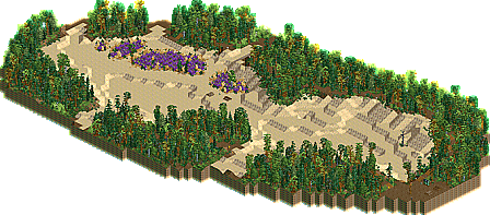
Park / Bedafse Bergen
-
 21-June 13
- Views 28,386
- Downloads 783
- Fans 4
- Comments 22
-
 Description
Pro Tour 4 prelim round 5; Foliage & Landscaping
-
4 fans
 Fans of this park
-
 Download Park
783
-
 Objects
79
-
 Tags
Tags
Pro Tour 4. When the elite battle, who will come out on top?
Prelim #5 - Best Foliage & Landscaping
COUNTDOWN CLOCK WEBSITE
Maverix - Happy Tree
Liampie: 60% | 5dave: 55% | Kumba: 65% | Cedarpoint6: 65% | Six Frags: 50%
Pacificoaster: 75% | Roomie: 45% | Fr3ak: 80% | Loopy: 70% | Louis: 85%
What the Judges Say:
"Quite nice small landscape diorama, but it all seems randomly placed without much thought (mushrooms don't grow in direct sunlight for example). Also the roxks seemed out of place (visible object boarders and the colours seems wrong compared to RCT's grey rock texture. At first it looks great, but in detail this entry lacks a bit. "
-5dave
"Nice, but not impressive."
-Kumba
"I think a lot of this felt too scattered. The mushrooms seemed maybe a little overused. I liked the way the waterfall hugged the cliff side, but overall nothing that really stood out."
-Cedarpoint6
"What was there was decent, but there wasn't much of a landscape at all. I also think those minas tirith stone objects stick out too much and destroys any flow you had going. I like the terraforming and the little waterfall though."
-Six Frags
"What's there is actually pretty nice but there's not much going on and it needs a wider context."
-Roomie
"I liked this one a lot. Had a very natural feel to it and it worked great from all sides. The waterfall feels just right too. Too bad it was a little small."
-Fr3ak
------------------------------------------------------ Does not achieve Qualification
Average: 65.00% < 80%;
__________________________________________________________________________________________________________________________
Sulakke - Bedafse Bergen
Liampie: 90% | 5dave: 90% | Kumba: 75% | Cedarpoint6: 90% | Six Frags: 90%
Pacificoaster: 75% | Roomie: 80% | Fr3ak: 90% | Loopy: 75% | Louis: 95%
What the Judges Say:
"The most credible prelim I've seen so far. The landscape feels real and I want to be there. I spent more time on this map than any other prelim somehow. Subtly original and almost flawless."
-Liampie
"Beautiful landscape and foliage. Maybe some pickniging guests or something would have added to the atmosphere, but what was there was really unique and beautiful. Loved the violet flowers there. Easily my favourite of the bunch. I could imagine myself being there."
-5dave
"Love the patches of purple flowers that were really the fruit tree. Some nice details mixed in, but overall I think it looked a little rushed and messy. "
-Kumba
"This is great, mostly for the use of fruit trees, which I really enjoy doing myself. The way the sand area was framed is excellent. The little trail was nice too."
-Cedarpoint6
"Very, very nice work! This is exactly what I was looking for in a best landscape and foliage contest. I live close to an area called 'Herperduin' which almost exactly looks like that; with the heath in the middle of a sand 'desert', those little poles which give people that have a walk an indication which route they must follow, the picknick tables, the patches of dense treeing, the little height variations in the terraforming and the map at the picknick tables. Great work!"
-Six Frags
"This is the best of the lot for me. Avoiding the use of rocky landscapes and going for something a little different. Creates a lovely atmosphere."
-Roomie
"Great contrast between the powerful green tree lines around the sand parts in the middle. And OH WOW those purple flowers in combination with the dry grass."
-Fr3ak
------------------------------------------------------ Achieves Qualification
Average: 85.00% > 80%;
__________________________________________________________________________________________________________________________
Dimi - I am the Elephant Seal
Liampie: 85% | 5dave: 60% | Kumba: 70% | Cedarpoint6: 80% | Six Frags: 75%
Pacificoaster: 80% | Roomie: 70% | Fr3ak: 80% | Loopy: 75% | Louis: 95%
What the Judges Say:
"Unusually colourful and fun. The rides/entertainers/names might be overdone, but they imply that there's some kind of story to this island... I don't know the story and actually I don't need to know... The implication itself adds charm already."
-Liampie
"Liked the island itself, but the plantwork was wrong (pine trees on a tropical island?) I think more lush/tropical foliage and some wet sand spots over and under water would have been better. Also there were too many unnecessary rides/entertainer which made the entry slightly cheesy. Rockwork and whole feel was nice, though!"
-5dave
"Cute details, but this about landscaping and what you had was not that great. Another round should suit you better."
-Kumba
"I like the varied trees and land types here-- it ended up being a little messy, but I enjoyed this a surprising amount. The little rocky outcroppings were a nice touch."
-Cedarpoint6
"Hmm, hard one to judge. Nice little details here and there, but there was not enough of actual quality landscaping imo. There were bits of brilliance such as the mountain with the volcano on top and those patches of stone crawling to the top, but overall it just lacks a little 'wow-factor' to deserve qualification to the main contest imo."
-Six Frags
"Again this is a good entry but its just a bit to random for me. I could see this style fitting well into a park but it lacks that certain something which pushes it over the top. The small details like the eel and the hut were lovely though"
-Roomie
"Great stuff here. I loved the very thoughtful combination of ground textures, quarter tile objects and foliage. Had a very nice pirate-island-feel to it."
-Fr3ak
------------------------------------------------------ Does not achieve Qualification
Average: 77.00% < 80%;
__________________________________________________________________________________________________________________________
BelgianGuy - #DATCREEKYBRIDGE
Liampie: 70% | 5dave: 85% | Kumba: 70% | Cedarpoint6: 75% | Six Frags: 70%
Pacificoaster: 70% | Roomie: 75% | Fr3ak: 70% | Loopy: 85% | Louis: 85%
What the Judges Say:
"Definitely a good entry, but I felt the architecture was too overpowering and the rockwork was not very strong. Loved the campsite."
-Liampie
"Some high quality stuff here. I really liked all the details and there was the right amount of supporting details (camp, bridge, crows, and ruins). Again I didn't like the mushroom placement in the open and the RCT vanilla shrooms looked just wrong. Nice use of the 1k ruins - great stuff! The Replacements approve!"
-5dave
"Pretty much the same as entry 3 imo, so... Cute details, but this about landscaping and what you had was not that great. Another round should suit you better."
-Kumba
"When the contest is on landscaping, it's hard to carry an entry on bushes and brush. There were some pretty nice touches like the small ruins as rocks. "
-Cedarpoint6
"I like the idea, but the execution leaves a bit to be desired. It's mainly the terraforming that brings this down for me; too many land is just flat out raised without any variation in height. Those 1k ruins also don't mesh well with the rct rock texture. I don't understand the trend lately for people to massively use those 1k ruin objects so heavily in their landscaping. It just rarely makes a landscape better imo. The foliage was great though! I love the bush combinations and how you placed them. It transcends well into the tree patches. The little camp side and ruins look great too."
-Six Frags
"Exactly the same here. Its good entry but for me the foliage is a bit too random and doesn't create a cohesive atmosphere. The details like the rope bridge and ruins are nice touches."
-Roomie
"The foliage and overall landscaping felt a little random in this one. The trees were a little bit to spread out. Would have been a lot cooler if at least some of them formed groups."
-Fr3ak
------------------------------------------------------ Does not achieve Qualification
Average: 75.50% < 80%;
__________________________________________________________________________________________________________________________
FK+Coastermind - Fox Glacier National Park
Liampie: 70% | 5dave: 65% | Kumba: 80% | Cedarpoint6: 80% | Six Frags: 60%
Pacificoaster: 85% | Roomie: 65% | Fr3ak: 50% | Loopy: 65% | Louis: 70%
What the Judges Say:
"I loved this landscape up to a certain height, literally. Where the foliage stops, the entry goes from 90% work to 60%. The rock work is impressive, but it did not blend with the lower landscaping. I googled the landscape from the read me, but it didn't look alike... Cool how you included a coaster though, makes it more interesting to look at. This entry might not be good enough on itself, but it shows once again that you've got balls and discipline; in my opinion you're one of the front runners for a wild card right now."
-Liampie
"I won't judge the coaster here. The whole 1/4 landscaping looks daunting. IMO you should have mixed in some full tile or actual RCT landscaping. The gfx of the 1/4 make the giant walls look strange. The path to the top+bridge was nice, but the top itself not so much. Must have been a lot of work so props for that!"
-5dave
"The landscaping was very grand, but not that aesthetically pleasing. The glacier itself was disappointing. The coaster was a waste of time. "
-Kumba
"This is a balance for me. Some parts were very neat, but others lacking. You get points for the scale of the 1/4 tile work... that's very impressive. I wish there would have been some other regular land mixed in there, but it was very impressive. "
-Cedarpoint6
"I love the quantity in here, but when I first saw the readme before opening the park, I expected an epic landscape here. Unfortunately all the 1/4 landblocks stacked on each other ruin the flow it could have. The coaster running through it also ruins the realisticness it could have. A+ for effort though!"
-Six Frags
"Another good but not great entry. The ride is actually quite cool and I like the double launch section but the landscaping felt unnatural to me. Also a few to many of those smaller blocks. "
-Roomie
"Ignoring the coaster the landscaping felt unnatural. I liked the trees close to the water a lot though. They were very conclusive."
-Fr3ak
------------------------------------------------------ Does not achieve Qualification
Average: 69.00% < 80%;
__________________________________________________________________________________________________________________________
ivo - Unnamed Entry
Liampie: 5% | 5dave: 10% | Kumba: 10% | Cedarpoint6: 5% | Six Frags: 5%
Pacificoaster: 5% | Roomie: 5% | Fr3ak: 10% | Loopy: 5% | Louis: 15%
What the Judges Say:
"I liked this more than your first entry, because it was landscape and nothing more. The shades of grey changing on each view were interesting, also the casting shadow of the rock. Reminded me of something artificial that has eroded over times (stadium, city in a valley,...). Keep those trips coming!"
-5dave
"Your weird..."
-Kumba
"I don't see much in the way of landscaping. "
-Cedarpoint6
"What am I looking at?"
-Six Frags
"Well that was random."
-Roomie
"Sadly it's still not working out."
-Fr3ak
------------------------------------------------------ Does not achieve Qualification
Average: 7.50% < 80%;
Please don't waste a wildcard one me. You have seen what my work is capable of in the Prelims, its not what the judges are looking for, so it wouldn't make much sense to put me in your competition. Frankly, at this point i probably wouldn't finish, it's hard to muster energy for building when you have no confidence in rct anymore.
@Liampie-it's not based off the Fox Glacier, its based off my fucking mind, so yeah, its not gonna look like it.
FK
who wants to be respected by squares like them anyway?
I like you a lot and I hope you aren't offended by my comments, but like I said, you've done so much better than this.
Maybe it's better for you to build at your own pace and enjoy the game itself some more rather than to strive for being the 'best' (best is subjective anyway, as I'm sure that a lot of people actually really enjoy your work). I personally know I will not win the Pro Tour, but at least I'm gonna have fun building an entry. The deadline and overall competition format make sure I finish the damn thing
Actually, you are what I'm looking for. I was looking for you to join the finals, and when you look at your 3 recent submissions i've often voted around or above the 80% mark.
With these two prelim entries I voted below 80%.
In my eyes, you are capable of above 80% work, as proven by my scores of your submissions, I just felt that you didn't bring your usual greatness to the prelims, which is sad
At least this gives you a chance to start our serious business
Wish I would have remembered to build something for this round. I'd have dropped out if I qualified anyway, but I'd like to have seen how I could do.
ivo- if that is a continuation of the last round, you have me interested. that is, if it ends up evolving each round into something cool and finished (although I'm not sure how much that follows the rules, it would still be awesome
that said, its still mostly just a bunch of shit, although more pleasing this round than last. I liked that black stripe that came from the center which had the grey box hovering on it from one view.
also, fk, definitely keep doing shit because you're probably one of the top contenders for the wildcard spot IMO. One more solid entry would seal it for you. (just realized this was already mentioned- well I still want to see you in the finals
1. Sulakke, Dimi, FK - 3 awesome entries. Gratz, Sulakke
2. In my opinion, qualification for the PRO TOUR should be more than just landscaping/foliage. While it is insanely important (one of the most important aspects of a park) I think a Pro Tour qualifier should be something that can blow your mind. Then again, Earth by Natelox. Scratch everything I just said. Peace ✌
I can't review my fellow entries at the moment, but I'll sure do when I'm back from my two weeks excursion.
on the other hand I expected not to get 80% I basically made this in 4hours on the train to work with a trackpad on my laptop... oh well guess there won't be a pt for me then haha, I'll just build on the other stuff I have going...
lmao