Park / Ayres
-
 07-July 13
- Views 16,050
- Downloads 1,116
- Fans 2
- Comments 43
-

-
 80.38%(required: 65%)
 Design

5dave 90% zburns999 90% Jonny93 85% Pacificoaster 85% Austin55 80% Dimi 80% In:Cities 80% Liampie 80% Loopy 80% nin 80% turbin3 80% tyandor 80% Maverix 75% Louis! 70% Airtime 65% 80.38% -
2 fans
 Fans of this park
-
 Full-Size Map
-
 Download Park
1,116
-
 Objects
1
-
 Tags
Tags
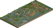
![park_4086 [H2H8 R1] Tahendo Zoo](https://www.nedesigns.com/uploads/parks/4086/aerialt3817.png)
It's really easy btw, you simply merge the pretzel, use geewhzz hack to make it invisible and with MOM you lower in a B&M looper where you want it.
thanks everybody for the kind words and I hope the panel doesn't get more beef from this release as I don't think it's justified to call them out. they gave fair votes and I'm happy with the score, 80% is already a massive score and I think the score was fair.
I hope to finish some more projects soon and I hope not to disappoint
That's all i CAN say.
I'm going to give comments later BG, but it looks stunning!
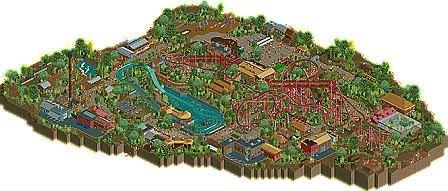
I think my biggest gripe with this is you have this beautiful flowing layout that interacts with surrounding rides and path and you shoved the entrance behind the storage track. Why? It looks like you have plenty of room to have it weave next to the splash boats 'lake' and have the entrance be under the first half of the pretzel loop.
On the topic of the splash boats, this was my other big gripe with this. There's very little interaction with the path, and no way for people off ride to get soaked from the splash itself. Half the fun of splash boats is getting wet off the ride. This problem could've been solved by simply mirroring the rides layout. All the cool details would be the same, but now guest can clearly see and interact with the boats splashdown.
The only other thing that I didn't like was the final helix of the ride. Not the placement, but I felt that it would've been better fitting to have it be an upward helix to end the ride rather than downward as B&M's mostly end on a rise rather than a drop, with very few exceptions.
I know that was a lot of criticism but I still very much enjoyed this hence the 75% score. I think all you need now is to think to yourself 'How can I make this more awesome from a peeps perspective' when building and you'll be hitting close to 90%.
Great job.
Sorry, nin
BelgianGuy, great job on this. I'm at work and haven't gotten around to checking out the map, but it looks fantastic from the overview. Well done!
If what you say is correct then surely this just shows that its best to be good friends with many people in the community instead of bitching and whining and causing conflict with everyone.
Sorry, I already graduated high school years ago. I don't need to be in a "click" to feel empowered. I'm pretty sure you can't use the word "everyone" there, see it looks like since you have all this power that you feel like you can speak for everyone when that's just not true. I'm sure everyone has opinions and they're not all the same as yours. Now do yourself a favor and just accept the fact that you & others, give their "favorites" the extra 10% buddy vote, don't try to turn this on me when I'm just pointing out the obvious, which was
I would believe he would of voted upper 80s-90s if your name was on this. He voted 85% on SSSammy's Desgin and that was BARE,NO THEME and yet he somehow sums this design up with 65%?
Also I think its very interesting, these designs & parks are suppose to represent us as builders, you slamming BG because he doesn't take YOUR ideas(because that's just what they are) its ridiculous! Its one thing to help him try to execute a hack, its another trying to change the way HE builds, this is HIS creation. If he doesn't wanna take your idea, he shouldn't have to worry about you docking 10-20% off your vote because your idea wasn't used in HIS creation.
good job contradicting yourself.
I don't give people a buddy vote. Your logic is icredibly flawed as I would consider BG to be a 'buddy' of mine, which, if you are correct, would entitle him to recieve an extra 10% buddy vote, which he didn't recieve. I'm also pretty sure that Stijn doesn't need you to fight his battles, particularly when there isn't one.
I wasn't complaining about Stijn not taking my ideas, I was making an observation that he often chooses to not take people's advice and comments into consideration. I believe I also stated before, and I'll state again, that it is up to him whether he takes advice on board or not, but that I know from my experience scores tend to increase when you listen to what people have to say as most of the time they improve the creation, and improvements lead to higher quality, which leads to higher votes.
SSSammy's design may have been 'bare theme' to you, but to me it oozed atmosphere and charm in a way that many struggle to do so, it was classic, fun and I enjoyed it immensely. It may not be to everyone's taste, but as you keep saying yourself, everybody is entitled to an opinion. Also, Acolade Panelists don't know who has created the submission they are voting on. Only us admins do, so therefore, yes I can apply a buddy vote if I wish to, which I don't, but other panelists, including Airtime, don't know who has built what, unless the creator has made this apparent in some way, which Sammy hadn't and his submission came totally out of the blue.
I probably have contradicted myself, it generally happens to most people, but I apologise for not being a robot. You are totally right though, I have all the power and I will use it to speak for everyone because I am the greatest member at this site. I am the chosen one, bow down to me.
Oh and if you have beef with me, which for some reason you seem to as you can't let this subject go even when it's been explained and the argument had settled down, please take it to PMs as this is a topic about Stijn's latest design, not your issues with the way I vote.
Apologies BG for taking over your topic, but sometimes people seem hell bent on continuing an argument that had finished.
I gotta say, my favorite thing about this is the fact that the screaming swings go 'nearly inverted' just like the real ones do. about god damn time someone made that realistic touch into a design.
other than that yes, loved this design. the color scheme really brought it all together.
-Josh
Just a minor thing I noticed in an otherwise flawless design as far as I'm concerned.
-Josh
EDIT: After re-reading my post with a calmer and clearer attitude, I decided to get rid of the ridiculous attack on Kumba's post (which I still think is stupid), and that's what Austin's post is/was referring to below.
That merge is sublime, i couldn't see it, so well done!
Only that s bend in the 'pretzel loop?' was painful to see, but inevitable at the same time.
Didn't really liked that water ride, although it was beautifully constructed, like everything in this design.
Congrats BG and Cena... i guess.
A well deserved score.
Is the only way to do a pretzel loop with an s bend?
here basically I did the normal 4D merge and used the gee hack to make the entire pretzel invisible at first, then I simply lowered in another track that is running in the opposite direction from the coaster so it doesn't confuse the game to get the "clean" pretzel loop.
What happened to that?
"MFG"